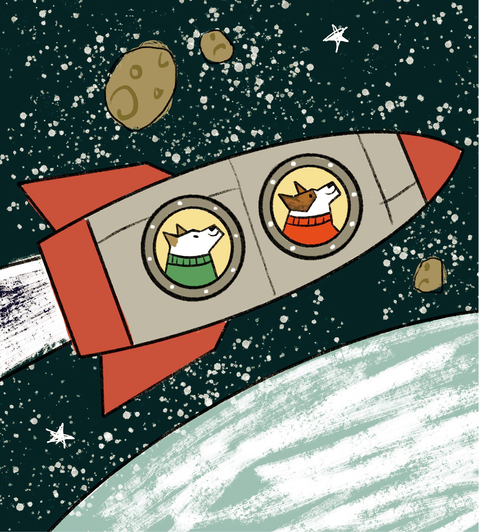
Thoughts on Color Scheme etc.?
-
Hi fellow art folk,
I just made an iPad sketch for a project I’m doing in an astronomy class (I’m an undergrad). This piece will end up in gouache and collage, so the textures and line quality/weight will be totally different. But I’m trying to resolve the composition and color scheme before I paint. I like the composition (except maybe the stars, which will look different on paper) but am unsure about the color scheme. The dog’s sweaters have to be red and green, and the rocket should have some shade of red, as it is Soviet. The earth should also be some shade of light blue. But it doesn’t feel totally harmonious yet. Could use fresh eyes.

Thanks a bunch.
-
Hello @cianamacaroni I think the image is composed very well. The palette seems to be consistent and I can tell what kind of theme you're going for. That said I can something, but it might be based too much on my personal tastes, so please ignore if you feel they aren't working towards what you're going for.

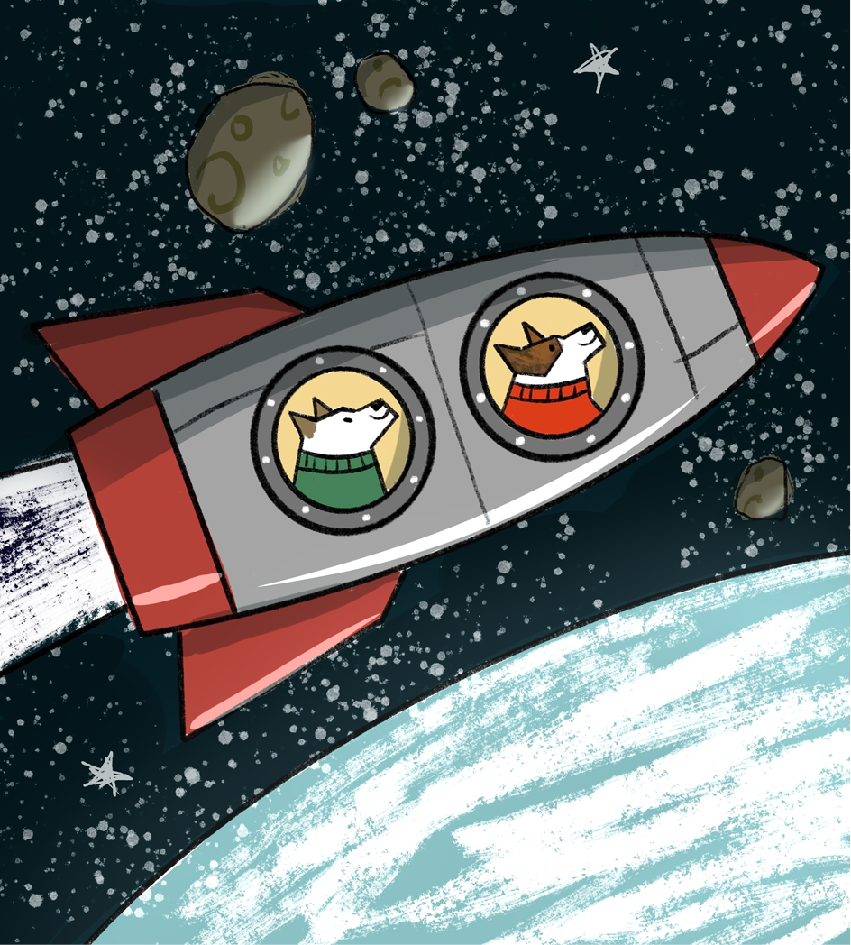
For this interpretation, I lowered the saturation and added a yellow filter so this illustration can have a sort of old timey feel to it to compliment the textured outlines. Filters also always help to bring the entire palette together.

For this interpretation, I just generally prefer art that has some shading. What I did was I darkened the sky so the stars don't take away from the main image: the two dogs in the space ship. I also highlighted the earth so it can have a natural glow to it. You'll also see this in many outerspace videos and photos where the Earth's atmosphere sort of creates this "glowing" aura around it. And basically I just reflected the light source onto the ship and the surrounding asteroids.
I hope this was helpful in some way. Perhaps you could also hybrid these two suggestions. I hope you can incorporate these suggestion into your physical collage piece, if they are applicable.
-
I think the green is throwing it all off balance could you change up the shade of green? give it maybe a blue-er hue? It would compliment the earth blue a bit better I think.
-
@Michael-Angelo-Go Thank you, kind genius! I love what you did color-wise, that's exactly what I was going for. Adding a filter to harmonize a color scheme is a great suggestion, I'll remember that. And although I tend to prefer flat lighting, I like the dimension your shading added. I think I'll do it flat first and add shading afterward if it looks like it needs it. Thanks again for your time, I really appreciate it.