Which cover version works the best and why?
-
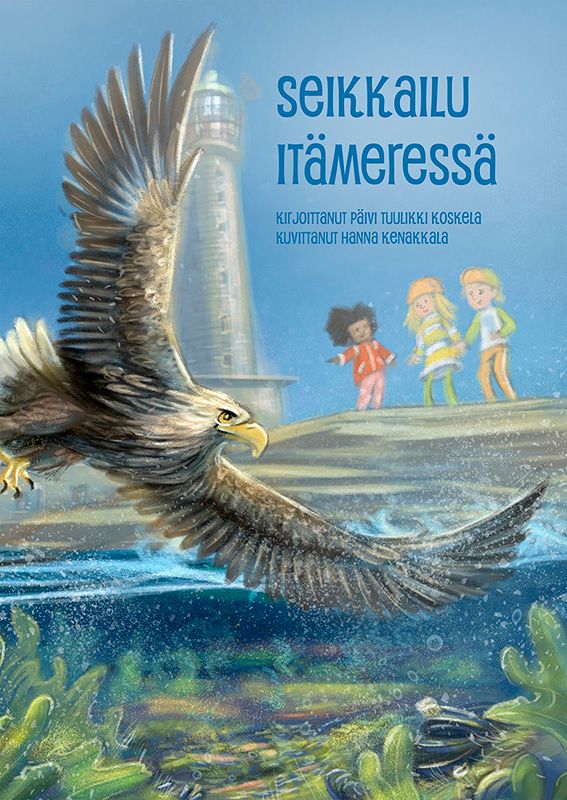
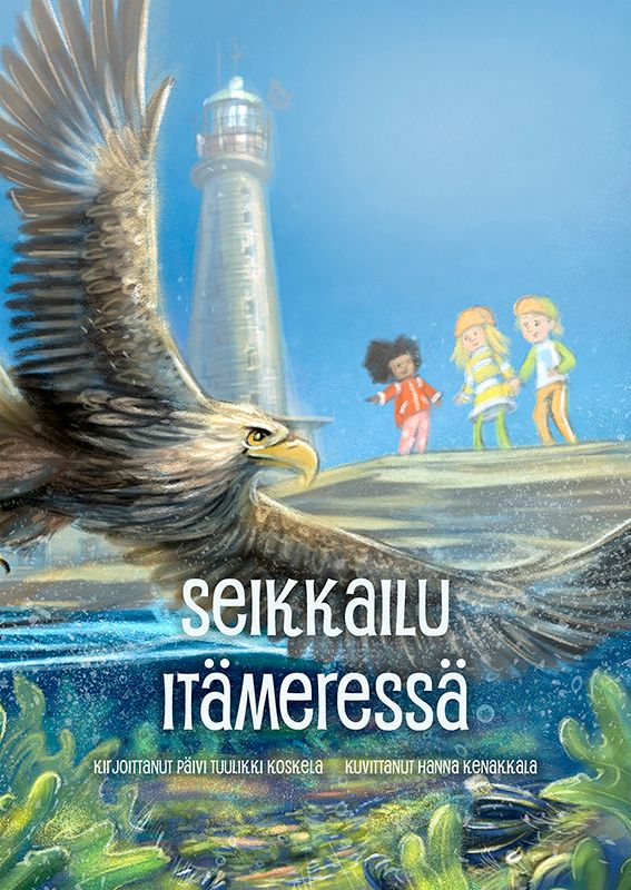
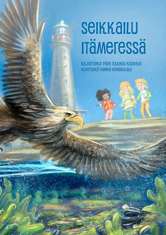
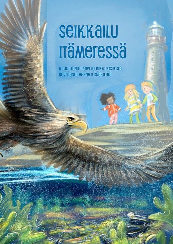
This is a cover for a childrensbook. Which version do you like the best and why? Having trouble deciding.
-
Hi, I think it is better if the title is in the sky, as it stands out more clearly and will be easier to read when displayed really small. Think if seeing it in the size of an instagram post or a stamp size print of the cover in one of the magazines that is ling around in the bookshops. Much easier to red the title. Hope that helps.
-
Hi @hakepe my thoughts, If I have to chose from these 3 I would chose the 3th, because the bird isn't so much in line with the lighthouse. For the 2th I like the white colored title there, but the space above feels really emty and it doesn't read clean in small.
Looks all all 3 images in small:
The bird almost disappears with the lighthouse, same line.
What about changing the composition? Take the smaller bird and mirror the lighthouse?
Than the lighthouse isn't align with the bird...it reads better than and you have also this U courve.
The composition of your kids is really nice, how the little kid looks to the older kids and is pointing to the eagle.
-
@MichaelaH Thank you, flipping it did not occur to me, I need to try it. Thanks!
-
@hakepe I like the third one! But I would use color and light to differentiate more the wing of the eagle from the rock in the background, for better readability at small scale (or from afar). Also love @MichaelaH's suggestion for the lighthouse, it really helps the composition!