Nov Prompt composition
-
Howdy folks!
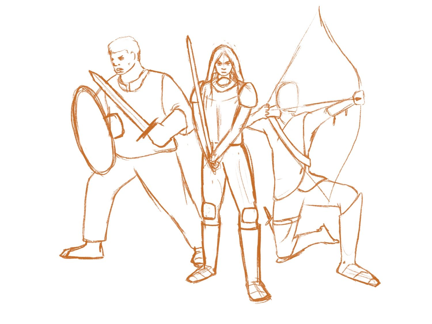
So I’m just trying to figure out the right composition right now. I’m really struggling to see which works best so it would help to get some fresh eyes on it. I love the idea of the guy on the left having hammers but the shield makes the composition more balanced I thin. Maybe I can keep the hammers and find a way to add more weight on that side. Let me know your thoughts!
A
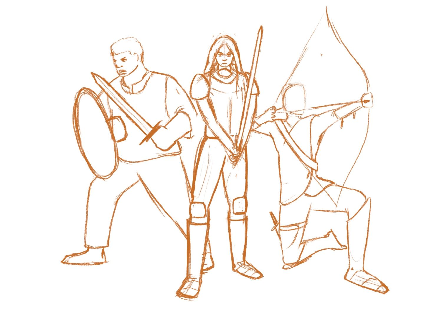
B
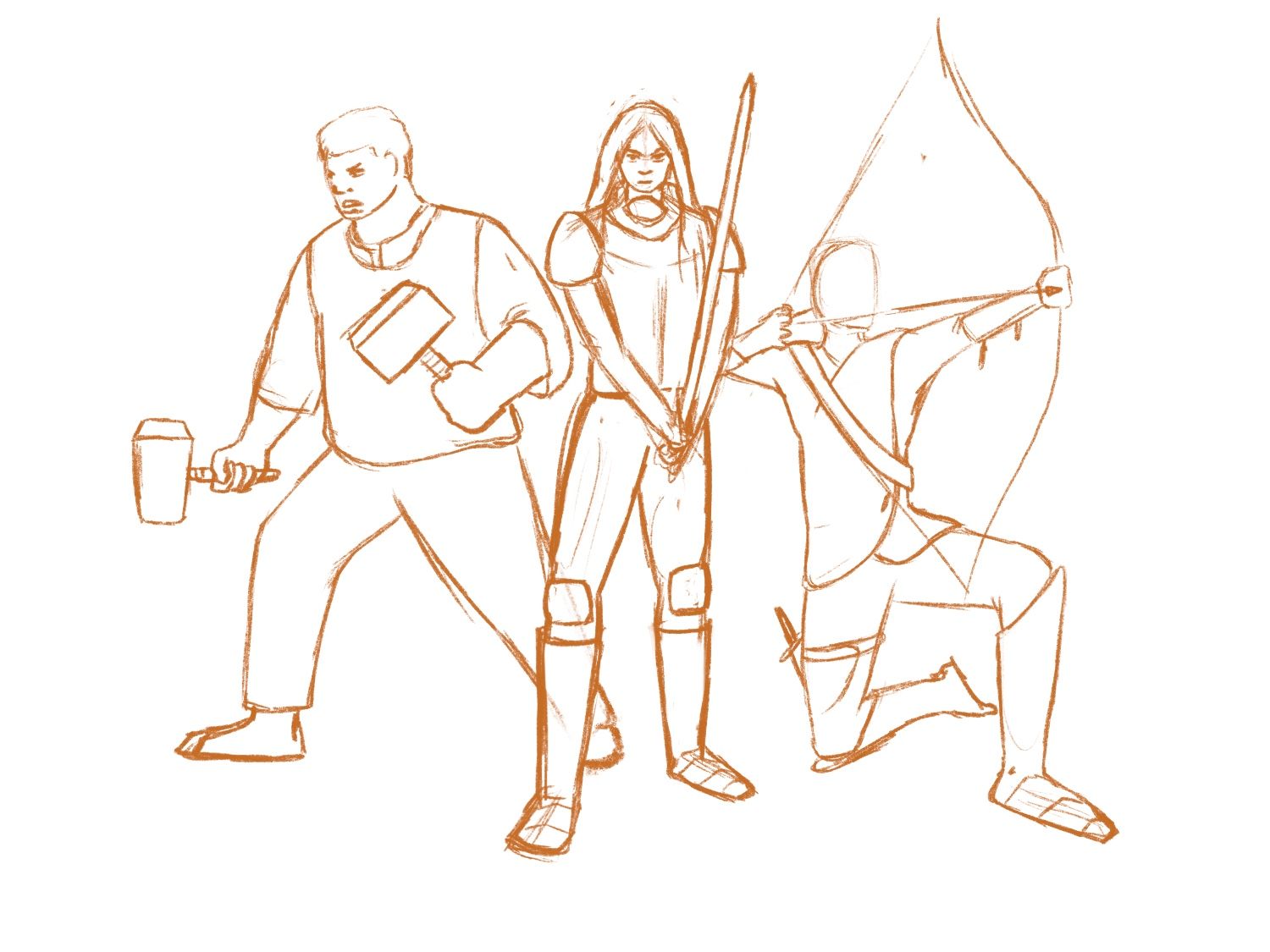
C
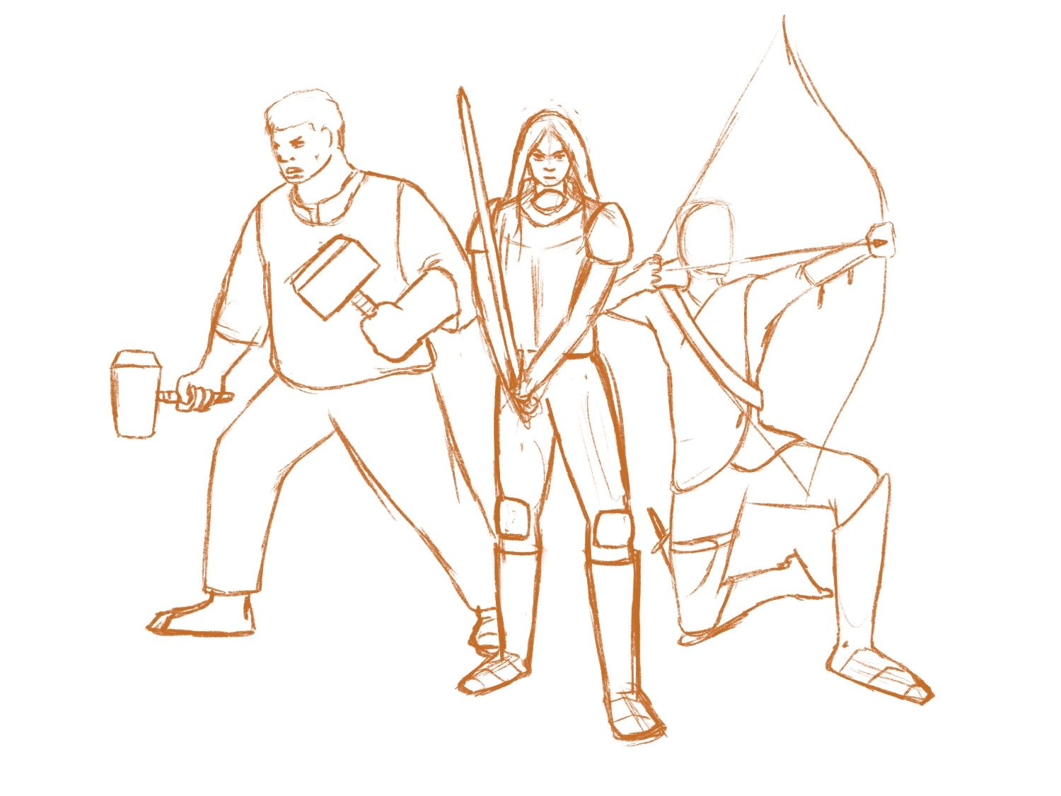
D
-
Hello!
I agree with you in that I think the hammers are more unique. Personally, I like them more! I also agree that I think the shield/sword combo does make the piece more balance, though. Another thing I noticed is that the shield/sword combo pose makes the character more compressed, while the hammers allow for the character's pose and silhouette to be more visible.
If you go with the hammers, I'm try to make them bigger, or have one big hammer and one hammer stay the size it is. Perhaps if the character held a more massive hammer in his right hand, that would balance the size of the bow? If you decide to keep the hammers as they are, I'd choose the pose variant where the character in the middle is leaning/holding/pointing her sword towards the left side of the image, as I feel like that would help balance out the piece (the 3rd image).
Overall, things are looking good here! I like how the characters have different body proportions (how the guy on the left is more massive than the other characters) and I like the various kinds of weapons, too! One last thing, though; I'd double check how the hands of the bow-wielding character are positioned/interact with the arrow. I've included an image I found on Bing below for reference. Some of the details are tricky to pinpoint, but they make a big difference on the final product.
(I've got a family member who's really into Medieval weaponry and he gets really annoyed when things aren't historically accurate. So, I thought I'd share some of the knowledge he shared with me, with you!)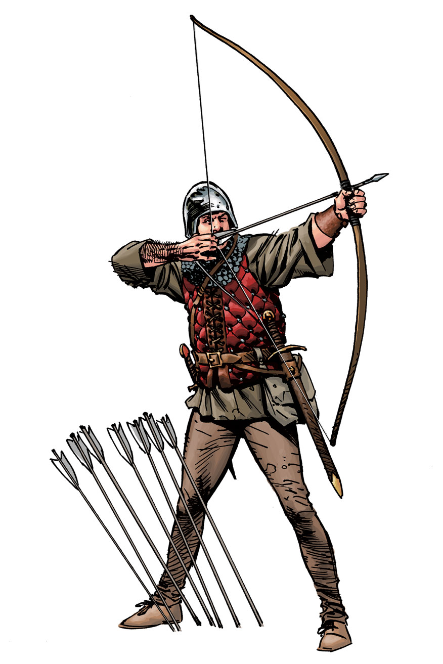
You've got a good concept here and I'm interested in seeing where you go with the details of the illustration! Best of luck with the contest!
-
I think I’ll definitely try to make the hammers work. They’re just more interesting. I haven’t gotten into the character design much yet so maybe once I add some more details it will balance things out, we shall see. Also thank you for that archer reference! I was aware the archer isn’t currently holding the bow correctly but wasnt really worried about it for the more general composition. It’s something I’ll be tweaking soon. That reference seems to be at just the right angle too so that will be very helpful!
-
@Griffin A potential way to make the hammers work is a subtle shift of the character's pose, so he's turned more toward the viewer, the hammer coming more toward us also. I also agree with @gavpartridge about adding some more dynamism, and maybe having the focus of all three characters in the same direction so that it reinforces that they will be working together to solve whatever problem they're facing.