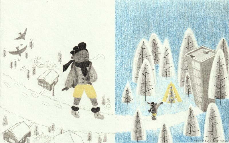
Updated Images Slowvember (dec) Childhoodweek (winter) Combination 2 pg spread -Feedback
-
Hi- I want to take a slower approach at childhood week winter with a 2 pg spread combining all 7 word prompts to end my year pushing myself out of my comfort. In the New Year I will be taking up classes again.
Childhoodweek word prompts are: animal, dare, far away, shiny, wild, fort, winter. I combined them into a story about a girl walking home from school, her friends dared her to walk home in shorts (she'd be very cold but her skin won't freeze) and she is quite a confident girl, it's a breeze.
I want to focus on different perspectives at once and size relationships along with designing the spread across two pages with spot and vignettes.
I have laid out my sketch thumbnails in order of appearance. However on the first page I combined 2pg spread also. I don't want you to be lost.
I have 4 questions (lols I listened to the podcast on this):
-
When working on a 2 page spread should I focus on the individual drawings before I lay out how and where (and what shapes)/design they will take up on my page, or vice versa or alongside?
-
What composition thumbnails of each part, do you like that help tell this story? I want to convey an atmosphere like how we/some feel about the movie Home Alone -nostalgic joy.
-
How do you feel about the set up of my spread (how it flows and whether the individual parts work together) and if not how could I alter them?
-
My fourth page focuses on a memory I had as a child but I am having difficulty telling it and conveying my feelings: My great aunt lived in an apartment and during the winter/Christmas season my family would visit and down in the lobby was a Christmas tree and I remember how I loved how the lights would shine and illuminate off the glass windows. I considered making my character small in the awe ambience of the glowing tree while in the rest of the work for the most part she's "larger than life".
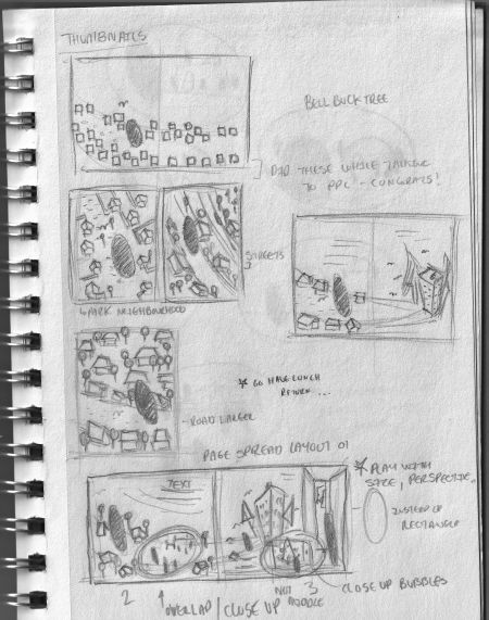
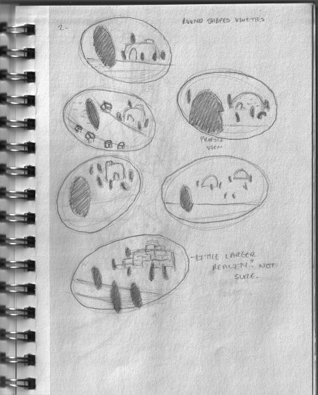
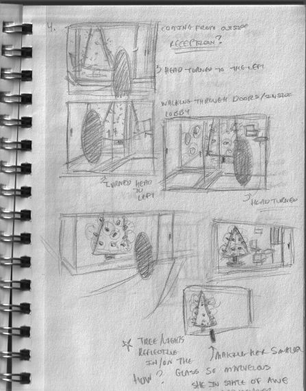
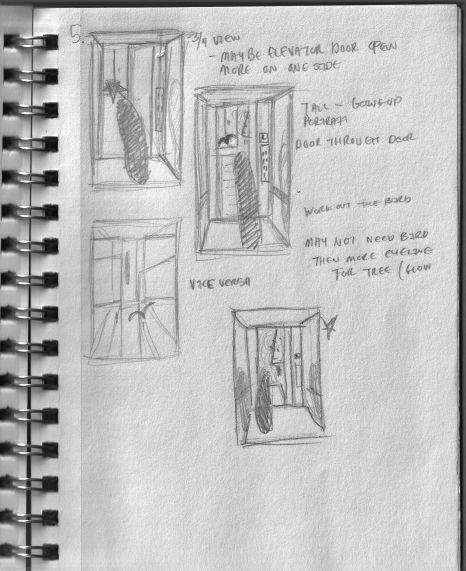
This one will still be fuzzy but it's an overall look. Thanks @Coley

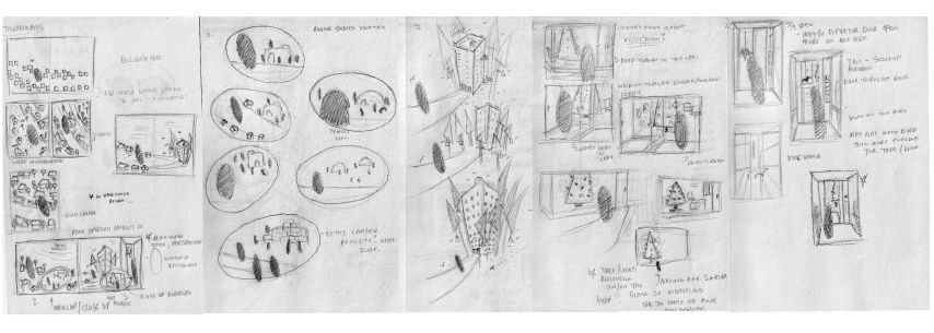
If you need any clarification let me know,
Thank you so much, -
-
Hi Heather, I’m having trouble really seeing anything, is it possible to upload higher quality image or adjust contrast? I can’t tell what things are overly clearly but I am 50 lol so it could be my eyes! I can see that you are playing with shapes and it looks very intentional and appealing! Would love to see it better, when I zoom I. It’s just fuzzy. Certainly I can’t read any notes you have written. Again....might be my eyes!
-
@Coley No it's not you, don't blame yourself. But when I have to upload I have to put my image under 2500kb but that always blurs my images (scanned from traditional work). I have yet to figure out how to get around it. I'll see what I can do. I may just upload them separately.
And thanks for speaking about the shapes even when they were blurry.
 Much appreciated!
 -
@Coley Hi I hope it's better -I had to change resolution to 68 and leave them on their separate pages.

-
@Heather-Boyd wayyyyyy better! I’m taking a longer look now in a sec! Just wanted to let you know. And maybe update your title to say updated images? I wonder if some people passed on feedback because it was hard to see.
-
I really like the overhead ones and the ones with the little city are pretty awesome in shape variations. I’m impressed with your thumbnails! The dark tall oval is to represent the girl is that correct? Is she meant to be really big because it looks like she is to me at least, especially in the overheads.
The one on the right side of the page on page one is really nice and flowy, I like how it continues across and you have the space broken up nicely too, at least I think so!
I haven’t done many spreads, it’s actually on my list and I’m working on one right now. And I haven’t really done anything in terms of spots and vignettes so I’m not a lot of help in terms of planning a spread I’m afraid, I think you are on a good path with the shapes though!
-
@Coley Yes the ellipse is the girl character and yes she is meant to be large. I will work out how large she might be in later steps.
I was afraid my thumbnails weren't so readable so thank you. I like the spread you pointed out if I had only two parts of the story, but alas I need more "windows into her world".
Thank you, and I'd like to see your spread wip!
-
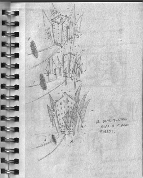
@Coley Hi so I took a second look at the thumbnail spread you liked and thought I'd like to continue with it because overall it was more simplified. I loved the idea of glowing and glistening Christmas tree but wanted to bring it out of memory storage and into a image that could connect more with people. So I played with the scene more (below):
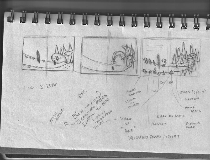
I started with bringing a bubble window from the apartment outside showing what she would see inside, but felt perhaps people would see it more as a speech bubble and the apartment talking lols.
Second one was more like Charlie Brown's Christmas tree.
And the third was a little like Charlie Brown's Christmas tree as in it stood out among all the others. I want the smaller tree to glow and glisten or shine (#childhoodweek word) like twinkling stars lighting it up. And the girl (I have worked on separately already) to either be in awe or just ecstatic (she also would be smaller, playing with size again).
Any suggestions from you and anyone else on how the second page is laid out, because the shiny tree would be in the middle and everything surrounds it. Or anything else you might have
 .
.I'd appreciate it tremendously thanks,
-
@Heather-Boyd I'm busy with kid stuff atm but will take a look and respond a little later tonight

-
I like the last one best! It has more interesting detail and shapes,and I agree the first one looks like a speech bubble from the building LoL. But I think you're on a good track with it for sure.
 Excited to see what you do from here!
 -
I finished and will post the WIP parts in the Slowvember thread later this week.
