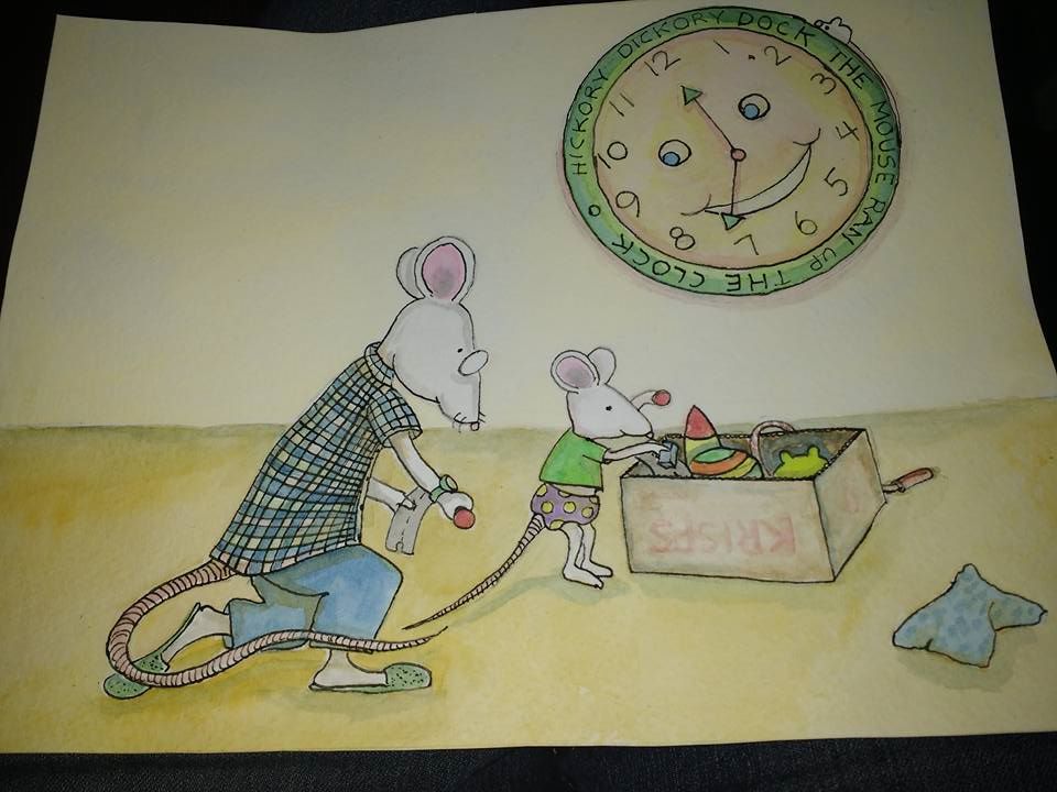
Color tips for this?
-
I am working on colors. These aren't working. Larger palette? More contrast? Brighter colors? Should I be using "lullabye" colors? I feel the characters need to pop and I don't think there is enough contrast from the background. Thanks.
-
There is no pic...
-
yeah, no photo

-
OOPS!

-
Should be here now!
-
@Katrina-Fowler Here it is...sorry.
-
@Christina-Taylor-Brown Here it is...sorry

-
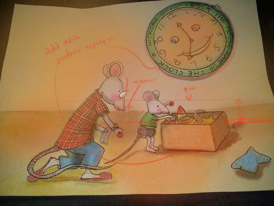
I'd try adding some warmer colors. Everything is cool now, so it's giving off a lifeless feel. Try bumping up that orange on your clock, and maybe have a bit of it one the ground, or even dress one of your mice in a warm tone. Cute drawing! I feel like that daddy mouse, I'm constantly doing this with my son haha!
-
I just dusted over it with a little orange and okra yellow. the horizon line is hitting your mouses nose though, creating a tangent. I'd consider lowering it or moving it higher. Oh and try adding more highlights and shadows too.
Hope this helps!
-
I see what you mean! The colors look a lot nicer when warmed up. I agree about the line, I was going to move it so it wasn't so even with the box top. I'm going to look through some books I have too and see what kind of colors they're using. I like color but feel I need some work on color matching skills
 Once I get the palette for this down I will have an easier time....I hope
-
I should probably review the highlight and shadow class too, eh?