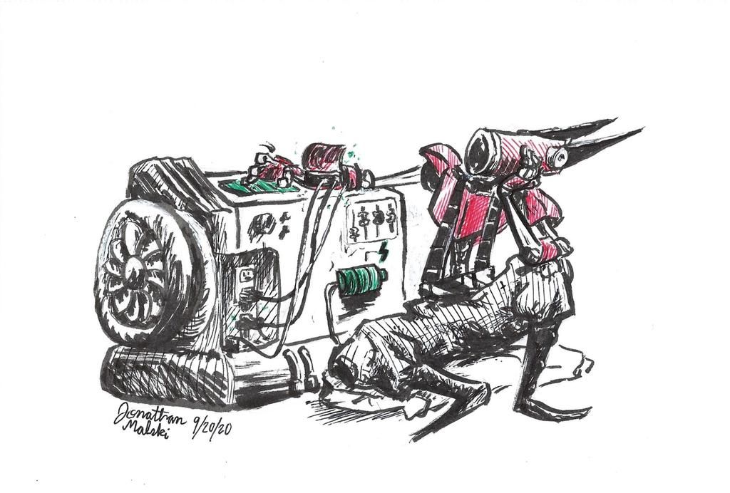
Robot Ink Drawing Feedback Request
-
Hello everyone!

Charging...
8.5 x 5.5 inches
Brush and Ballpoint Pens
Drew this image 10 days ago.
I strive to post at least one illustration/drawing on social media every week and since my previous posts were full illustrations (and because I was late to post anyways) I decided to do something much quicker and simpler than I normally would, and this was the result!The character's name is RG-B (Named after the Red Green Blue color model system) and he's currently waiting—not so patiently—for his system to charge up so he can go back to living his life.
(He might be a "fighter" type of character, I'm not 100% sure yet)I used this as sort of a pre-Inktober test. It showed me that illustrations/drawings don't have to be completely colored/filled in to be successful and it led me to use a brush pen more accurately (I used it more like a paint brush, before)
Things I'm concerned about:
-
My lack of knowledge on machinery, specifically the "generator" device/block thing he's using to charge himself up with. I don't think the battery (highlighted with green ink) is particularly noticeable and I wonder if the details of the device, such as the turbine engine, actually distract from the purpose the generator serves in the image/story as a whole.
-
The cross hatching on the character's pants. I added the lines quickly as I didn't want the image to be posted past the time I set aside to post, and the result was kind of messy. It works, I wanted the clothing to look like it was colored grey, but I think it could have turned out better if I made the marks in accordance to the folds and creases of the fabric. Or would that then make the marks look like stripes? I'm not really sure. I think this point could also be applied to some of the cross-hatching on the generator.
-
The character's right hand/arm. I worry that the action/event of the character impatiently waiting for himself to charge is not clear in the area where he rests his right hand/arm on the top of the generator. He's supposed to be tapping his fingers on the glass screen/surface (Its green as I wanted it to contrast with the red armor of his arm).
I am pleased with how the pose and "expression" of the character show through, though, and I also like how the charging wires connect to the character's arm (I don't know if this is grim, but I wanted the wires to resemble veins of sorts)
That's all I got for now! Thanks for giving this a read, look, or comment; I appreciate it!
P.S. Am I posting too many Feedback/Critique topics? I feel like I am.
-
-
@Jonathan-Malski
Hi Jonatha! Nice concept! I don't know anything about machinery or much about cross-hatching (so they both seem good to me).I had a little trouble actually finding the right arm at first--my brain was trying to read his suspenders and belt as his other arm (but I also really need to be sleeping right now, so there's that...). The lines for that arm seem to be thinner/lighter than the rest of the body and seem to blend in better with the machinery, so maybe if those lines were thickened a little and the connection to his body made more clear. But once I saw the arm and the hand, I got his mood and the tapping of his finger right away.
Great character design! His expression reads very clear

-
@miranda-hoover Thank you for the feedback!
I showed the drawing to a few family members and, from a distance, they couldn't make out where his arm was either; I think I need to put more effort into making sure the design remains visible/readable throughout the image, as all the small details of his arm really make it congested in certain areas, I think.Thanks again!