Critique and Feedback, Please
-
Hello folks! This is my first topic here, and I'm still getting used to the format of the site.
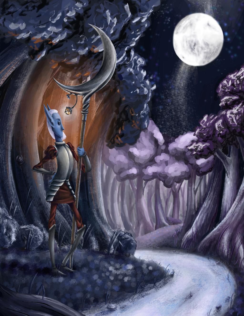
This is a piece I finished a couple weeks ago. I'm always looking for lessons to learn and seeking for ways to make my art better so please give me all the constructive feedback you can!
A couple things about it: the dimensions are 8.5 x 11 inches at 300 dpi, created using Procreate. The initial subject/idea came to me back on the 17th of January, 2020. Usually I start with characters first and then add a background, but this time I created the background first and then inserted the character.Here are some things I take issue with on this piece:
- The tree in the middle-ground at the edge of its grove looks as if it is blending with the background. I wanted to add highlights/lighter values on this closer tree in question, but I also wanted to show atmospheric perspective with the trees in the back. I think the solution would be just to darken the particular tree, anyways.
- The Elf's hand disappears amongst the background of trees, probably because both are blue in hue. I tried to color the hand as if it was in shadow, but I think I should have taken some artistic liberties, nonetheless, and made it a lighter blue.
- The Path. I've created paths before but they were all during the day (some examples: https://www.instagram.com/p/CB4IidAF4Xa/ ,
https://www.instagram.com/p/CEISCzYFHoj/ ).
This was my first time depicting a path during the night. I think it's okay, but it's missing something; whether it be more texture, other colors, etc., I don't know. I showed the piece to a family member and he thought the path was actually a stream! (Honestly, that probably would have been a cooler choice) - This one's more minor, but I think the moon could use some refinement and maybe some added shading. I finished the sky last, and I was getting tired of creating the image as a whole, which would explain the hastiness of completing it. Also, I think the string of stars directly below the moon could be touched up with a tinge more highlight, too.
- The shaft of the weapon could also use some refinement. I colored it mostly blue and orange to reflect each light source, but I think this caused it to blend in too much with the background. Going with a more brown color would have been better.
Lastly, I think the title could be tweaked. I originally imagined the character holding a more pike-like weapon, but I kept the title even though I switched the weapon design to its current form (I just liked the sound of the word "pike"). I showed the piece to a different family member and he suggesting titling it, "Elf Scytheman."
Thanks to all who gives this a look, a read, and/or a comment! I appreciate it!
-
Someone here at SVS recommended a video recently (was it Jake?) If I find the link, I'll post it here. It talks about value. I think perhaps it would solve your atmospheric perspective and path problems. The gist of the video was that in the light areas, the light/middle/dark values should be light. In the dark areas, the three values should be dark. On a scale of 1-10, maybe the lights are 1-4, but in the dark areas the light/middle/dark are more like 7-10. In other words, the highlights in the dark area never go brighter than a 7ish unless it's a reflection. Does that make sense? So for example, the highlights on the bushes behind the elf, the highlights on the road, the light areas of the trees in the far background as well as the highlights on the detailed trunks at the right are all a similarly light value. I think that's why the path looks like water. It seems to be reflecting light. Maybe at the farthest part back where it bends into the distance it would be hit with that sort of moonlight, but in the foreground, it looks like the other foreground objects are in shadow. While the modeling on the trees in the background are good in isolation, when you add them to the picture as a whole, the highlights on the trunks of the trees (which should be shadowed by their leaf canopies) are the same light value as the tops of those trees that are directly in moonlight. Hope some of that makes sense. And thanks to whoever recommended that video! It was really helpful for me.
-
That's some good advice, thank you!
It does make a lot of sense to restrict the range of values one uses in each specific area of an artwork. The whole work should represent the whole range of values, but each area should be limited, in some capacity, to a smaller range of values within all the values that are possible.And thank you for pointing out the specific issue of all the trees having (more or less) all the range of values. It definitely limits the effectiveness of the highlights, I think, because of the smaller amount of contrast in the piece as a whole.
That's similar to an example my painting professor gave me; she said to distribute like colors throughout all the areas of the piece, rather than limiting them to only a few specific zones/shapes.It's definitely something I'll try to keep in mind, the relationship between each section of a work and the piece as a whole, that is.