Bongo and Clyde Feedback?
-
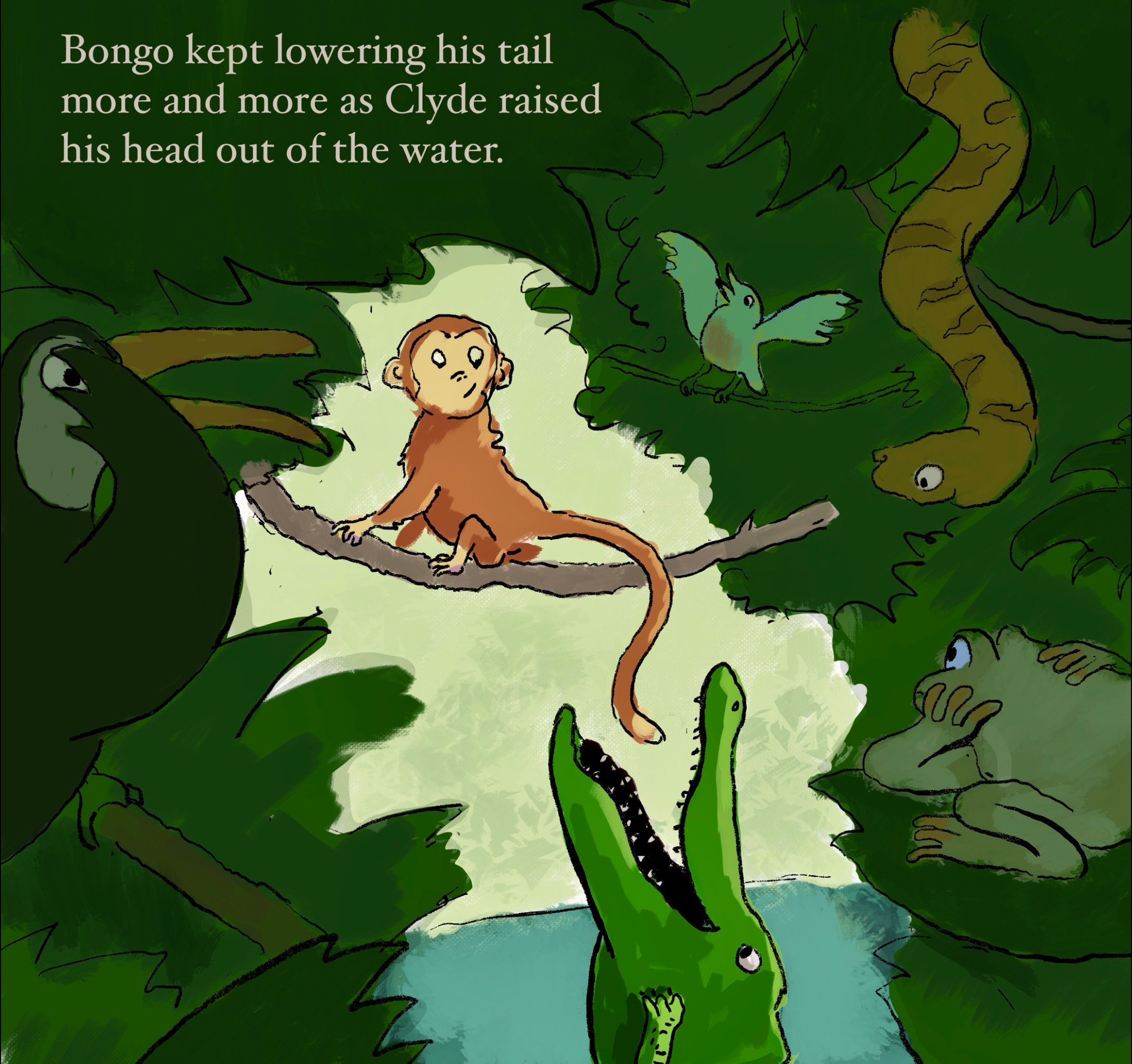
I'd really appreciate any feedback for my June contest entry. I'm thinking especially about 3 things (although of course I'd love feedback on any aspect): 1) Is the concept working? Are there opportunities to push it further? 2) How is the color? I'm trying to give some color variation to the supporting characters without having them distract from Bongo and Clyde. 3) Is the composition working? This is a more complex scene than I'm used to in terms of the number of characters, etc. Thanks!
-
@Braxton Hi Braxton, I'm happy to provide a bit of feedback but I'll preface it by saying that I'm still very much a student myself so I'm not sure how valuable it will be for you. 1) I think your concept is very clear. It looks to me that the monkey is teasing/baiting the crocodile and not at all worried about being eaten. The other jungle animals are clearly looking on with concern! I like this aspect quite a bit as it adds another dimension to the story. I think the concept is solid and adding more may not add any additional value. 2) Colors are ok if a little monochrome. I do like that Bongo and Clyde are in the light and the others are in the shade. This provides focus for me. 3)The composition works ok as is but I do feel that Bongo and Clyde are a bit cramped and the other characters enjoy a bigger percentage of the page. Also, each character except the little bird are all about the same size. There are opportunities here for more variety. Just my two cents. All in all nicely done!
-
@Braxton first I really like how you are using value and value contrast to provide focus on the main characters.
But I feel like they seem a bit cramped. I wonder how it would feel if you gave them more room to breathe. I would agree with @Brad-Newman that the animals are all about the same size and if you varied size some more you might be able to free up some of the dark space.
You might try lighting some of the bottom area where there isn't an animal on the left and then put dark text on the lighter area instead of having light text on the dark area like it is now.
Just some thoughts.
-The Prairie Fox
https://www.instagram.com/theprairiefox
https://www.theprairiefox.com -
@theprairiefox @Brad-Newman thanks for the feedback, it’s really useful! I’ll try adjusting the sizes of the characters and see if I can give more variety as well as breathing room for Bongo. I’m a little unsure of how to treat the size of the frog and the toucan-like bird...they’re closer to the viewer than Clyde and Bongo, but I’m worried if I make them too big they’ll detract from the main characters. I guess I’ll just have to experiment.
-
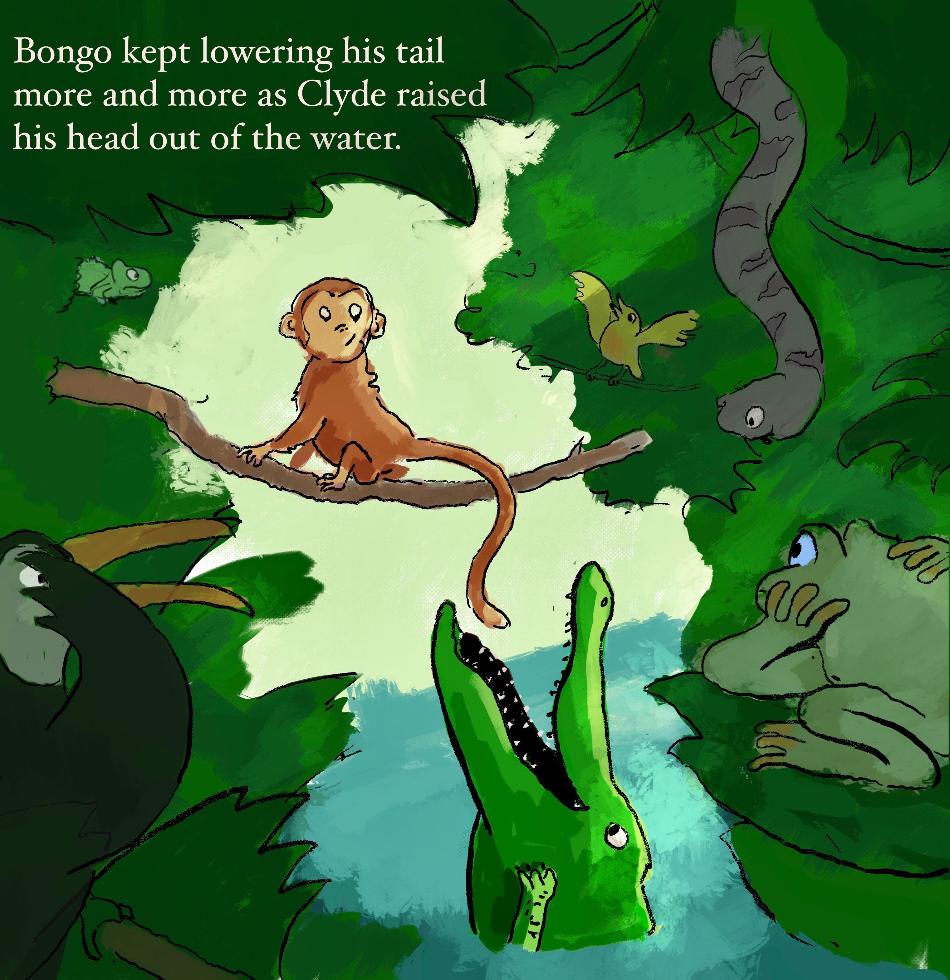
@Brad-Newman @theprairiefox Does this feel any better composition-wise? I tried to give Bongo more room and adjust the sizes of the animals (and added one new one). Changes could have been too subtle though:
-
@Braxton definitely feels better. It is not crowding Bongo so much.
-
@Braxton Yes, this does feel better. I like the addition of light slanting in from the top right as well. Nice one!