Props class WIP: Please critique.
-
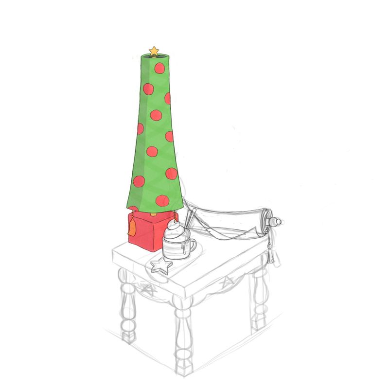
Here is a sketch of my lamp assignment so far. I think the table needs to be straightened out a bit when I get to that point. Do the items look like they go together? Should I make the end of the scroll chunkier? I want to make the first ball bigger and flat-ish, but i am afraid to loose the detail of the end of the paper. Can you guess whose table this is?
-
Hi! answering your questions in my opinion, in order:
- Items -yes- table -maybe not enough
- Scroll -good- lightens up the heaviness
- I'd leave it as a ball not flat, maybe a little wider to fit with the roll up of the paper -looks very loose, hanging off
- I'd keep the part you want to emphasise - paper- I like the edge coming forward -nice element- and the hanging tassel
- I'd say Santa -scroll/list, hot coco/whip, and the colours red and green
*6. Suggestion would be to have the legs of your table resemble a reindeer or another recognisable element
") This class class look so tempting. I wasn't sure about the vehicle class until I saw how the Shane draws -looks like I could really get into it but I will have to wait (for both).
This class class look so tempting. I wasn't sure about the vehicle class until I saw how the Shane draws -looks like I could really get into it but I will have to wait (for both).Please keep sharing your wip here.
-
Theres a few things you can do to connect the lamp and table. I think the shape language can he improved.
- The lamp is nice and tall and the table/desk looks small comparatively, you can extend the legs more.
- Also the base of the lamp and the lamp shade are nice solid bold shapes. Using the same mind of thicker shapes in the table legs might help too. Like a bigger cube for the feets. Or a taller cylinder for the center part of the legs. Relate the shapes of each prop to your main prop (i.e. the lamp).