Drawing Fundamentals/Inking sketch - could you make a critique?
-
Hi Lola! Nice job on the portrait. The biggest thing that stands out to me is not necessarily the hatching, but your proportions. Her hand is too big in relation to her face/head. Also, you have created a lot of tangents that have taken away much of the depth from the portrait. The first is where her hair meets her forehead on the left. Hair has volume, even when slicked back or pulled tightly back. Next are all the tangents in the fingers. You have the tops and bottoms of all the fingers touching. They should overlap some. There is another tangent where her middle finger and thumb touch her chin. For this pose, the middle finger would normally in front of the chin (but then I have not seen the reference you used). Her index finger appears oddly attached to the hand currently. I would rotate that finger counter-clockwise from its center, and draw some of the tip of the finger showing from behind the check. Lastly, the ear is a bit squished.
As far as your line work goes, not really sure what you are looking for. Hatching can take many forms. Some of the areas do need to be darker, so for those you would add additional lines going another direction, and so forth, until you achieve the desired darkness.
Hope that helps!
-
Thank you, Tombarrettillo
 Yeah, the ear is strange to say the least
  You're right about the hand too, I realized the index finger is off and that the angle is not right when I had already traced it with a pen, so I couldn't really make much about it.
What you've said about the tangents is very useful for me, I dind't realize it. I think maybe if I got some of those lines (for example the border between the hair and the forehead) simply wider, that would create some sense of separation between those surfaces and make the hair feel more like hair...?
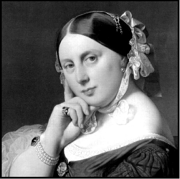
As for the proportions, there is more that is off: her face, for example, which in the original has much more fat residue in the lower parts; without it she looks much younger. I didn't aim for exactness, to tell the truth. I just wanted to trace something with a pen, because I really like the effect it creates. But you're right about the proportions.
Here is the reference I used:
-
Thank you, Tuthie

I must say I don't see that much of a difference in a quality between the lines on the hand and elsewhere. Could you tell me which ones are not so good so I can compare them?
I suppose the tool is also important and I just got some better pens. I'll start using them right away, so I hope to maybe get better results. Thanks again!
-
@lola you are welcome! To explain my self : sometimes your lines seems confident and done in one single confident stroke (back of the hand, cheek, ...). Some other lines (the hairs line) feel like there is a lot of strokes. I Hope I am clear enough. I think you are right, finding the tool that feels right to your hand is important !
-
Hi Lola,
I'm not sure what rendering style you are trying to achieve, but one thing I think you could work on is understanding your values a bit better and identifying the shape of your shadows. Try to look at the image as a whole, compare value relationships against each other. Squinting your eyes at the reference material may help. When I look at your study, some of the value relationships are off. If the point is to study from the painting, I would be faithful to the value structure of the painting. For example, in your study, the side of the nose is more boldly stated than areas that should be darker and you've left off value statements from her eyes and her lips. I've upped the contrast the painting to show you what I mean. Notice how the value on the side of the nose almost disappears, and the shadow of her upper lip and the cast shadow below her lower lip stay intact? What are the strongest and darkest shadow values? Try to match the relationships in your study. I'd encourage you to study some of Ingres's drawings to help you with this.
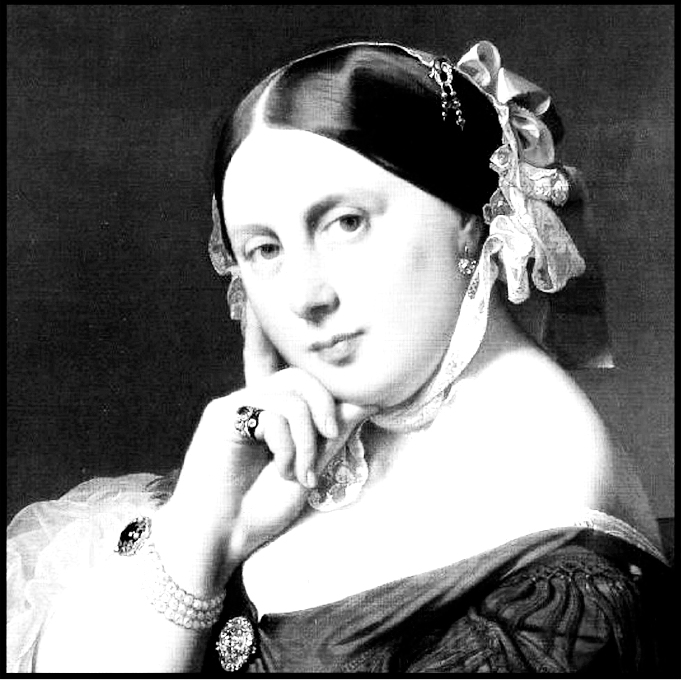
Good luck with your studies!
-
@tessw
Thank you, Tess!This is exactly the problem I have with hatching here. I'm almost finished with the course Drawing Fundamentals where the instructor says not to put too many lines on women's faces (which makes sense to me) and he does this portrait in which he merely suggest some of the lines. So I did one basically copying what he did (I haven't shown it here) and did another (this one) where I tried to treat the face just as lightly.This is why there is little value on her eyes and mouth. But when I tried to do this with her nose, it just looked strange. So I added the hatching. This is exactly what I'm not sure about - in a pencil it's easier, but what to highlight and what to just leave out in a drawing made with a pen – I don't know.
-
@lola I'd encourage you to post the other study you mention as well as the reference you copied it from. If you are trying to apply a certain rendering style it will help to see it, so we know how to guide you to make it work. There are too many rendering styles out there to be able to guide you effectively. If we don't know what you are trying to achieve, we can't help you get there.
-
Thanks, now I get it. Actually, that's intentional. I watched the course How to Ink and got the impression that I could use different lines to draw diferrent textures and obtain different effects within the same drawing. I tried to use thinner and wobblier lines for the ribbon in her hair, a thicker line for the outline of her head and hand, and thiner and shorter lines for the chin, etc.). I'm not saying they are just as they should be, but I wanted them to differ

-
@tessw
Yeah, you're right.
This is what I saw on the course (it's not a ready drawing, the course is more about drawing shapes):
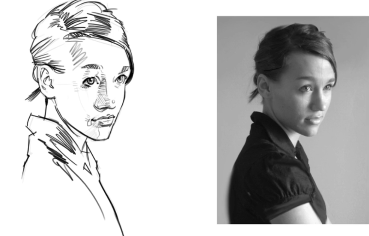
And this is what I did:
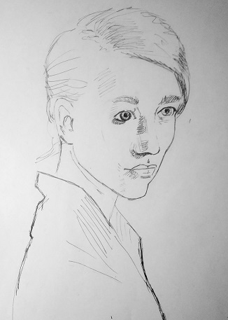
It's messy and has obvious flaws, the left eye is the biggest I think.
What I would like to achieve is a clean drawing in this style, ie not too much shading, black and white.
-
I wonder if you are putting the cart before the horse? Something I hear over and over again in SVS classes as well as elsewhere, is that you need to get the structure right before moving onto the details. I would ask yourself if perhaps you are focusing your studies in the wrong place for now. Focusing on getting spacial relationships down, proportion, and understanding what you are drawings as a 3d form goes a very long way in knowing how to apply your details and where to place your shadows and values. It seems to me like you are taking the Drawing Fundamentals class, but you are not really applying what he is teaching, instead you are trying to jump to the detail and rendering phase, without spending much thought on structure. I feel like a more effective way to learn is to start with the structure. Really pound out studies focusing on structure without worrying about making a pretty picture. You can slowly start to introduce rendering techniques, but really strive to understand the structure of the drawing first and foremost.
-
@tessw
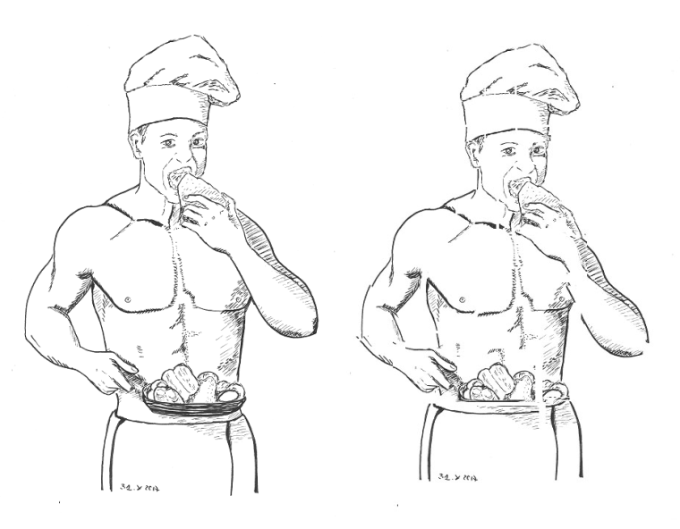
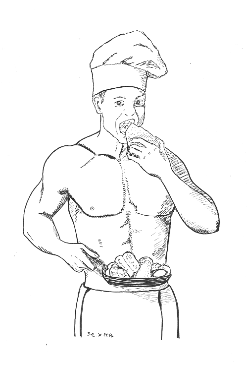
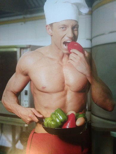
Which one do you mean? The first one or the other? The other I didn't want to put here precisely because it's not a good drawing in the first place. And I could see some of the flaws of the 1st one, but I thought there's got to be more that I can't see.Today I've got another one. This time I used drawing pens and a tad better paper, I also scanned the image so that it's not distorted. I've already spotted two mistakes myself and corrected them (by gluing small pieces of paper on them, so it shows on the original). I'm pretty happy with it, although the model feels too slim and too tall when compared to the foto, his hat may be too big as well.
What do you thing? I'm sure that, again, there is something I can't see (even using the mirror).
And this is the photo I used (there is a gutter, so I had to do a bit of a guessing about how the arm looks):
-
This guy looks pretty good—the line work, the hatching.... The only thing that is really off is his expression and his head needs to be a bit bigger. Also, one thing with hatching that helps with form, is to curve the lines in the direction of the form. You got his right arm good, but the left, esp the upper arm, looks flat since the hatching is straight lines. And, start your hatching as dark as the line that forms the shape. Again, the right arm is good. Hatching lines need to be darker on the left.
-
Thank you, Tombarrettillo! Yes, the head looks definitely too small. Thanks for the tips about the hatching. I'll try to do some excercises to practise curving the line and unifying the darkness of the lines. Great, thanks!
And about his expression - do you thinks it's because it lacks some lines, wrinkles maybe? Or that there's something wrong with the proportions of his face?
-
I'd say his face is too much in the center. Offset it to his left more, but keep the chin and lower jar where they are. If you look again at him, it's as if his mouth is going for the food while he tries to stay focused on the viewer. And look at his nose again; you are missing the "point" at the end of his nose above his upper lip.
-
You're 100% right. Thanks. I imposed the drawing on the original photo and just cut the drawing and pasted the pieces so that they match the original. Here is the before and after. It shows where the faults are, how his body is too much to the front. Cool.
