Thoughts on my favorite pieces. (3 Images)
-
I have drawn a lot in the last year and a half. Though there are a couple pieces I made that I myself REALLY like, so I just wanted to get some feedback from the people here on those pieces! Please don't hold back, criticism, thoughts, etc. Thanks! Hope you like them as well!


-
You should enter the first one for the treehouse contest,I like them!! I dont want to give critique as I dont know enough to give good advice.
-
I think these are really good. You seem to have a creative way of designing images. Here are my two critiques
-
i feel that these images would really work out better if you added more light on objects in the image. The shadows are there, but I don't see enough direct light
-
the font seems off. I am no expert on font, but intend to learn it at some point. It just seems out of place with the images.
Hope that helps.
-
-
@DOTTYP I'll have to check the rules and see if I can do more than one because I definitely have an idea I'm working on for that! Thank you
-
@Eric-Castleman haha I'm no expert on text either, I am very bad at it actually. I just kind of threw it up and said to myself "ok" And the lighting! Yes Thank you, it's something that I have been trying to get better at for a while. Part of the reason I started my sub to SVS was to help with certain techniques like that. Thank you for the feedback!
Jason Kilthau
www.jaskil.com
FB- https://www.facebook.com/JMKilthau/
IG- @JMKilthau https://www.instagram.com/jmkilthau/ -
@Jason-Kilthau we are in the same boat then ;-). I think you definitely have a really strong base to work off of.
-
Hi Jason. Your work is so fun and weird in a good way. I have a few thoughts.
Illustration #1
I would consider changing the way you render clouds. Instead of using the blur tool, I'd include sharper edges. Look at Adventure Time or Steven Universe backgrounds to see what I mean. Here's one from Steven Universe.
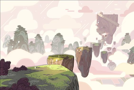
Is the figure supposed to be a man or a woman, or is the gender up for question? To me it looks like a man with somewhat feminine clothing and luscious golden locks. There is nothing wrong with that, of course, but I can make suggestions if I know what you were aiming for in terms of the figure.
There is a haze in the room of the tree roots. Is that supposed to be light or shadow? If it's supposed to be light, the value and perhaps saturation needs to be brought up.
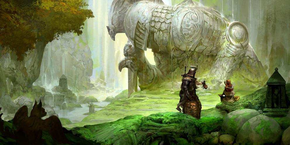
Illustration #2
The rock behind the warrior's sword is a bit heavy handed with the line work and is popping forward a bit too much. I would demphasize that rock a bit.
I would change the font and not have it so crowded and close to the edges of the illustration. I think you can get away with a funky font, because of your style, but it has to be the right one. I don't think this font adds anything.
Illustration #3
The dog in the foreground is too close to the figures down on that path. It creates an awkward reading to the piece and the eye can't flow through it. I'd consider moving them to the far right or left. I would also add more contrast to the figures in the foreground by adding darker occlusion shadows. Perhaps darken them up altogether and amp up the saturation the whole foreground a bit.
Here's an example from Kekai Kotaki
Overall, really cool pieces. I look forward to seeing more.
Website: www.tessawrathall.com
Instagram: www.instagram.com/tessawrathall_art/
-
I like the concepts you have and how you have created depth with overlapping. I also like all the details in your pieces. One thing you could do to create further depth is to vary your line width. As you more farther back within the picture (towards the background) you can make your lines smaller or get rid of them altogether. having everything outlined gives its a sort of coloring book look that isn't bad, but I think you would be happier to vary it up a little. I think a good idea is to study light and color because I think your coloring could use a little softening in some areas. But you have a great base to work from. I love all that is happening in the background of the second image.

-
Overall very nice work. I really like the first two pieces. I would consider changing the line color and value of your background objects to make the foreground area pop more.
-
@TessW This is awesome, I'm likely going to save these images with a small writeup of what you mentioned when I get home to help remember in the future. Thank you for the time you spent writing this up!
@JeaneBean Thank you for the suggestions! Linework is something I am still working on getting better at, my basic knowledge is just make the big things outlined thick, and details small, so knowing the background could possibly eliminate lines all together helps. Along with what @rcartwright suggests about changing line color! I have only started to do something like that in a couple pictures but I will keep this in mind too!
Thanks!