Advice on book cover design please
-
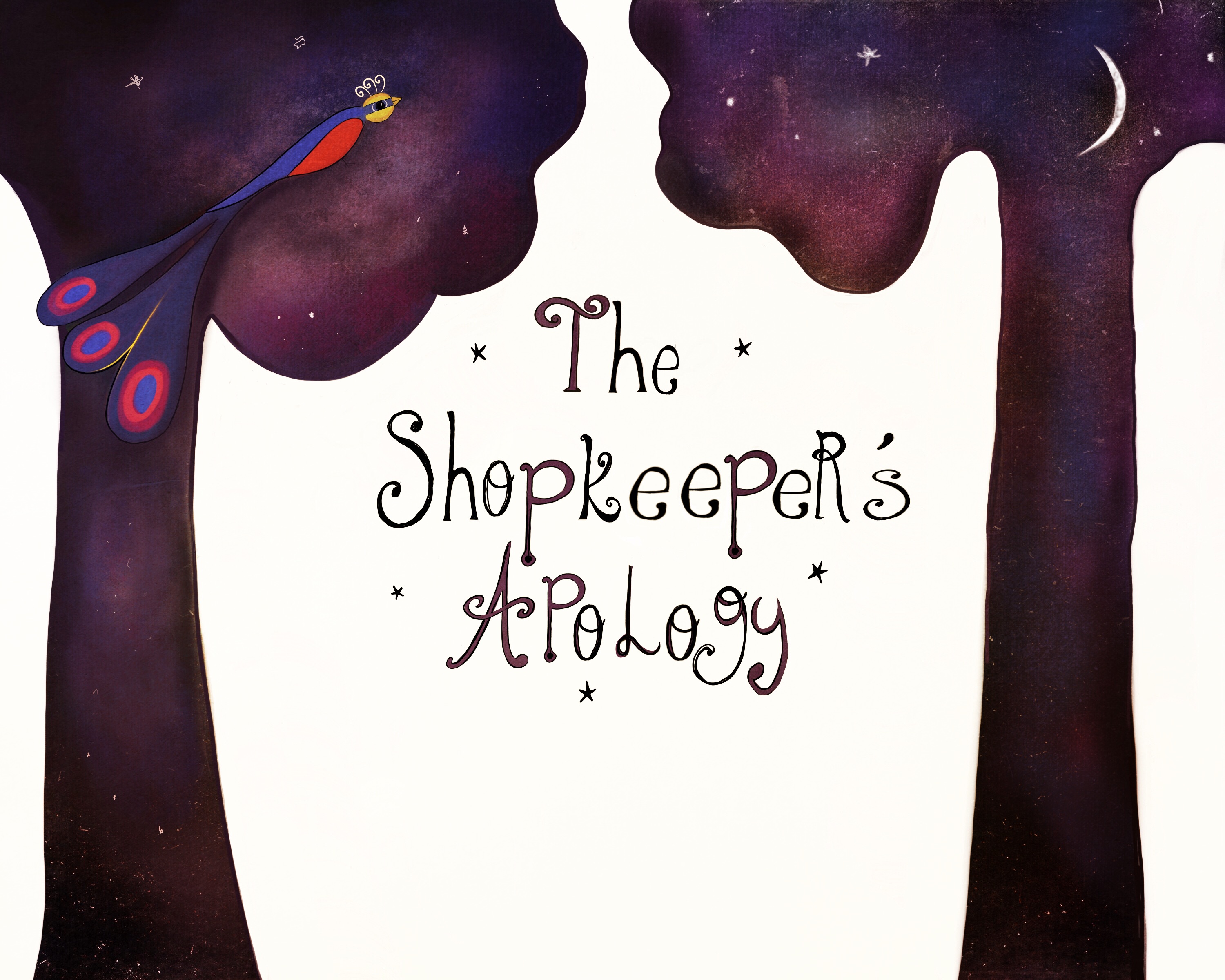
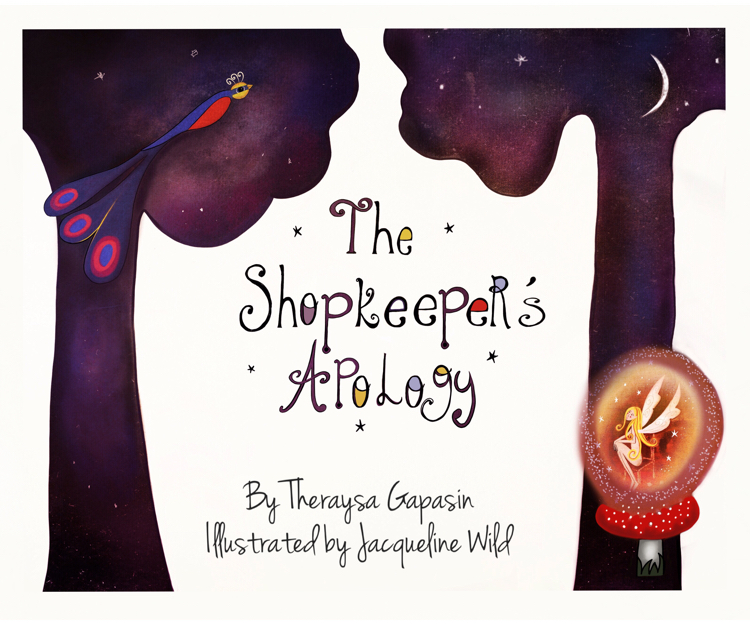
Hi, I would love to know your thoughts on this... It's for a fairy tale and the messenger bird in the tree is quite symbolic of communication and the apology that doesn't get made.
I'm nearing deadline, so I don't have too much time to play around with it now, so 'easy' changes please! I'm still figuring out what to put on the back! Eek! I've been working on the whole thing for three months now and it
Will be strange to not work on it!
-
Not knowing the story, I can't really comment on what you have or have not included, my only critique would be maybe a little too much white space... I like the palette and your decisions with the tree shapes being the sky! Great job!
-
@Russ-Van-Dine thank you for feedback - I really appreciate it! Some of the white space is for the author/illustrator names to go. I have just added a bit more to it though as I was worried it wasn't magical enough...
-
I really like where you are going with this. My suggestion would be to make that white space a shape that is part of the story, maybe the shape of the main character. I love the colors you are using..
-
Hi! I really like the contrast and that sky texture idea on the trees is fantastic! Overall it looks very painterly and nice, but here are my thoughts:
-there is a bit too much blank space that gives me the feeling that everything is going down - that is "unfinished", that something should close the composition
-before reading your description, I barely noticed the bird - so maybe you want to make it stand out a bit more- either by putting her in the middle of the page under the text, or by inverting the trees with the background (dark sky with stars and all that, light trees, dark bird and light text).
p.s. I love your choice on the font (or the way you've written the letters if you made them)- I'm always having a hard time figuring out how to make proper letters for each book cover :))
-
@Anda-Ansheen and @KamiLyon thank you for your advice and supportive comments. I have adjusted it a bit and am going to fly with it now. Just a bit of formatting now and I think I can put this baby to bed!
I really appreciate your responses! Working on your own can be tough when you want to bounce ideas around, so many thanks for taking the time to read and get back to me.


-
@Anda-Ansheen thanks for the compliment on the font! I looked for fonts on myfonts.com and adapted one I liked.... I'm glad it turned out okay. It's a good job I like things a bit messy!
-
I like it! The colors in the letters work really nice.
-
Thank you @Marsha Kay Ottum Owen
-
The second one is really much better! good job! Love your use of colors!
-
I like this a lot! The only thing that feels weird to me is that it looks like the fairy is glowing, but the glow is opaque. A more transparent glow would make more sense I think.