Revised main character design question
-
I'm redoing this question because I ended up pulling down the original reference photo of the client's grand niece that she wants to use as the main character of her book. Wasn't as comfortable with uploading the picture as I initially thought.
I feel rusty and character design is a struggle for me anyway. I tend to make stiff-looking characters (no matter how hard I try it seems).
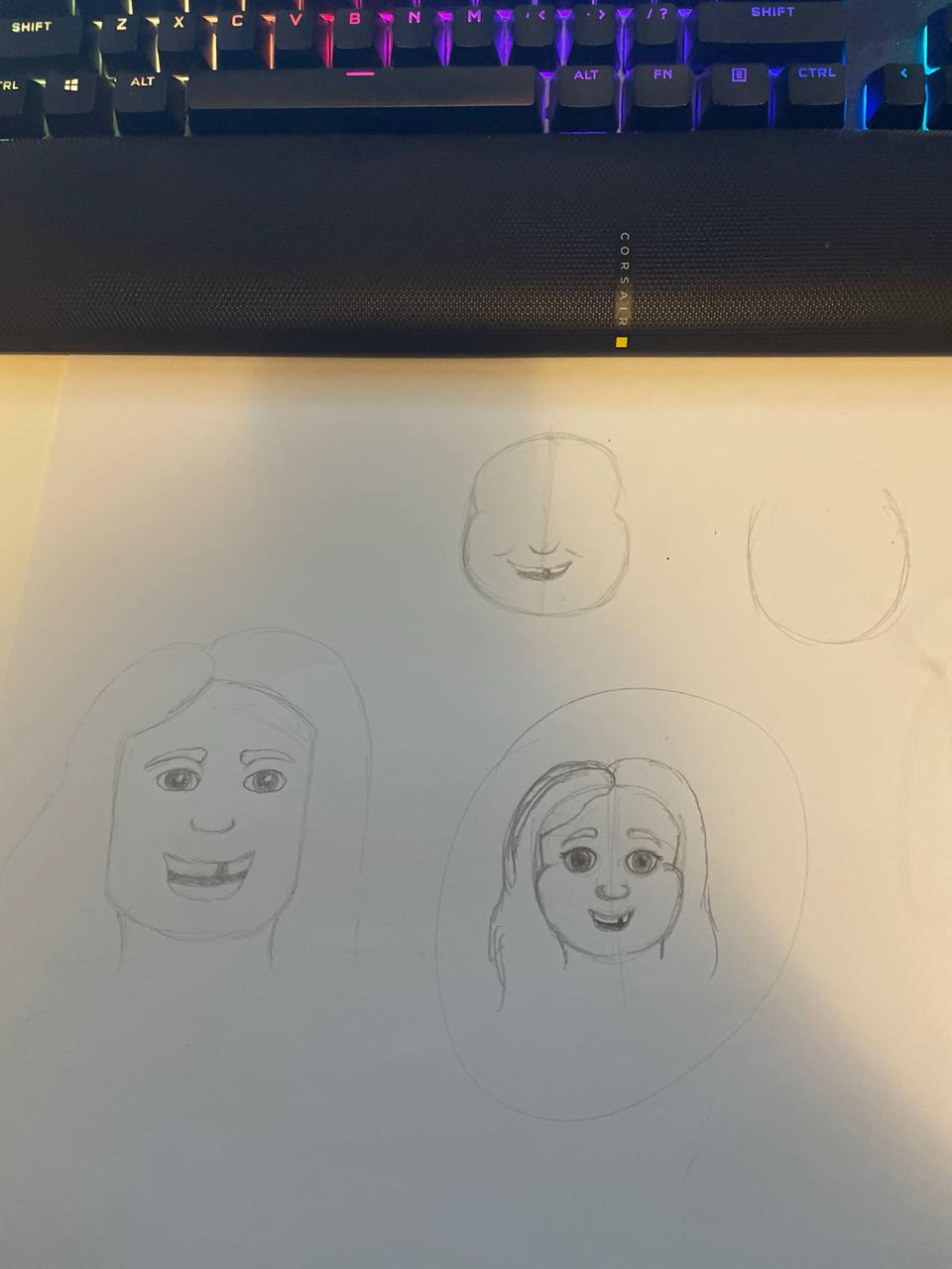
Here's a couple of initial sketches of the character. She's based off of an 8 year old girl. The most personality I've given her is the missing tooth but I know it needs more.
Thoughts?
-
@lpetiti It's normal for early explorations to result in stiff drawings. Can the issue be due to lack of information from the client? A character profile or a list of personality traits are necessary for the imagination. If not, does the manuscript inform you what kind of role the child needs to embody?
For example, you started with a standard smile. Would a more expressive smile be suitable, like beaming, forced, smug, reserved, chuckling, awkward, etc. Some animators explore faces by making funny faces in front of a mirror. Perhaps there is someone you know or an actor in a particular role that can be used as a model. It can jumpstart your exploration of facial expressions, posture, and gestures.
Is there a particular reason for the missing tooth? Often it is a representation of the character's roughness, a badge of seniority amongst younger children, and/or potential growth.
If she is unable to express her vision, present mood boards for the character(s), location(s), etc. It helps to start a conversation and set more firm expectations from you.
-
@willicreate the most significant description that the client gave me is that she wants her to look like her grand niece. I did manage to find a cute ref photo of her (the family is close to my family). One of her ref photos had a tooth missing so that was why it was included, but I really like the advice you gave about including it vs not. The main character starts off lonely because she moves to a new place, but slowly makes friends through planting flowers in her neighborhood. So maybe she’s a bit shy.
-
@lpetiti Like @willicreate says above, it is natural for your first attempts to be a bit still as you begin to explore, but I think you are doing yourself a disservice by jumping in to drawing your ideas rather than sketching them out. What I mean is your lines are rigid and controlled, rather than quick and loose, limiting your ability to explore and develop your ideas to a greater extent.
When you sit down to work on this character, it might serve you to look at and practice some character design poses on Pinterest or Google to learn how to "unstiffen" you drawings. Search "child character design" and practice with some of the drawings that come up.
When you are ready, take a minute to think about what your character will be doing in the story, and sketch out those poses (her whole body) as fast and loose as you can. Don't get caught up in adding too many details. Just practice drawing quickly, trying to capture her personality, which will be more than a missing tooth and a smile. Slowly you might find traits that begin to repeat in the sketches. And think beyond the words in the story. You are developing a personality that should have traits beyond those just shown in the text. What makes her tick, why is she sad (other than the obvious), why does she plant flowers, where is she from, what might have influenced her the past. That might be getting a bit deep for a kids book, but we should be creating characters that kids can relate to outside of the main story.
I look forward to see what you come up with.
-
@tombarrettillo so the funny thing (more like frustrating, but that’s a conversation for another day) is that IS me trying to sketch out ideas. Intellectually i understand the concept of drawing loosely, but in actual practice I have always drawn stiffly. Even throughout my time in art school, that would be the most frequently said thing, but there was rarely help with undoing that. So I really, really struggle with drawing loosely. When I’ve tried it, it ends up looking like unreadable scribbles. I realize the sketching stage is supposed to be messy but mine look unusable.
I looked back at the manuscript and my notes from my first meeting. This is the extent of the description of the character. “Sally, who was eight years old, moved to a new neighborhood with her parents. She felt lonely looking out her bedroom window at the new houses. She missed her old friends and wondered how to make new ones”
This book also has SEVERAL other characters, none of which show any personality in the manuscript. They come in, talk and exit. Again, the most descriptive things about them were that the client wants a diverse looking group of people.
I hope it doesn’t seem like I’m making excuses. This is the first real art I’ve done in about three years, so not only is my rust showing but also all my old insecurities are surfacing
-
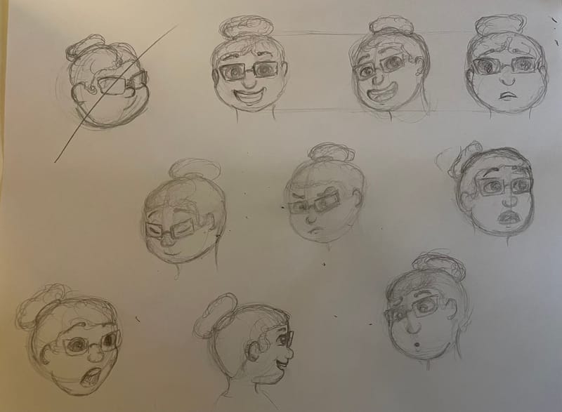
Ok so I’ve been wrestling with this for the last few hours. I “think” it’s going in a good direction.
-
@lpetiti Looks like a good start. The emotions look good.
I hope this doesn't sound too harsh, but the biggest weakness to me is the size of her facial features compared to the size of her head. Everything should be smaller and lower on her face, especially if you are working on an 8 year old character. She looks too old here. I would also make her neck a bit narrower.
-
@lpetiti Hi! I think you already made a huge improvement from the first sketch to the second set! You have used a better shape for the head (a circle I think works best for kids) and you captured some great expressions. As mentioned already, some adjusting of the proportions will help make the character look like a child and not an old lady. (especially as the hair is made up in a bun and she is wearing glasses!!).
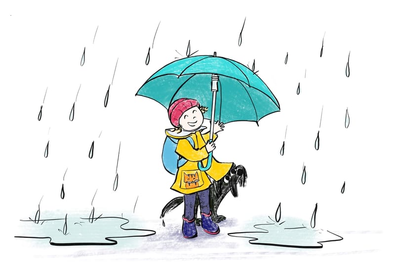
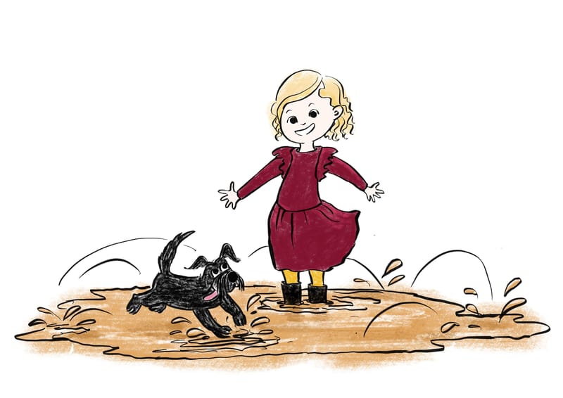
I had a project like this once (for a dear friend, hence not paid, hence no pressure :p). She gave me some pictures of her niece and I made a few simple illustrations. The thing that counted most was to get some likeness and to be cute. I have a more simple cartoonist stile and maybe it was easier to do it this way. I am not so good or experienced at complex characters, but I managed to pull it off. I will search some of the images and show you -
Some of the simple illustrations I was talking about:
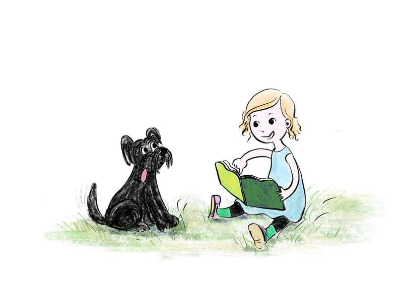
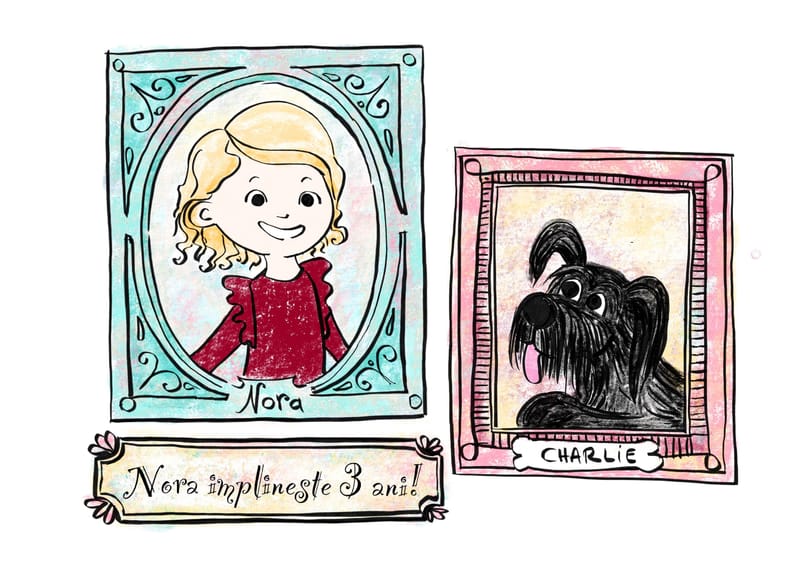
-
... And now I remembered some drawings I made for my own kid some years before, an you can see what terrible character drawing skills I had. Nevertheless, my family loved them and I still think they are wonderful
 . People love to have cute fun representations of their kids, that is the main point about this...
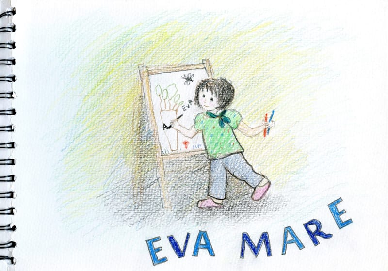
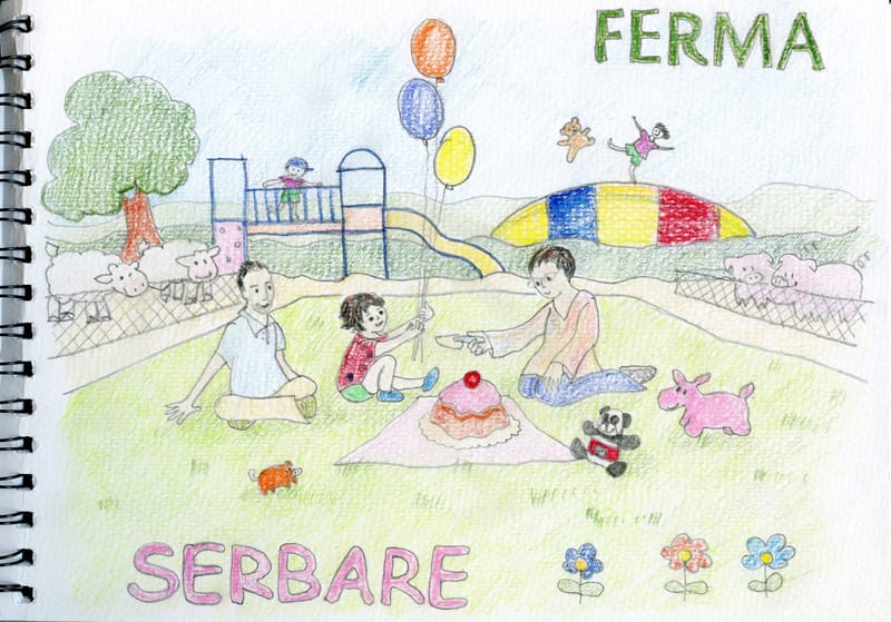
-
@lpetiti Mirroring what @Oana wrote, have more time to think back to my experience, I've also received this kind of request. My attempts to presented a loosely based, reimagination version of their relation weren't well received. It's best to start with a conservative, flattering caricature. If your client voices interest in a looser interpretation, have alternate designs ready to present.
In any case, it seems like you were supplied with enough information to work from.
As for the other characters.. The advantage of your day job is you have a diverse cast of actors to model from.
For the unreadable scribbles, have you tried first sketching with a hard graohite or a light blue pencil, then draw over with ink or a 4B to produce clean lines?
-
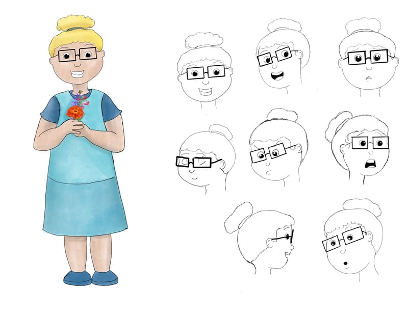
Well I’ve been working all day and I think I have something. The suggestions about reworking it and altering proportions helped!
-
@lpetiti You're made great progress. Some things I want to flag. The character still looks Indistinguishable from an adult. As an example of what you can do, in the following image I shifted the eyes to be lower, giving a more juvenile proportion.
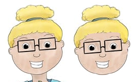
This might go against what I said about being faithful to the reference model... The eyeglass frame could be more complimentary to the character. Look up frames for round faces.
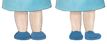
The lower legs I think you were going for plump, but instead look swollen. I would straighten the outer sides of the legs so that the skin looks lean against the bone. Shoes/feet could less dome-shaped, more snout-like.
Lastly, the character could benefit from having a more contemporary attire. She doesn't have to look like a child model for the GAP, but less like an aid worker.
I think I now know what the attire is based on and will keep quiet now