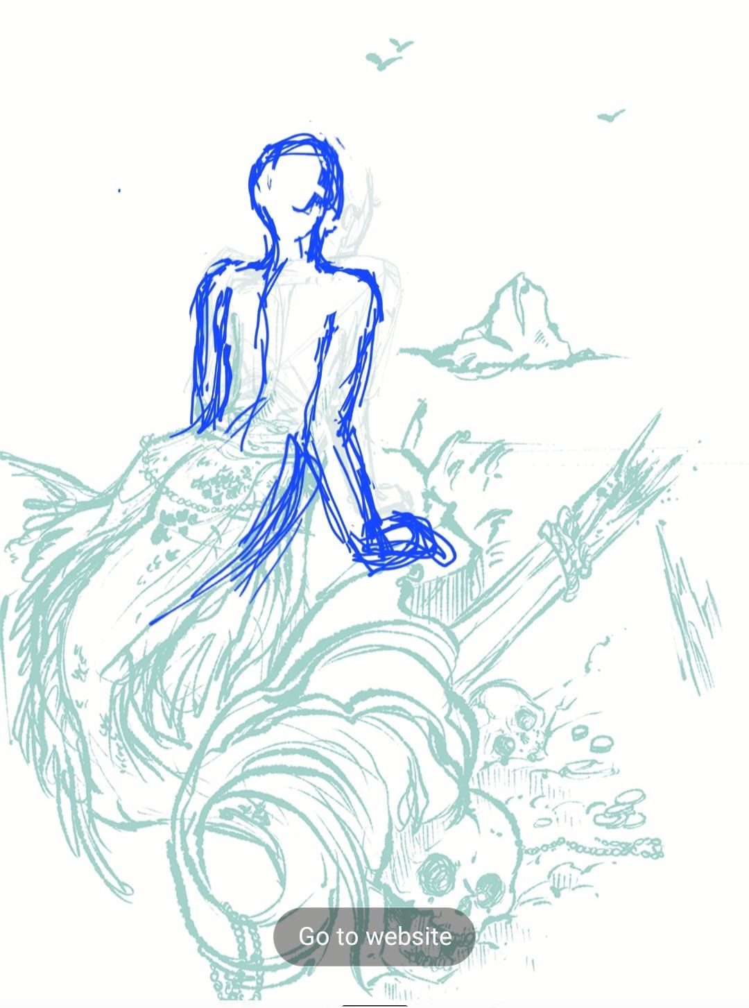
Work in Progress :D - Feedback Welcome
-
Hey,
as my anatomy skill still lak a bit (more) maybe, i wanted to ask for some help here.
I struggle with her upper body and her arms, i have been drawing arounf for 3 hours, mostly on her upper Body and i cant figure it out... also i cant find a good pose reference to understand how i have to draw it.
Could any one here help me out please
-
Hi @von_Nimmermehr, have you tried using someone to model the pose to take a photo? Sometimes that’s the best way to work out a tough anatomical pose.
-
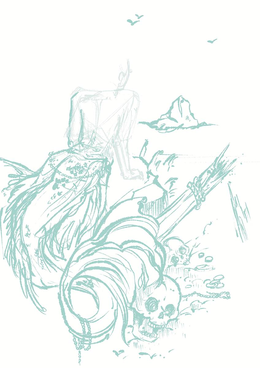
I apologize that this is not the best sketch ever and still not perfect. I drew this on my little Android screen with my finger, lol.
also, I don't always create perfect anatomy as it is but I hope this is helpful
What I see is that her shoulders need to be sloped a little more and her arm needs to be longer. if you think about where your elbow hits on your own body it hits about at the hip bone. Just slightly above.
Shoulders need to be wide but they need to slope down from the neck unless she is trying to shrug which I am not sure if that is your actual intent.
The neck should be longer and the head a greater distance away from the shoulders I have her head in a more upward-looking position but she could have her head and chin more down if needed.
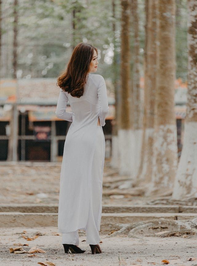
Something that sometimes is helpful for me is to find images of people who are posed at a similar angle so I can get an idea of the natural length and height of the body from that angle. I also sometimes just pose myself and take a picture so that I can get a good idea of what to do.
I don't know if this is helpful but I hope it is


-
@Jeremy-Ross i know, but i live alone and when you draw in the middle of the night, nobody will pose for me though

-
@von_Nimmermehr i found this photo from the little mermaid that might help
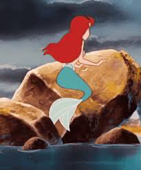
I also found out in my search that they used refrence video when animating the movie. Pretty cool.
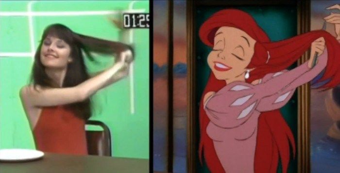
But beyond just getting the anatomy right, if you go back to the begining of the process you might not need to use such an awkward angle.
The begining is concept: what is your idea or story for this piece? Imagine a friend comming up to you excitedly and saying “ hey! Youll never guess what i saw!! Get this, A picture of a mermaid sitting on a rock… looking at something longingly!” You might be tempted to say “okay, what was she looking at? You were so excited, what made it so cool? Was someone over there? Was it a little mermaid type mermaid or a man eating siren? I need to know bro!!! (You say as you shake them)” “ bro thats it thats it!”
So for a picture that is complete you should show the explanation. For most things to some extent, at least so someone can tell someone else what was going on in the picture and share it.
Second is to do a few different (preferably several) thumbnails of your idea to see what is the most interesting way you can how everything that you need to in your story. These can be blobs and really bad scribbles, mine always are, but the important thing is to think about more than one way to do it. Another helpful thing for this stage is to look at what has already been made in the same vein as you—a quick google search for images can give you ideas on what works and how you can make your story different so it is fresh but still familiar.
Then you do work on your composition. When you have a good base of knowledge, reference, a solid interesting idea foundation, and a thumbnail you like you can enlarge it and mess with it, moving things around, trying to make it interesting and clear.
Then you work on your character design and other detail design. You dont have to be in line with the tradition of the genre, you can do something wacky and shape based if you wanna. Characters made out of interesting shapes are interesting.
Then you start to make it look pretty. Rendering and what not.
I realize you probably aren’t doing this drawing for the how to fix your art prompt (december: rock fortress), but this is all stuff they talk about in the how to fix your art live streams. They recently came out with a “ how to fix your art “ course with a book, a checklist, and all the livestream recording pieces that covers this more in depth. It is helpful for everyone, no matter what level they are at. You might like it!
Best of luck with your mermaid!
-
@R-Fey-Realme
Hey, you took quite some time for your replay to me, i appreciate that.
In fact im a long time listener to the podcast so i know all the stuff you are talking about.
I needed to get the pose right for a tattoo i'm doing, so the mermaid is actually longing for a ship to lure them into their death. I didnt upload a finished piece here though, it was jsut about the pose.But as a good surce of knowledge and always a helping hand i thought i could ask this Forum to help me.
with the help of @MerryMary i kind of understood.
Sometimes im just sitting over my drawings too long and i cant figure out, what im missing to make it right though.I aprecciate all you help

-
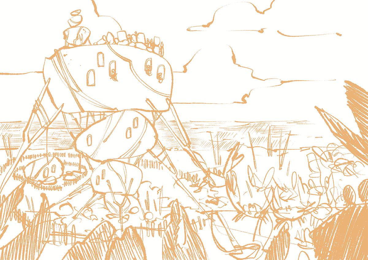
While i was watching yesterdays HTFYA i had an idea for a rock fortress...is beeing attacked by Crabs, i guess we have to wait to see how this will turn out for the small folks in the fortress.
if you have some recommandations, i whould love to hear it.
as all of us, im still working trough courses

-
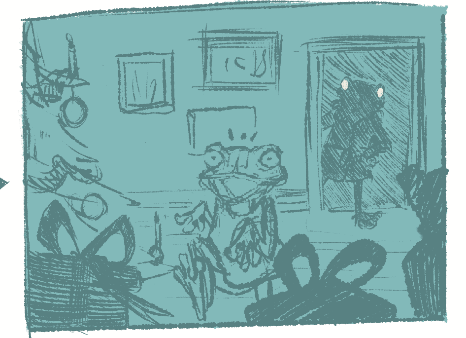
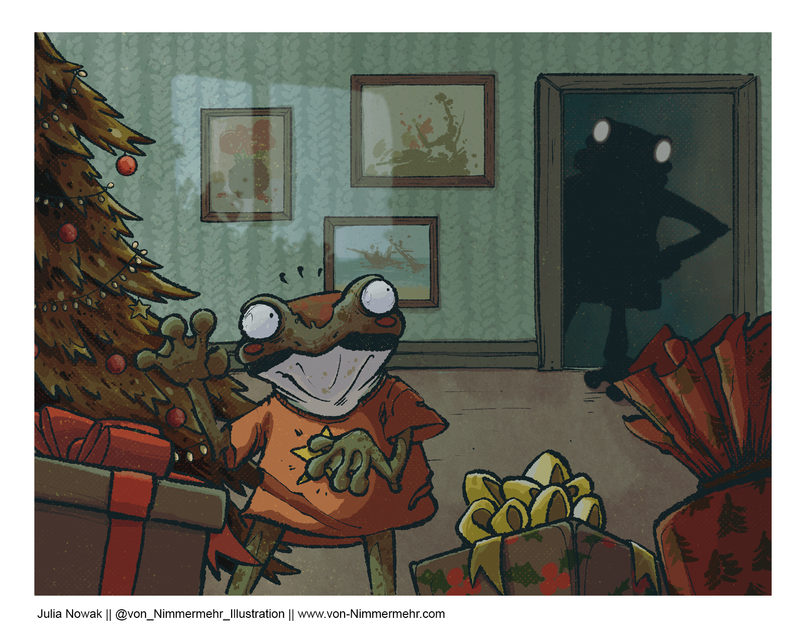
worked on my idea for this month promt and in the spirit of the season, the small frog is in fear of getting caught...and she knew she was not alone

what do you think of the composition?
do you have any recommendations?
i think a have a little problem with her posture, she looks a bit like a sleepwalker or zombie and not as a caught little froggo, what are your thoughts?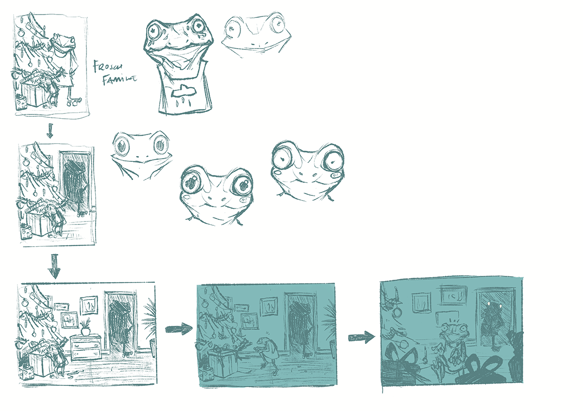
-
@von_Nimmermehr Love the idea! Composition looks pretty good. I agree, the current pose is not working well.
I suggest having her lifting the lid to a present. Keep her pose facing the reader like in the last thumbnail, but maybe a bit more off center, and have her eyes cutting back to the parent frog in a shocked expression.
-
@tom-barrett thank you for your feedback. i will try to change it

-
@tom-barrett said in Work in Progress
 - Feedback Welcome:
@von_Nimmermehr Love the idea! Composition looks pretty good. I agree, the current pose is not working well.
I suggest having her lifting the lid to a present. Keep her pose facing the reader like in the last thumbnail, but maybe a bit more off center, and have her eyes cutting back to the parent frog in a shocked expression.
thanks again for your suggestions.
you where right about her eyes and also the hand, it made the drawing much better
here is the finished drawing. i guess there are still changes i could do, but for now im done.
-
@von_Nimmermehr nice work! Her expression is much better, and the overall composition looks good. I do have a few tweaks, but I will leave those on the table for now.

-
@tom-barrett i will come back to you about it. for now i want to let it sit for a while before i come back to it.
I will ask you, when i'm ready
