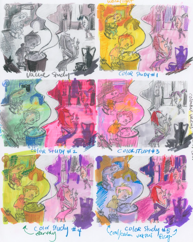
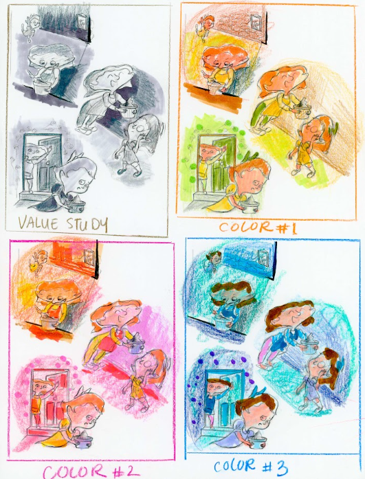
Color Study, help me choose one!
-
Hey guys, I'd love to know your thoughts on which of these color studies you like best!
The concept is this: this is an opening scene for a folktale called Mama Draga, which is about a daughter and a mom with few riches but who take a positive outlook on life and are contented with what they have. And the story is also about another mom and daughter who have a lot, but never stop fighting and approach life with a sour taste in their mouths... a pretty classic tale in many ways.
Which do you think is the best way to show this with the use of color?
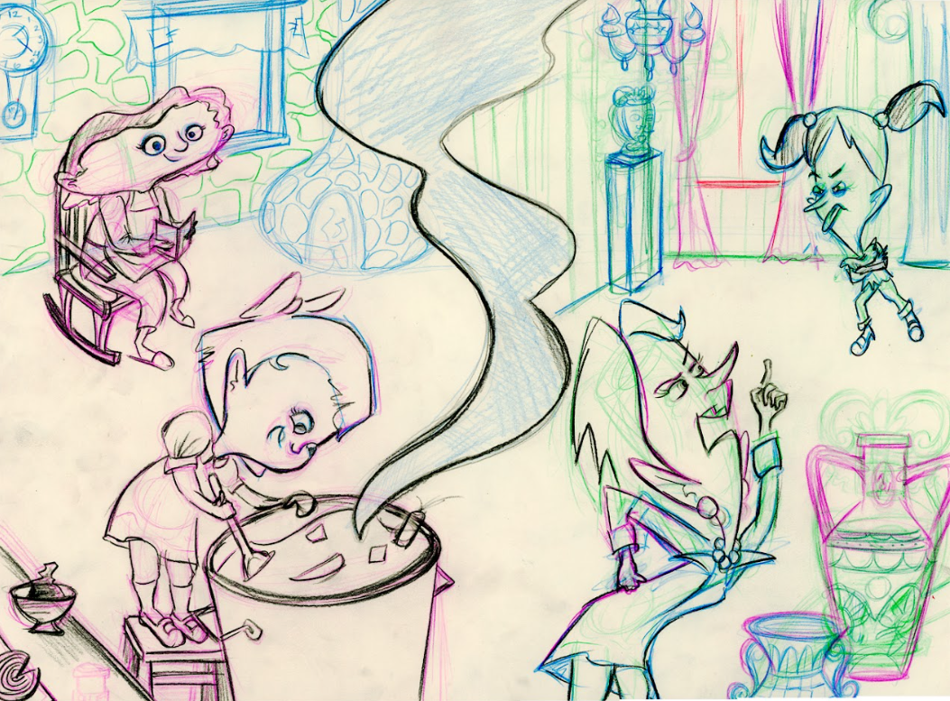
Here's the sketch in case anything doesn't read well in that study sheet:
Thanks in advance!
-
I think this is such a cool thing to make a story about. Kids can benefit from learning about how attitude can affect their lives and I think it's so cool that's what this is about!
If you look at them all in black and white, it looks like #3 is the closest to your original value study but it's not exact. That said, I like the left side of #1 (the yellows and happy oranges) and the right side of #3 (grays and muted). I think that would fit the story you are trying to tell of some people being happy and looking on the bright side of things and other people just looking for the bad in life.
Keep those things in mind with color. It is important to choose whatever helps tell the story.
www.instagram.com/lisaclarkart
www.lisaclarkart.art -
@Lisa-Clark Hey thanks for this Lisa! I really appreciate your comments!
Yes, so the color studies are only color explorations. The value that I defined in the value study will be applied to whichever colors I land on.
So thanks for doing that black and white copy, but I wasn't also exploring value in those color studies as much as I was just trying to see what colors could work for the scene.
In other words I'm not trying to match my color studies to my value study - that would be the job of the final piece. But rather I'm using this to understand what color I want to choose for my final piece.
But I agree with you that option 3 may be the strongest for storytelling in this case.
Thanks again!
-
I totally get it. It would be time consuming to do an exact value study in each potential color scheme and wouldn't be worth the effort it would take. I am still glad I pointed it out because it could have been something helpful.
Did you decide which colors to use? I am excited to see how you proceed!
For a long time color was so confusing and frustrating to me that I drew nearly everything in black and white. It's only been the last couple of years that I've started actually playing around with color. I guess it's better to mess up than be scared!
-
@Kristen-Lango I have a hard time with color pallets, too. All of these (except #1) are very saturated colors, so it's coming off as garish and overwhelming to me. But maybe this would be calmed down when you apply the values?
Lee shares some tips for choosing colors on a video posted recently: https://www.youtube.com/watch?v=5ThjaL7cLtg
-
I like #1 the best of these--mainly because it conveys the happiness the best to me. The pink / purple doesn't necessarily convey the strife all on its own, but it reads that way to me in combination with their expressions. Cool project!
-
I know this post is about the color study, but I believe you are missing a connection between the mother and daughter on the left side. Without knowing the story, it is hard to know what the mother/daughter relationship is. The mother/daughter pair on the right is good, but I might move the daughter's eyes more towards the mom for direct eye contact.
As for the colors, #1 looks the strongest. Might even go darker on the right, like in #4.
-
@Kristen-Lango maybe I'm way too late. But I also like the warm yellow from nr 1 for the left panel with the gray scale with accents of nr 3 for the right panel as a way to tell the story in colour.
-
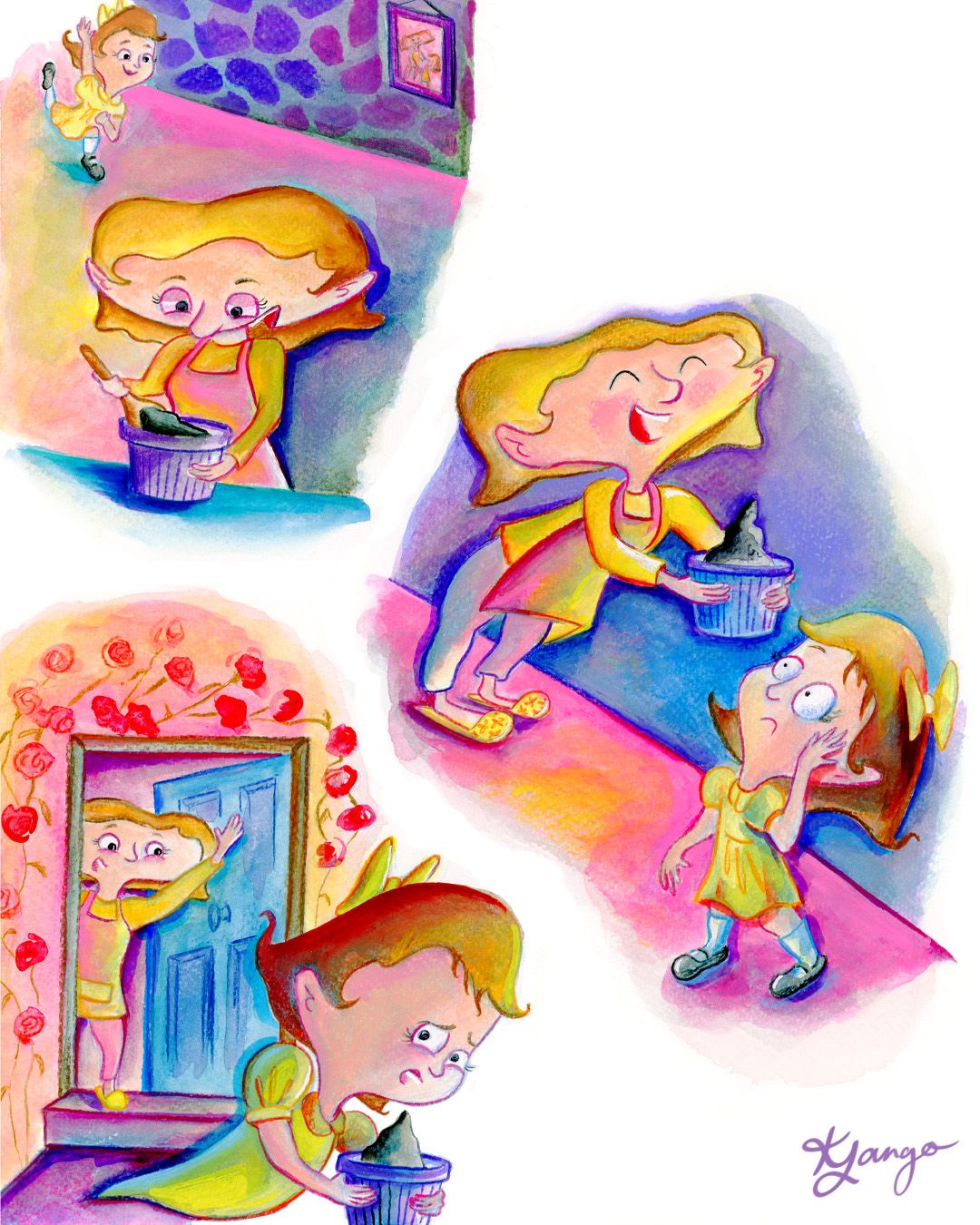
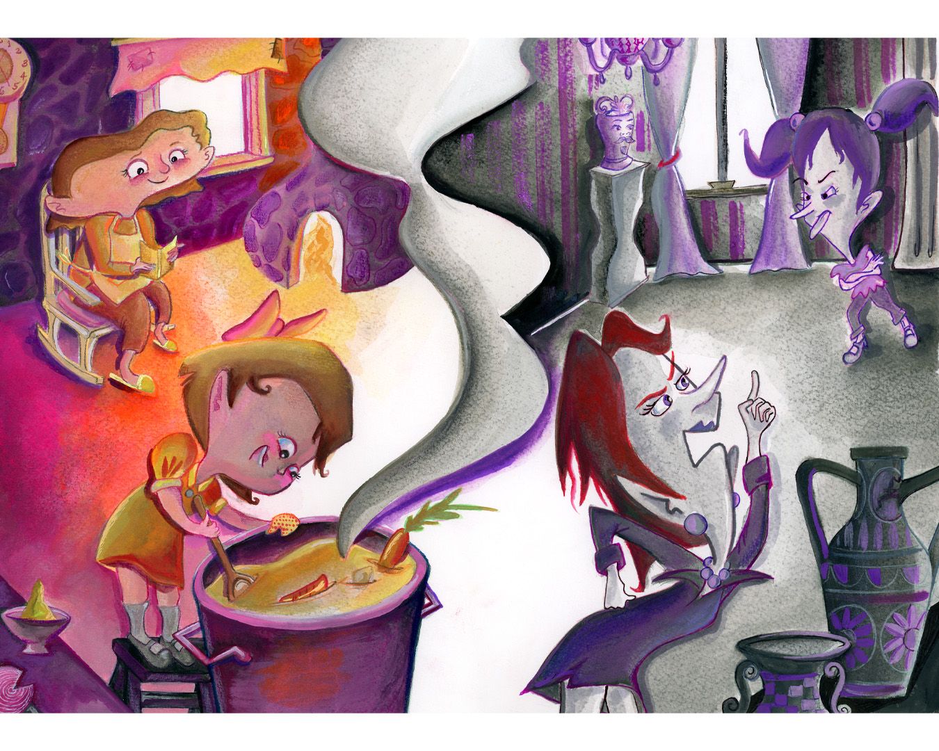
Hey everyone! Thank you all for your incredibly insightful feedback. I've read through it all and have tried to incorporate as much of it as possible into the final piece.
So here it is!
-
Now here is the next value and color study I need you all to help me out with haha
Ignore that bit of grey next to our mom character, that was me adjusting the sketch in this study, which is obviously something I'll do when transferring the lines onto my final watercolor paper.
I personally lean toward 1 or 2.
Thanks again all!
-
@Kristen-Lango I love how your last one turned out! The values and colors are working really well. 🥰
With this new color study, I'm drawn to #1. I also like #3 though...probably because I like blue. I'm not sure exactly what's happening, but from your sketches it looks like the scene starts out happy, and then by the bottom the girl is a little unsure. What if you were to start off the scene like in #1, but transition to a cooler palette like in #3 for the bottom of the illustration? Just a thought! Take it or leave it.

Instagram: https://www.instagram.com/kirsten.mcgonigal.art/
Portfolio Site: www.kirstenmcgonigalart.com -
@kirsten-mcg aw thanks so much Kirsten!

Yes that is exactly what's happening! I'm so glad it reads. Oh that was such a great idea! I should have done that!
I will definitely keep that in mind for next time.
Thanks again!
Here's how the spots turned out
")