Looking for feedback on a piece
-
Is it too dark and depressing?
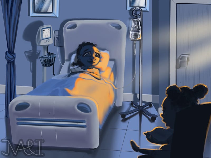
Last month I was thinking about what I could draw to add to my portfolio, and I noticed that my artwork is almost exclusively whimsical and fun action pieces. I figured that in order to stand out I should demonstrate a wider range of emotion, so I came up with this idea to draw a girl reading to her mother in the hospital.
I would say it isn’t quite finished yet. There are some things I want to change, but what are your thoughts? Is it too dark? Should I have the mother be awake and engaging with her daughter?
TIA
-
@jvartandillustration I do think this is just a bit too dark for children’s books. I think the alternative version you mentioned with having the mother awake and interacting could work well. It still has weight to it with the mother being sick but it brings a bit more brightness to it as well as presenting an opportunity for character interaction which is always a plus.
-
@Griffin-McPherson Thank you. I appreciate the feedback, and after thinking about it, agree with you. I am going to try and lighten up the tone a bit.
-
I think it's a really good idea to have a more "serious" piece in your portfolio. I agree with @Griffin-McPherson it feels a bit too dark. At first I didn't even notice that there's a girl sitting on a chair and reading, I had to explore the image a bit.
And I'm definitely not a pro, but to me it feels like the mom is really somehow? Maybe it's a perspective issue, I'm not sure. I might be totally wrong, I hope someone more experienced can say. -
Overall, I think it is a very good idea to go with this kind of themes.
But I agree with the others, I think it is really dark at the moment, as the color and the lack of life dramatizes the theme that is already serious.
Maybe add some life to it by making it happens during the daylight, with the mother awake? I think it is is better to communicate hope to children that are in this situation, rather than communicate depression and fear.
Also it is hard to say that the person in the bed is an adult and is the mother of the girl. You might need to play with the proportion to make sure she is seen as an adult?
-
Nice idea but perhaps to lighten up and bring more a sense of "hope" the mother could be by her bedside sitting and reading but holding the girls right hand and the girl could still have her eye closed with a slight smile as if imagining the story she's hearing.
-
@jvartandillustration Hi!
You may have changed quite a lot of this already, so I might be adding nothing helpful, but I'll throw my 2 cents in anyway...
I think it's a lovely concept. The warm light contrasts beautifully with the cold blues, and adds a tiny bit of hope to the scene.
I agree with another comment: I couldn't tell that she was an adult, I thought she was a young girl too.
The fact that her face is actively turned away from the light makes it harder to know what's going on, but the main issue I had was that I couldn't tell what the little girl was doing at all. She's also really far away from her mom, poor thing, and is almost escaping from the image.
I think a change of perspective and some moving of characters would make the illustration more easily readable, with more light on the little girl - I think that then, even if the mom was not awake, it would be more hopeful. (I don't think it's really necessary to make the mom awake: that seems too cliché to me.)
Looking forward to seeing it if you've done any more to it! -
@jvartandillustration said in Looking for feedback on a piece:
a girl reading to her mother in the hospital
This concept isn't coming across for me. I couldn't tell that the girl is reading. Even after reading the concept, it's hard to tell she's holding a book. The foreground character is so dark, that all of my attention is carried past it to the person in the hospital bed. Since both faces are in shadow, the message I see in the picture is "in the hospital".
I also didn't get the distinction of an age difference. If it's an adult, I think her feet would be hidden behind the end of the bed.
To me, it doesn't make sense for a child to be reading to someone who is asleep. I could see an adult doing that, but not a kid (unless maybe if the sick person is comatose). If a child is visiting someone, the visitors would probably leave when the sick person is resting. Also, who brought the girl to the hospital? Wouldn't there be another adult or at least a teenager? Although, an extra person could be left out if it was cropped in tighter.
I also agree with the comment that the visitor is too far away. More often than not, it's very cramped in hospital rooms. The curtain implies that this is a two-bed hospital room, so the visitors would be even closer than in a one-bed hospital room.
Other than that, you've done a good job on the medical equipment and environment.
Adding illustrations with a heavier emotion is a smart choice. I agree with the other comments that the subject matter of being in the hospital provides enough solemnity, so you can lighten up the characters & expressions.
You might even consider going so far as having the girl cuddling in bed with her sick mom (depending on whether it's contagious). Or you could have another adult holding the girl on their lap while she reads to her mom.
Good work so far!
-
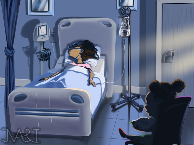
Here is an updated image. It’s still a wip, but I plan on doing something different with the girl (like moving her closer to the bed). I just wanted to make it not as depressing this time around.
Thank you again everyone for the valuable feedback.