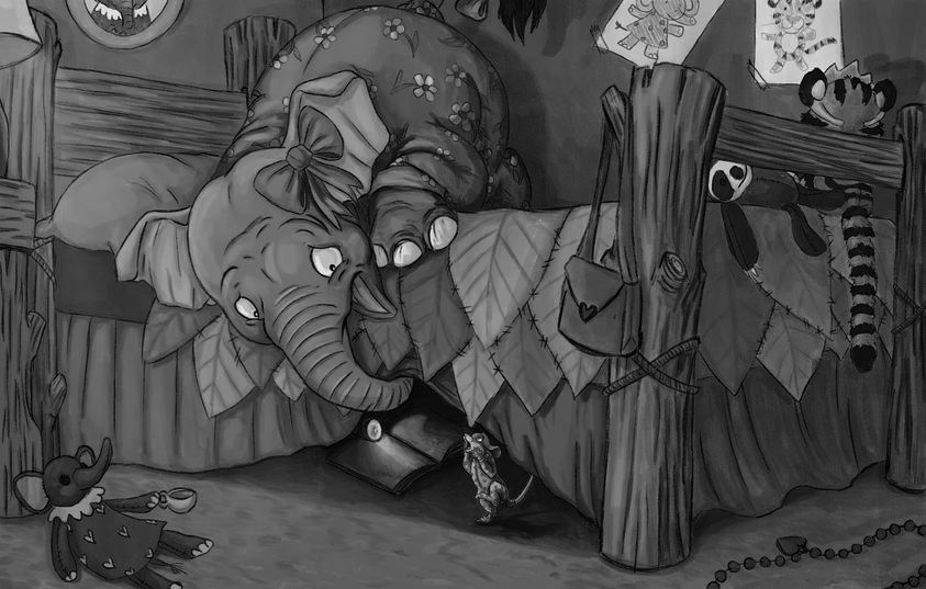
Seeking critique from other SVS members!
-
@Heather-Foxwood That really depends, is it happening during the night? What kind of lighting do you have in mind?
11 hours and many more hours can happen, depending on the piece
") What is important I think is to move forwards when you feel it is time for you to move forwards.
What is important I think is to move forwards when you feel it is time for you to move forwards. -
@Heather-Foxwood I LOVE this... your characters are so well done! Yes color is tricky. I wonder if you changed the color of the floor to a lighter tone, to make the mouse pop? And pull the mouse away from the bedspread a little more? Also group some of the elements in a more distant, less saturated detail? Just my two cents
-
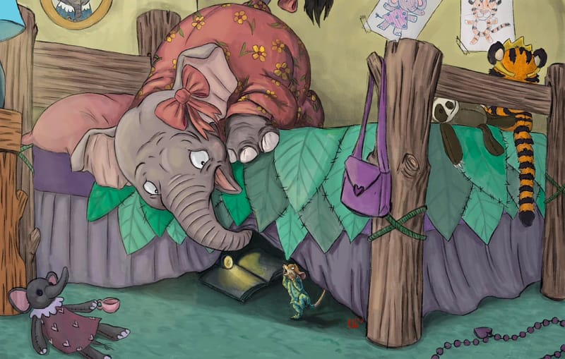 I want to thank everyone sooo much! I spent a few more hours on this, and at one point my husband was saying it was starting to look overworked so I did a bit more, and then.. I think it's time to stop before I wreck it. I never could have done this picture without you all helping! Thank you so much!
 -
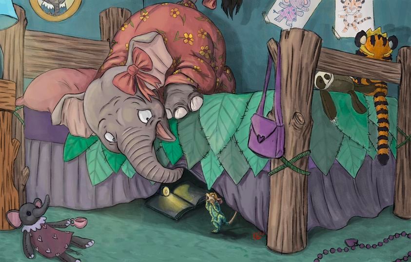 I lied. Someone suggested this last change and I think that helps a ton.
 -
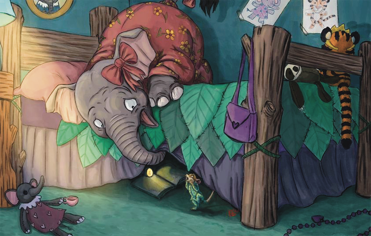
@Heather-Foxwood hey! i think its reeeealy nice, i just have one suggestion, if you could make it a bit more dramatic by adding a layer of blue and use the soft light function i gave it a try already if you visually would like to see what i mean, but i thought maybe you could try it first.
Also you could try to make the light pop more to really show that its nighttime, the room is dark and the only big lightsource is the lamp.
Just tell me if you would like to see the picture
-
@von_Nimmermehr I'd love to see the picture please! When I tried a blue layer on top it darkened everything to an extent I really didn't want for this one even with opacity. But I'm unfamiliar with a the soft light function? Is that in Photoshop? I used Procreate here but if I like what was done I might try importing to adjust that! Thanks!!
-
this is what i was thinking about, maybe you still think its too dark?
-
Im actually no expert in values i think @Griffin-McPherson has figured it out much better bye now than me.
But i tried this value comparison and what i understand is you have to have dark and bright areas and also lighter areas where you want your eye led to.
I think its really difficult, since i have not to much understanding of this value thing but the point is to avoid to stay in this mostly the same grey values and get more contrast in to your work. Please @everyone please correct me or add if necessary.
So just to show what i mean.
Thats my aproach
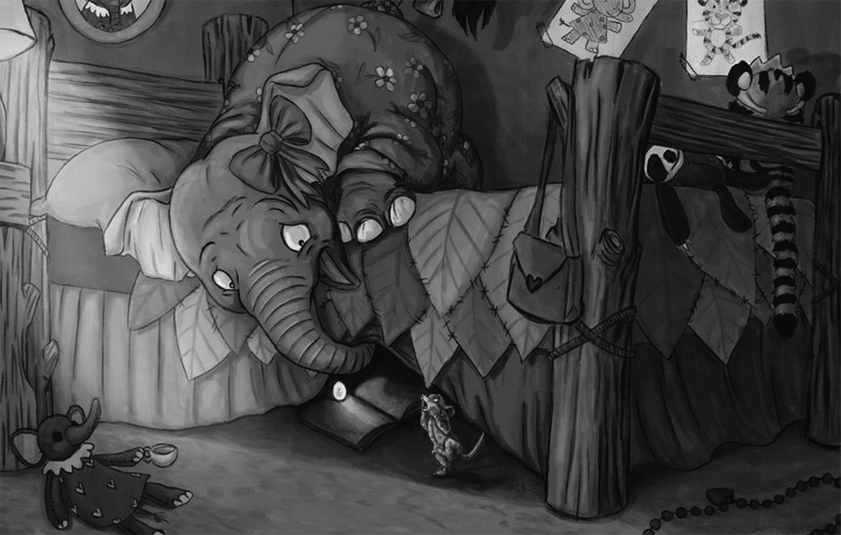
Thats yours.
Website: www.von-Nimmermehr.com
Instagram: https://www.instagram.com/von_nimmermehr_illustration/ -
@von_Nimmermehr this is really well done! Also, I definitely don’t feel like I have value figured out, lol. I think that super bright lamp light is important to capture that feeling of how bright a bedside light is when you turn it on in the middle of the night. One small thing I might add is bringing sim light onto the elephant doll in the left corner. It just looks a bit odd to me that it’s as dark as it is given how close it is to the light source.
-
@Heather-Foxwood This is looking so good!! Here are a couple more thoughts from me—I definitely am still trying to wrap my head around a lot of lighting and color concepts though, too, so I’m not sure what the most straightforward advice for that should be. But, here’s another draw-over:
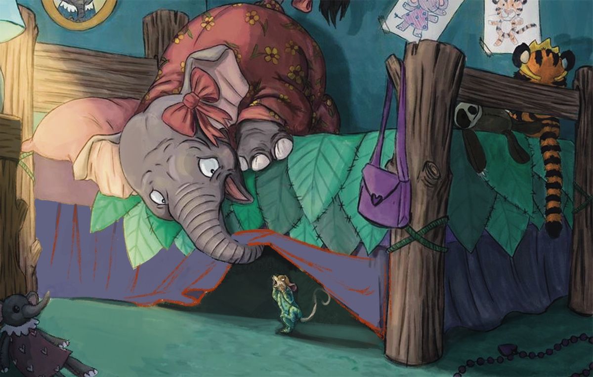
One lighting thing I noticed is that one half of the bed skirt looks pink, while the other half is purple. I know you’re trying to light this, but I think it’s over-lit, such that your local color is getting washed out. @Lee-White recently gave me a similar critique on a piece I did, and suggested I go back and watch his class on light and shadows, which was really insightful. Essentially, when an object is lit, you should still be able to mostly see the color/tone that the object naturally is in the light.
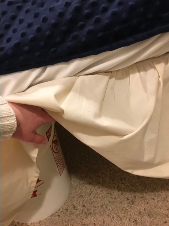
Secondly, you might want to take a look at some fabric to get a better idea of how it folds and warps. Here are some photos of my own bed skirt:
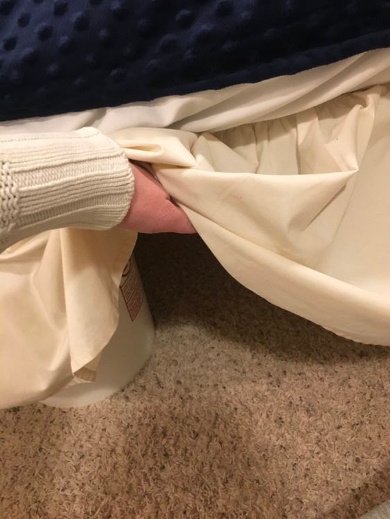
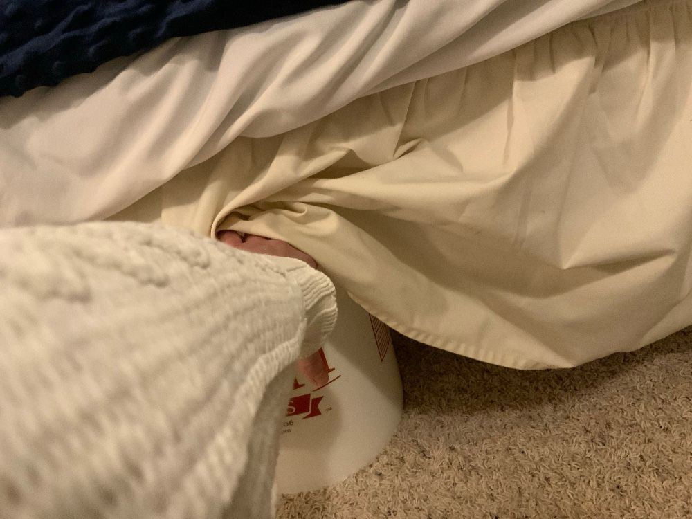
Is my bed held up with buckets?
Yes.
Is it weird?
Yes.
Is it ACTUALLY my bed?
No. I’m renting. So whatever. I appreciate the creativity.Lastly, I’m not sure what the stuffed elephant with the teacup really adds to the illustration. It draws a lot of attention, and it’s not quite believable to me that it could actually hold up the cup (either that, or the cup is on the ground behind it), so it raises some questions. To me, it actually kind of looks like a beggar, which is funny…
Love the details, like the drawings on the wall.
https://sarahvandam.art/
Instagram: @sarahvandam.art and @artistsandbox.etsy -
@Sarah-VanDam said in Seeking critique from other SVS members!:
One lighting thing I noticed is that one half of the bed skirt looks pink, while the other half is purple. I know you’re trying to light this, but I think it’s over-lit, such that your local color is getting washed out
Its maybe a bit overlitt because i just quikly did put an extra layer over the original to quikly show what i mean

My approach is not the original though (me sitting in front of my computer cant really figure if you noticed it, i'm sorry if i get it wrong)But i wonder why you took all the light out that i put on though, now all is plane purple again? Even with your explanation. A nightlamp still has light that shines. and when my nightlamp shines on my blue sheets it still puts some orange hue to it. I somehow dont get it. But i didnt take the class on light and shadow yet so i won't argue with you because obviously you are ahead of me, but it doesn't look right to me?
Did Lee give you this critique in a live session? I would love to see his explanation if it got recorded, maybe you can send me the link
-
@Heather-Foxwood
I could not explain in words how I would change colors, so I took your illustration into Procreate and changed around a bit.
What I did:
Moved mouse and book to the left, changed the wrinkles at the end of the bed (they look so moving/dynamic in your version that it distracted my eye).Then I desaturated big parts of the picture: the blanket, the bag, the part of the floor that is in shadow, the wood of the nighstand.
As all the high saturated colors were battling for attention of my eyes.Then I changed the color of the cushion to a color that doesn't make it a focal point and doesn't merge with the elephant's colors. For me the pink was too close to the inside of the ears and the pyjama.
I realized that the color of the pyjama of the mouse is too close to the color of the floor to make her a focal point so I changed it to something very bright (just an exaggeration to see where it leads).Then I added a grayscale layer to see where to add contrast value and added light. (the greyscale is set to off for this screenshot, of course)
I messed it totally up under the bed, it didn't work out the way I think it SHOULD look, I'm sorry. Could not fix it.Then I added a blue layer to change the shadows to a more blueish tone. As I work in procreate I first filled a whole layer with blue, then changed the mode of the layer to "Color" and the Opacity to 45%, then I masked the layer and erased (on the mask) every area that is lit by the light on the nightstand.
Then I realized that the shadows of the wood of the end of the bed didn't have enough contrast to the shadows of the blanket and darkened them. I also darkened the wood that meets with the elephant's body, as this helps the elephant to stand out more.
I erased the shadow of the body at the wall, as this shadow might be there in reality, but in the illustration it blurries the edge between elephant and wall and hinders reading the silhouette well.Then I realized that the face of the sloth makes a focal point with it's high contrast between white and black and make the white face grey.
I think that's it.
If there is anything helpful for you, I can also give you the procreate-file (if you want to copy the blueish layer to understand how to work with something like that).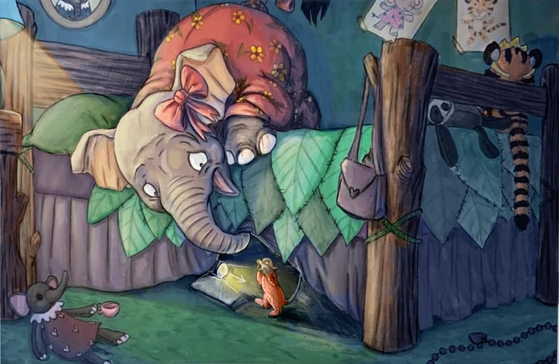
-
@MimiHecher just how i imagined it, but way better then my drawover!

Website: www.von-Nimmermehr.com
Instagram: https://www.instagram.com/von_nimmermehr_illustration/ -
@von_Nimmermehr Thanks for the flowers!
 It's doing "all the things Will tells us to do in all the courses about design and color management", but yet not doing them perfectly.