SVS Virtual Studio FEBRUARY 2023
-
@Sarah-VanDam this is beautiful!. I think I like the one on the right a little more.
-
@Mia-Clarke
The little town on the hill looks so cute! I love all the different houses. -
@Christijan LOL I remember that episode! And yes, I think they were carrots.
-
@Sarah-VanDam Okay, actually NOW this is done. Haha. STILL wasn’t entirely satisfied.
-
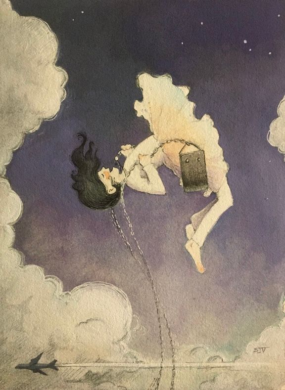
@Sarah-VanDam So cool! I am just wondering what the story is, and your process... obviously it's watercolor and colored pencil, am I right? I love the contrast and movement, the expression on the girl's face! Just wondering what the plane is about. And what is she holding?
-
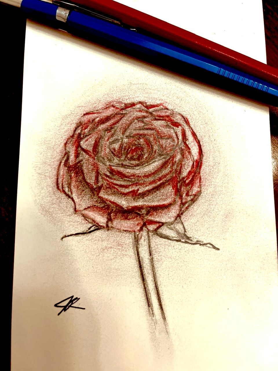
Happy Valentine’s Day!
I did a Timelapse on IG if you’re interested in seeing
 ️
️
-
@Sarah-VanDam love the plane and the girl swinging so high that she's meeting the planes! Love the dress looking a bit like a cloud and the arch of her body.
-
@ArtistErin I also wondered for a bit what she was holding. I thought it was a handbag at first! But it's a swing she's sitting on. Interestingly enough, I've been working on something similar for a story my husband wrote a few years ago. Very different styles though.

It does make me wonder whether perhaps the drawing of the swing seat/her dress needs to be adjusted a little so that it's clearer she's sitting on it.
EDIT: other than a slight adjustment to the angle or shape of the seat and dress, I wouldn't change a thing about this drawing. Love her stylised elongated body, slightly exaggerated position and the little aeroplane flying below. It's a beautiful work of art.
-
@ArtistErin Hi Erin!! Thanks so much for the feedback. It’s kind of a weird mix of watercolor, pencil, micron pen, white gel pen, and white acrylic paint. I went over the sky again with a mixture of the acrylic and purple watercolor.
This illustration was originally part of a contest I had against AI art, and also used it as practice for making a video. Here’s a link if you’re interested: https://www.youtube.com/watch?v=OPHg29B3DGs&t=41s
The prompt I came up for this piece is “A child bursts through the tops of cumulus clouds on a playground swing,” so my intention was to show this little girl high up in the clouds holding on to the chains of the swing. She also has a necklace on that’s suspended in the air. The plane is just for context to show just how high she is. I didn’t like my original outcome, so I just wanted to keep trying until I was satisfied with it.
So, that said, what’s working, and what doesn’t?
Also, awesome work on your website!!! I saw the thread for that, but haven’t responded yet. Would you like some of my more nuanced thoughts on that? Anyways, way to go. I think I need some feedback on my website, too.
-
@Sarah-VanDam @Sarah-VanDam Oh!! I get it now
 It's reminds me of the vintage illos in classic literature, reminiscent of some of the original Dutch illustrators, I absolutely LOVE this look. SOOOO GOOD!!
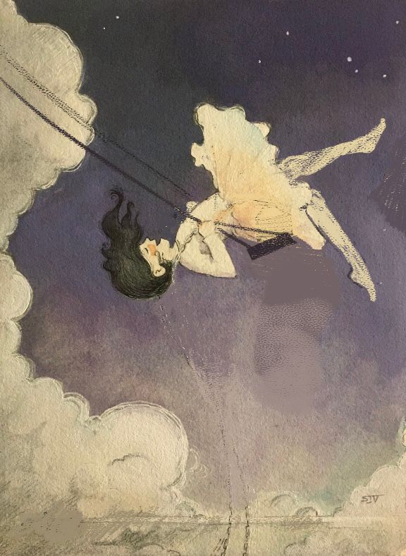
I did a draw over here, just a simpler approach and for sure you'd have to adjust the details to match the rest of your piece. And, of course, I only intend to help and so all advice or suggestion is merely what I would do, so hopefully I don't offend!
I studied the proportions of the girl I noticed her legs were unnaturally long, and angled back too far. If you look at the way people swing, when they are on the "upswing" they are pointing both feet or at least one, to show they are moving up or even coming back down. I also changed the of the chain so it looks more like there is tension in her holding herself on this structure, so let me know your impression of this. I also understand why you made the chain come from the bottom to show she is really up there however that seemed like she was dangling unnaturally and it wasn't believable enough to look like a swing so I moved it to a position that makes it more believable, you could create something like the swing is fixed on a cloud or a moon? I also took out the airplane because it seems out of context and unnecessary, since you have clouds, which demonstrates showing how high she is swinging. Anyway, the basis you have started is in my opinion a portfolio worthy piece!
I commend you in the traditional techniques. Hands down the best, I feel, especially in this digital world with AI and all that stuff! I wrote to another artist on IG and commented on how her colored pencil inspires me to go back to my pencils, and she said "Do it!" So I will... I keep reading about gouache and have never worked with it so that will be my next task. Thank you as well for the inspiration!

I would love your feedback on my website!
Some things I am planning on fixing :
- My brother is an excellent photographer and when I can get to Ft. Collins to see him he is going to set me up with some good clear photos.
- I am adding more images of kids with adults, in varying emotional situations.
- More scaled pieces with top-view angles and worm's eye perspective.
- A black-and-white/sketchbook section
- Traditional pieces, with full bleed images. I have yet to learn how to convert traditional media into digital files without changing the natural component. Recently I tried scanning in some stuff and I didn't like the way it came out digitally. I end up cleaning it up too much and when I did that it lost its organic natural appearance. I would like to know how you achieved this!!!!
- Book Covers
- The mobile app is strange when scrolling through the gallery, for some reason my name hangs on some of the art for a second. I need to adjust how it scrolls.
- I want to work my name in hand-illustrated text, with color. I love the vintage lettering in pen-and-ink, with either gouache or watercolor... so my branding is going to evolve in this direction somehow.
-
@ArtistErin Ooo I used to live in Ft. Collins!! I wish we could move back so bad but my husband is a teacher and getting a teaching job up there is close to impossible. Plus my kids would be mad if we moved but man I love Ft. Collins its the perfect blend of small town charm with actual things to do. (sorry off topic but just had to jump on the fun connection)
I've used gouache, and it's like acrylics and watercolor had a baby. I'm not the best painter, but the jelly gouaches are way more user friendly than the tube gouaches. There are so many videos on youtube about them. It was a trend I think last year. That's why I got them and I love them, but also tend to work more digitally. I debate doing the "Lee White" original tip where you make it both digitally and traditionally so you can sell the original for a higher price, but also make great prints easily.
-
@ksfabian Oh I grew up in Ft. Collins! That's so cool you used to live there. It really is sort of one of those places, even more now than ever, small town charm, with a ton to do, and so much for an artist to really soak up. I have made it a goal to eventually get back there. Can't say enough how I took it for granted (when you're a kid, the world "out there" is so much better than boring old home) however when I went back after being away from home it seemed like it got even better! Super mind blowing. I know the job market is tight for teachers, however I have found you really never know when something might come up. Don't give up, there is so much opportunity! All my family is up there and they are always telling me the community keeps expanding and commerce is growing!
Thank you for the insight into gouache!!!! I used to paint trompe l'oeil murals as a freelancer and loved the immediate effect of acrylics. And marrying that with watercolor!!! OOOOOOHHHHH yayyyyyyyy Can't wait to get my hands on that. Would you recommend illustration board or just a multimedia paper? I have hot press watercolor paper for the smooth tooth for ink. Wondering if this is sufficient?
Anyway this was fun to just chat about cool stuff! Thank you

-
@ArtistErin I've used it on so many surfaces: Watercolor paper, illustration board, canvas, my pencil sharpener, It's pretty versatile.
-
@ksfabian That’s great!!! Ordering some soon
 ️
️ -
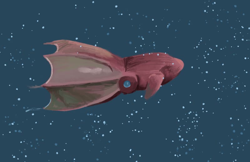
I'm in my favorite unit of teaching in Digital Art 1, intro to digital painting. I can see sparks in the students eyes and know some are already loving it.
As a demo of all the cool stuff they can do with painting, I drew a vampire squid in Photoshop. As a side note, is anyone noticing Photoshop brushes are seeming more...clunky(?) than things like Procreate?
-
@ksfabian Ok I ordered a set of Holbein gouache, thank you soooo much for your feedback about the paper! I used to sell art supplies for a local retail art supply store and fell in love with receiving load every day, gouache was in the back of my mind since then. There are some pretty beautiful papers that I have heard scan better than others as far as color/texture...
I figured I am not waiting anymore to try it out!

-
@Sarah-VanDam Lovin' the one on the right!
-
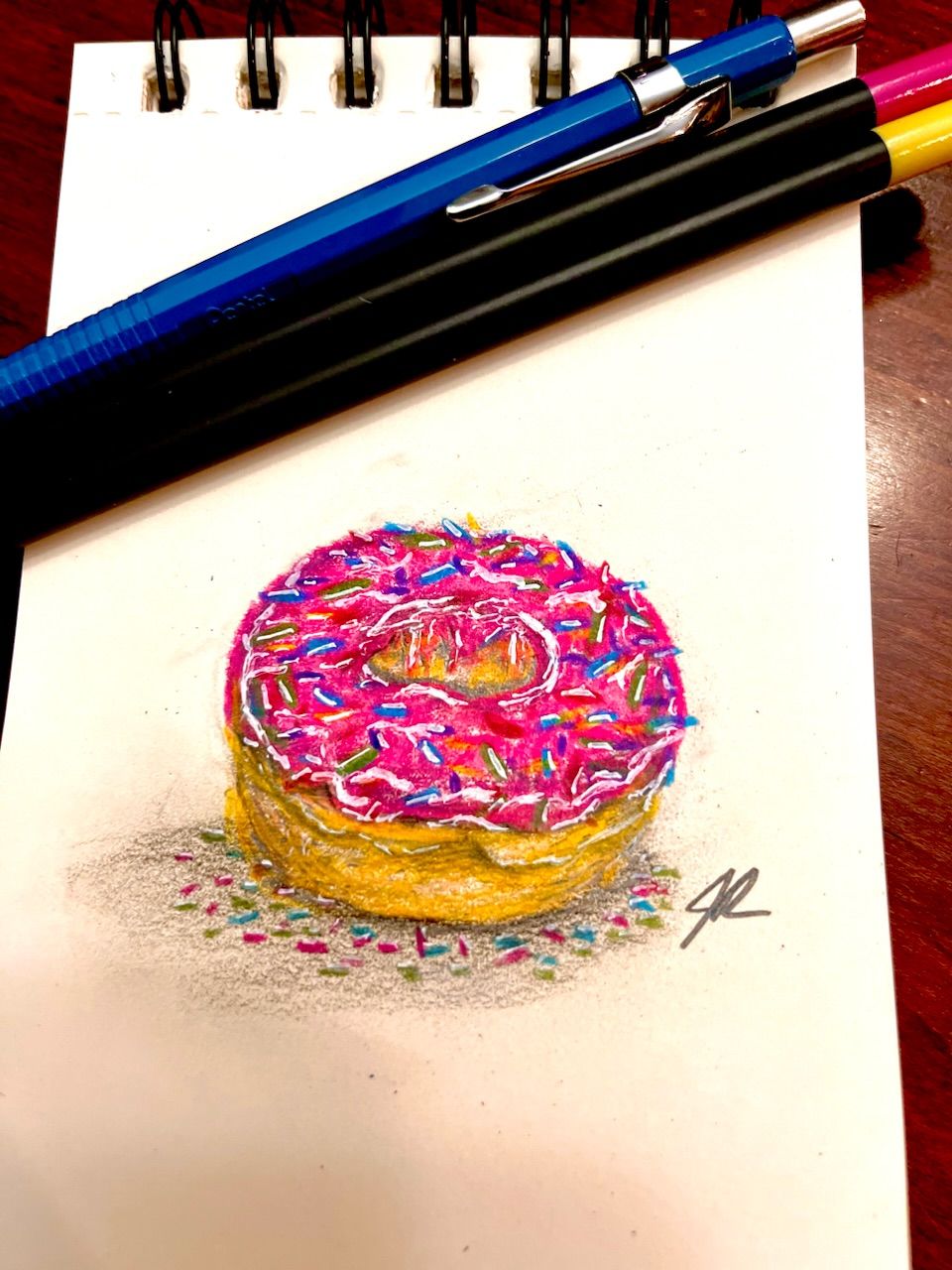
Practicing traditional art with Crayola colored pencils.
-
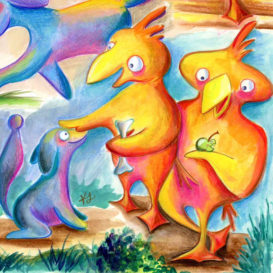
I'm calling these guys Boggo & Burb
-
@von_Nimmermehr I think you've really got something here, keep working at this character!