Feedback: Portfolio Piece
-
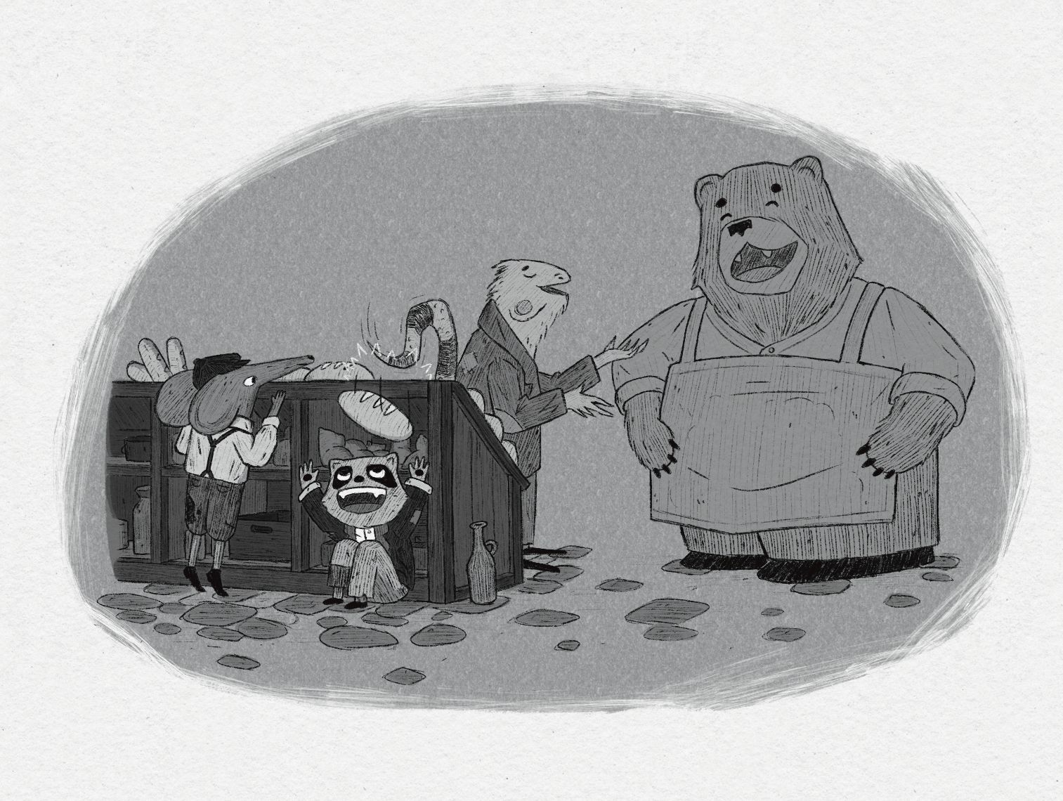
Been struggling with the values on this one. It’s in a place where I’m comfortable calling it done but let me know what you see that could be improved upon!
-
@Griffin the only thing I can see that feels off is the bear. He feels pretty single valued. Each of the other characters have a good variety in values between the fur and clothing, but the bear doesn’t. Could you give something different to his apron? Maybe lighten the background, and drop the other character whose interacting with the bear?
-
@AngelinaKizz I agree with your point.
Just like she said, just one piece of clothing should help, if you want to create less contrast on the bear, choose the smallest piece of clothes, maybe the shirt, and make it a bit lighter.
-
I agree with the other comments about lightening or darkening an article of clothing on the bear, also I would consider making your floor or skyish area different values too. Like lighten the background a bit to give it a little separation from the floor and foreground.
-
-
@Griffin
It looks to me like the bear and the background are the same value, so my suggestion would be to push both the background brighter and the bear darker. Making the fur darker means that we can see the bear's silhouette even clearer. Just one idea!
")
-
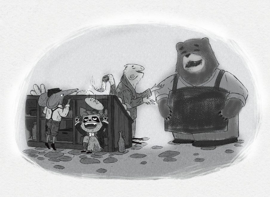
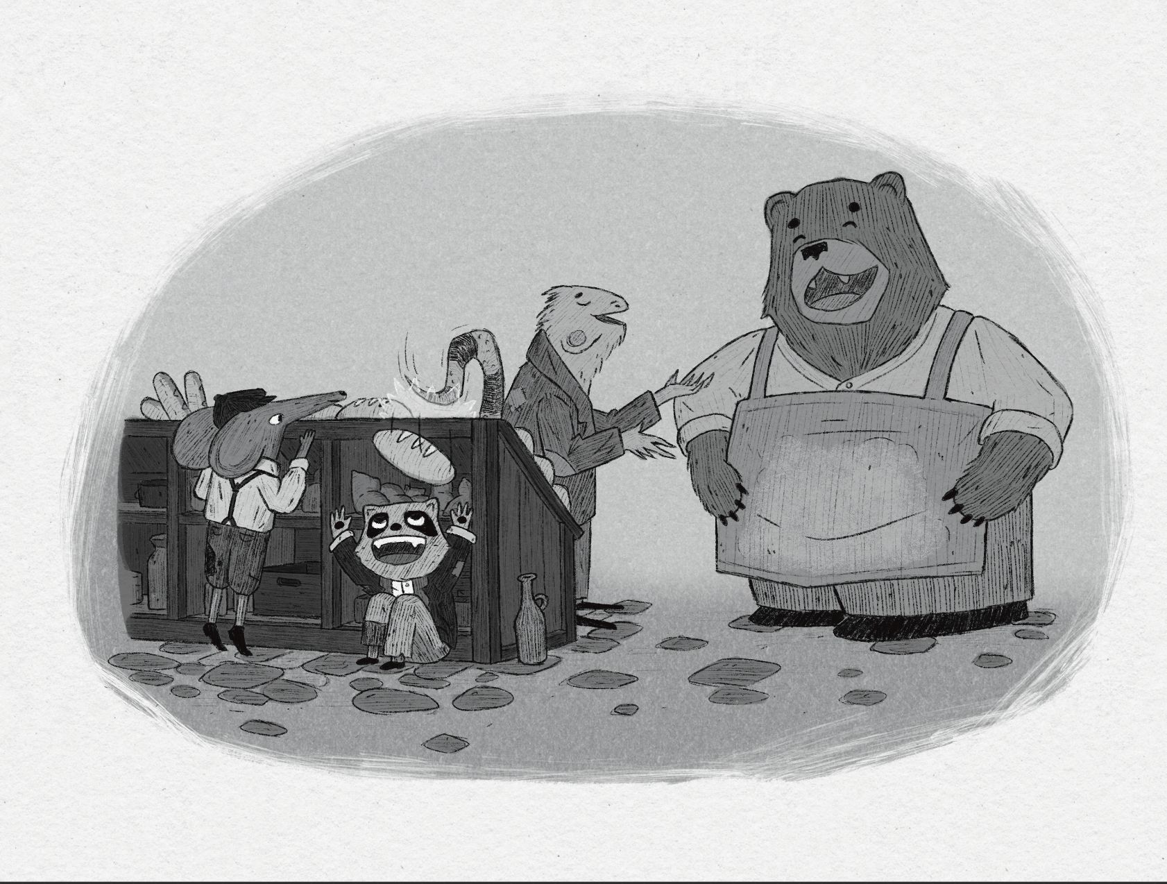
Thanks for the feedback, everyone! Separated the ground and sky, changed some values on the bear. The only reason I was hesitant to give the bear more values is because he’s already so big so I don’t want too much attention on him. I really want to make sure the focal point is the tail whacking the bread off for the raccoon. Does the visual hierarchy feel balanced?
-
Nailed it I think!
-
@Griffin looks great!