Treehouse feedback
-
Howdy folks!
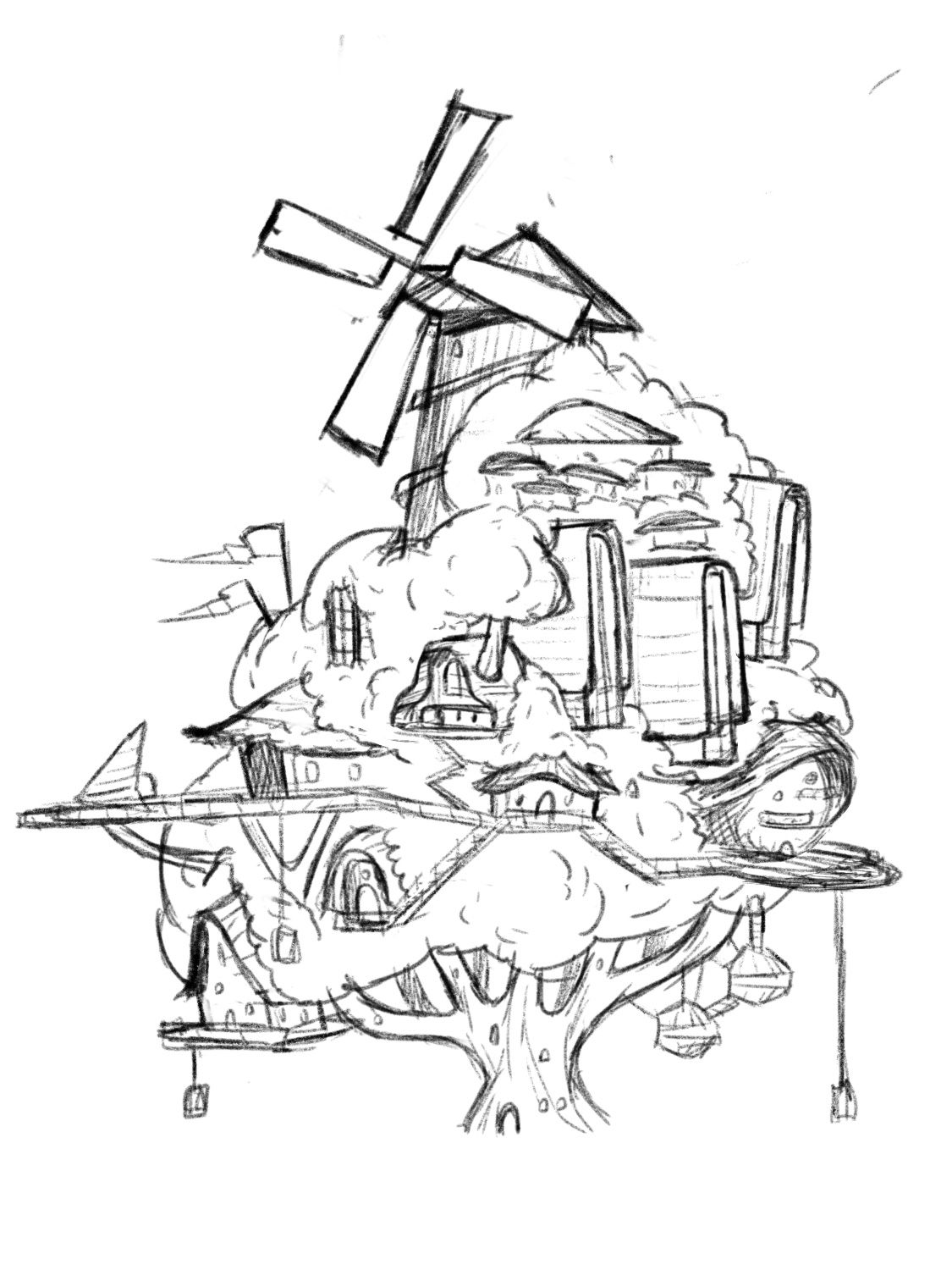
I’ve been roughing out my first sketch of my treehouse design. Mostly looking for compositional feedback since it’s messy at this stage but let me know if you think there’s some big design issues I could fix.
I want to make sure there’s a good building to tree balance. I worry some areas might be too congested like the center buildings and the ones on the top right. Let me know what you’re thinking!
-
@Griffin hey Griffin I think this looks great there are just a few things that I would tweak that would help the overall silhouette, but that’s just me. You can take it or leave like I said it looks great already!
-
@Griffin This is awesome! It's more of a tree villiage isn't it? I think it's a neat concept, but I'd be a little concerned about all the houses kind of getting lost in the whole thing... maybe that's something that can fixed with values and rendering though

-
@Kristen-Lango I don’t mind them looking pretty meshed in with the tree but I think color and value will prevent the buildings from getting lost.
-
@Asyas_illos that bit of variation at the top really helps the silhouette, thanks!
-
@Griffin I like how you included a power source
-
@Griffin yah it’s not much but I think so too, can’t wait to see how it comes along!
-
@Griffin
I think this looks awesome! Though I feel it's a little heavy on the left. But the triangle composition is nice! Maybe if you pulled out the round house of the right a tad more, not sure.
")
Instagram: www.instagram.com/heatherboyd.illustration/
Website: https://heatherboydillustration.ca
Shop: https://www.inprnt.com/search/products?q=HeatherBoydIllustration
Ko-Fi: https://ko-fi.com/heatherboydillustrationBe blessed,
-
@Heather-Boyd lol, I wrote down this exact note to myself for adjustments to make so I’m glad you’ve confirmed that.
-
@Griffin said in Treehouse feedback:
Very cool, looking forward to what you do with color. -
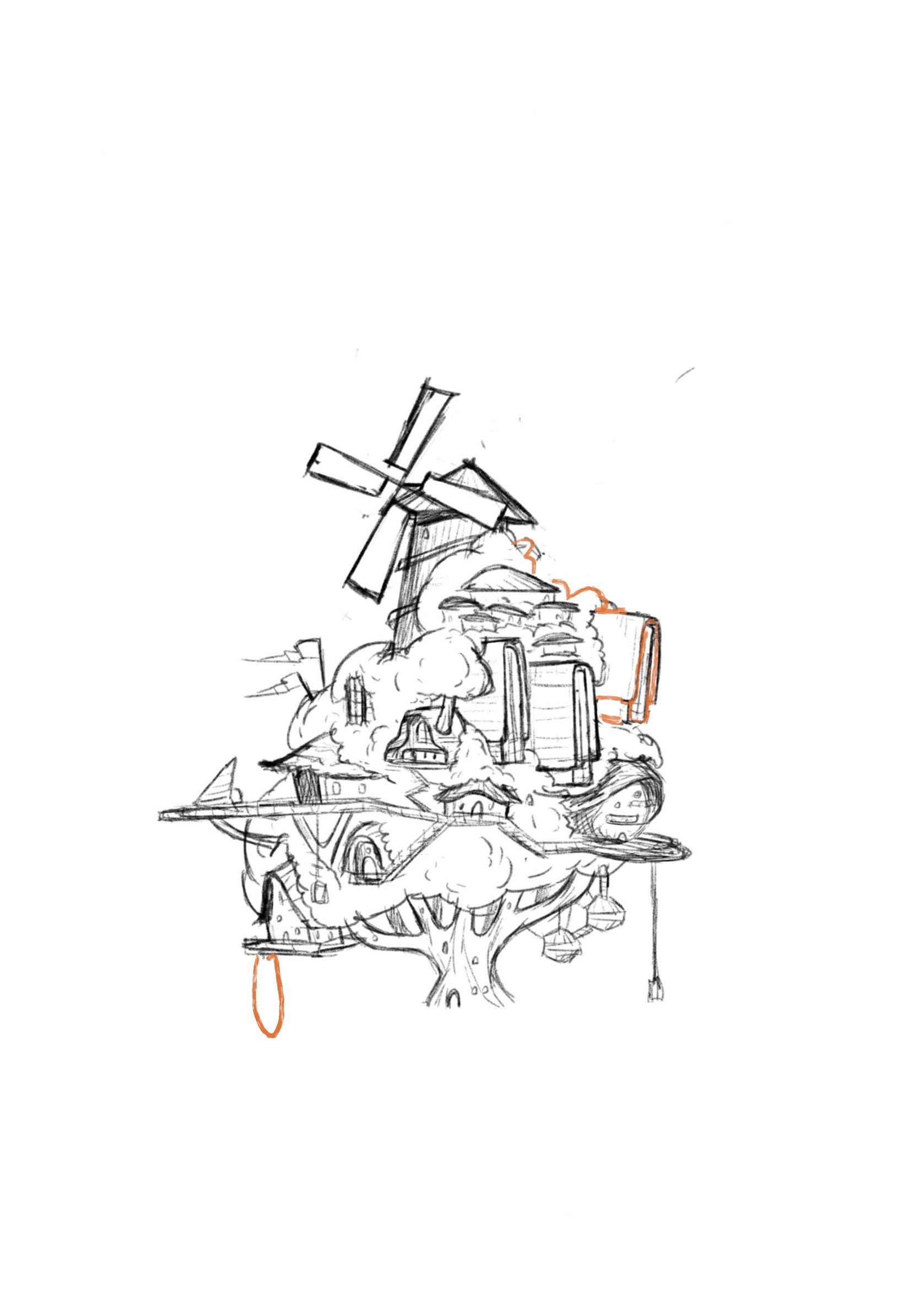
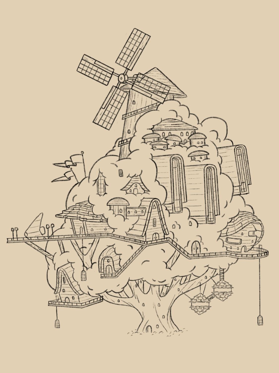
Update: here’s the more or less finished drawing. Just looking for any more feedback before I move onto color.
One concern I have is the building in the center. The perspective looks a bit awkward to me but before it was just a straight on perspective so maybe I’m just not used to it. Let me know what you think
-
@Griffin The buildings being in perspective definitely gives the piece more life. I think overall the piece looks great! I cant wait to see it once it's done.
One thing I'm noticing is that the perspective isn't consistent throughout. While I believe it's fine to have certain elements be flat, it looks like those flat elements are a bit random. Maybe you're noticing that and it's throwing off your perception?