A fresh start March wip
-
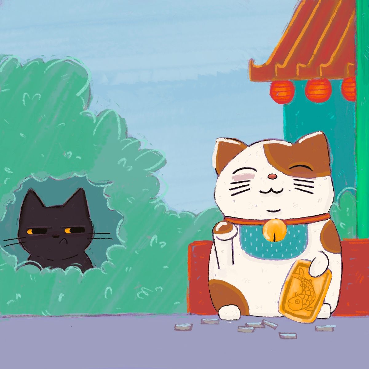
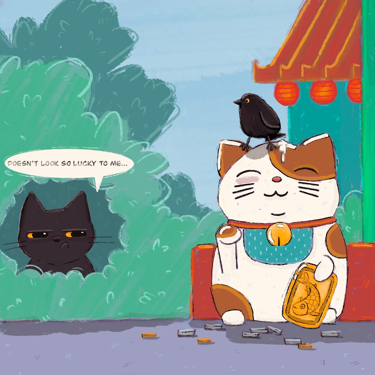
I am stumped on now to make this cat look more like a statue any suggestions? Or should it be real? I don’t know…
-
@asyas_illos I would say no outline, only shadows to define the arm and the hands,as well as shinespots that would give a smooth ceramic or marble feel… or whatever substance the statue is made from. Maybe a square based platform?
-
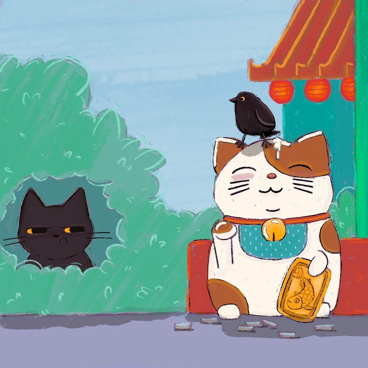
@angelinakizz thanks, I think I figured it though lol! it still may need a thought bubble… what do you think?
-
@asyas_illos that definitely helps bring across the statue! Try the thought bubble on a separate layer and see how it feels. Can’t hurt.
-
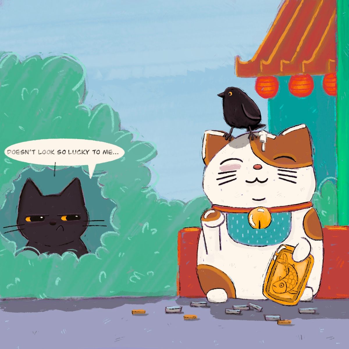
Ok need some opinions now, I’ve got thought bubble or just text, also the bird, squinty eye showing the action of what he’s doing ( in case you couldn’t see it) or no squinty eyes? And does the text fit, with the style or is it too indifferent?

-
Ok one down I submitted my lucky cat illo going off what my kids liked, which was with the white bubble, and the birds eyes open here’s the final.
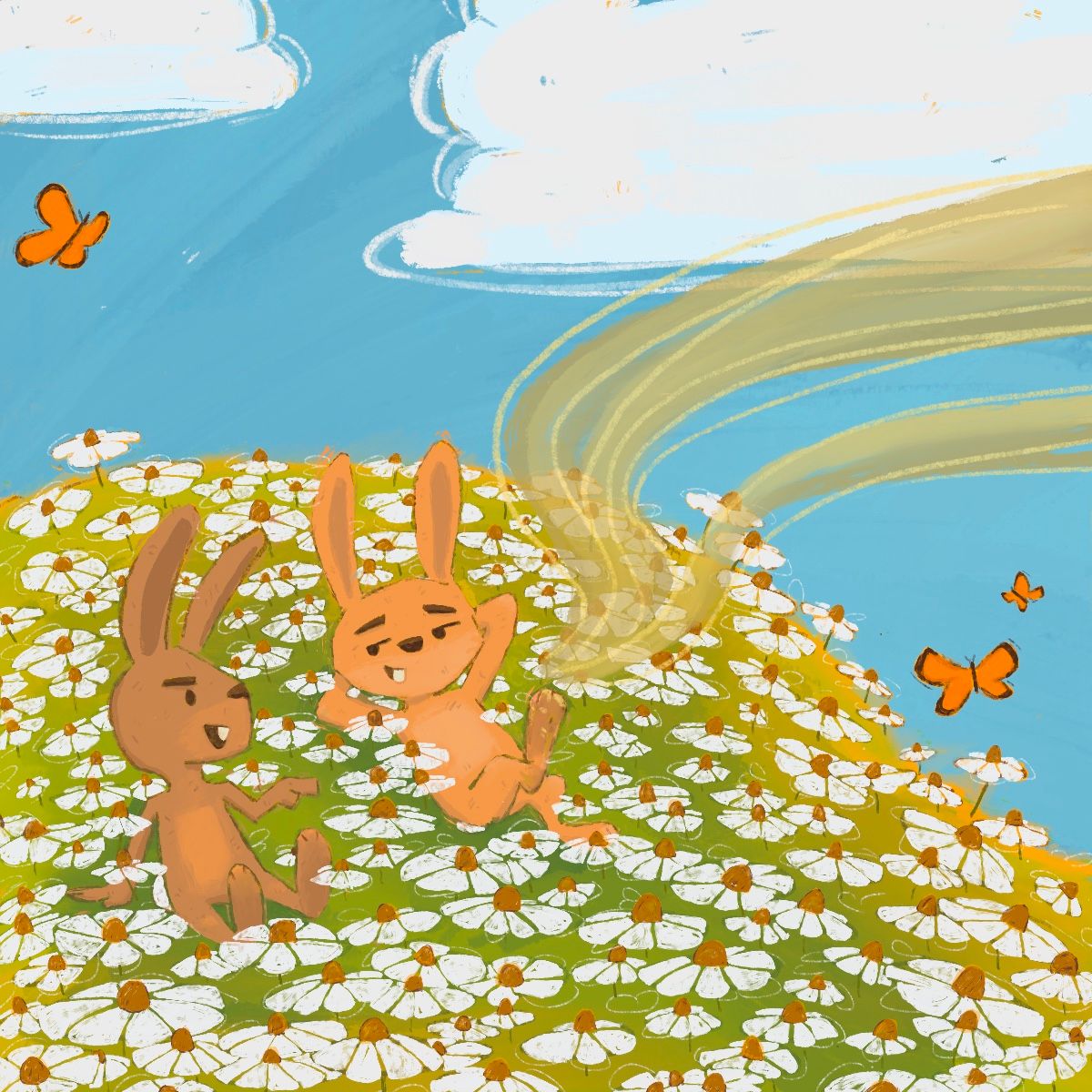
Also moving along I’ve only got to add the speech text to the lucky rabbits foot before I finalize.
-
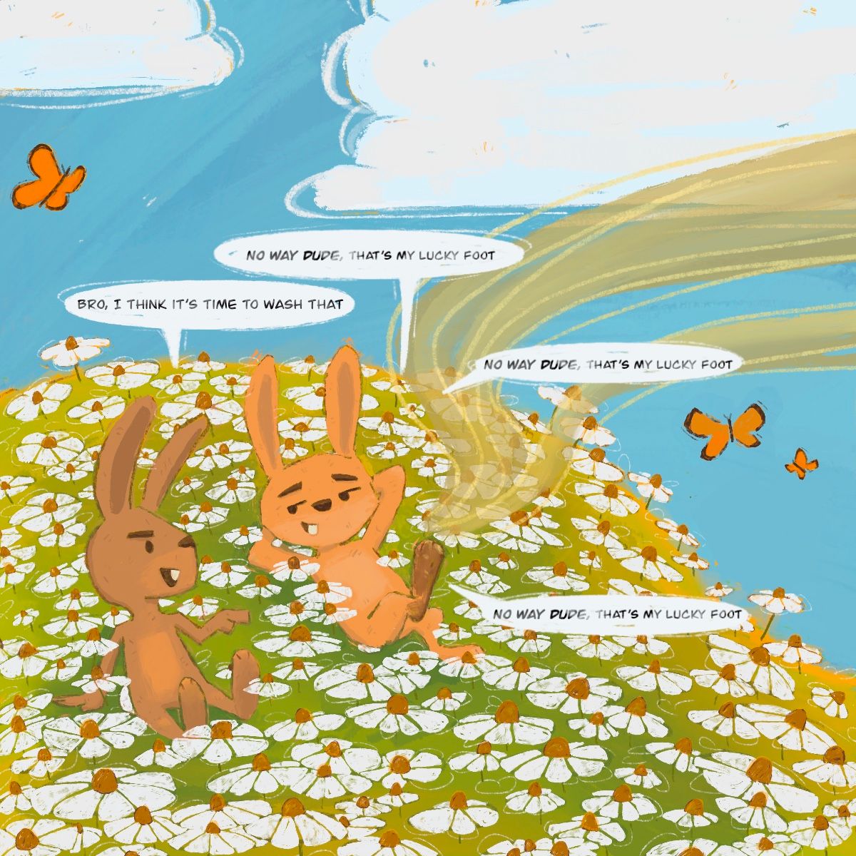
I’m trying to find the best placement for Lucky foots response any thoughts?
-
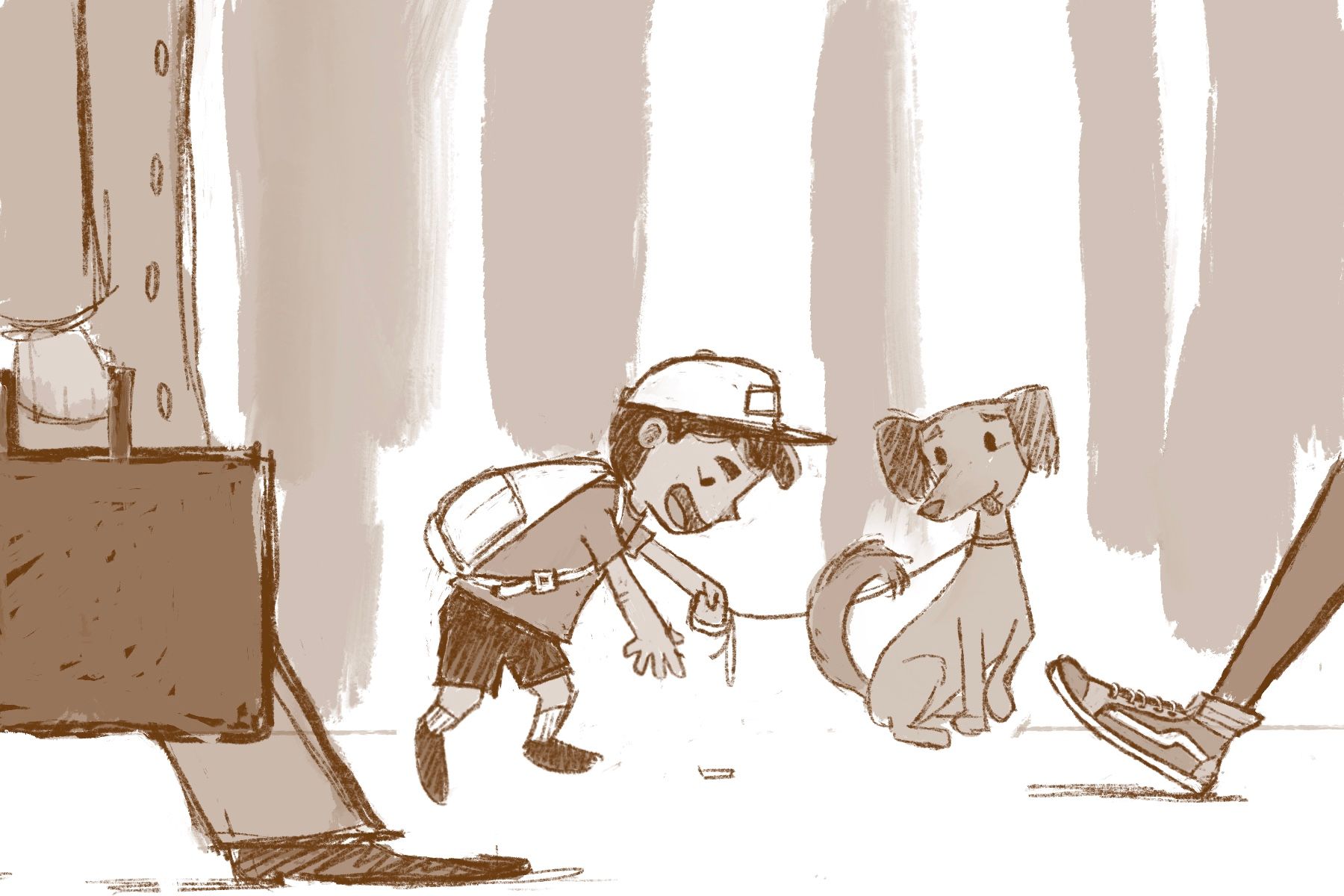
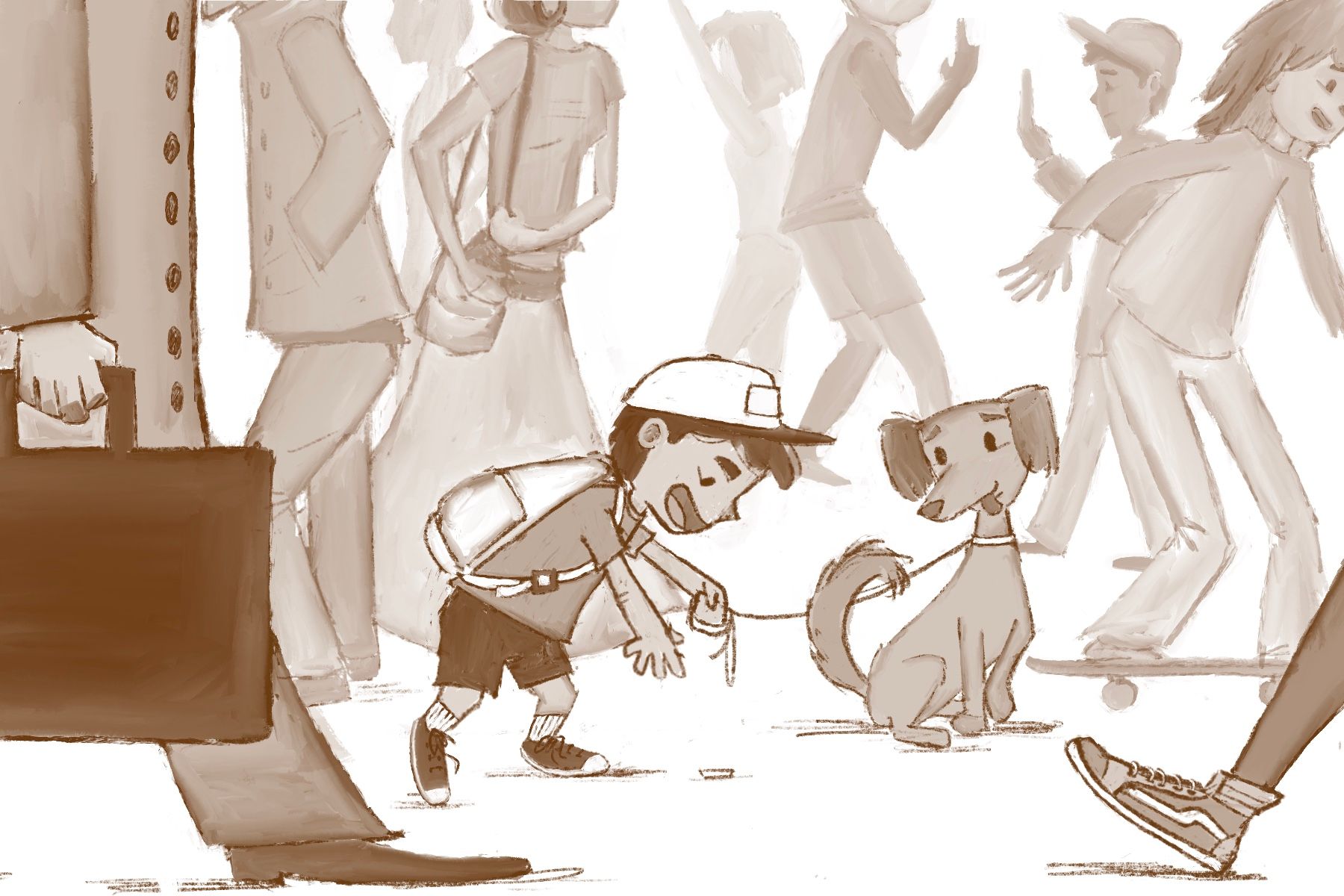
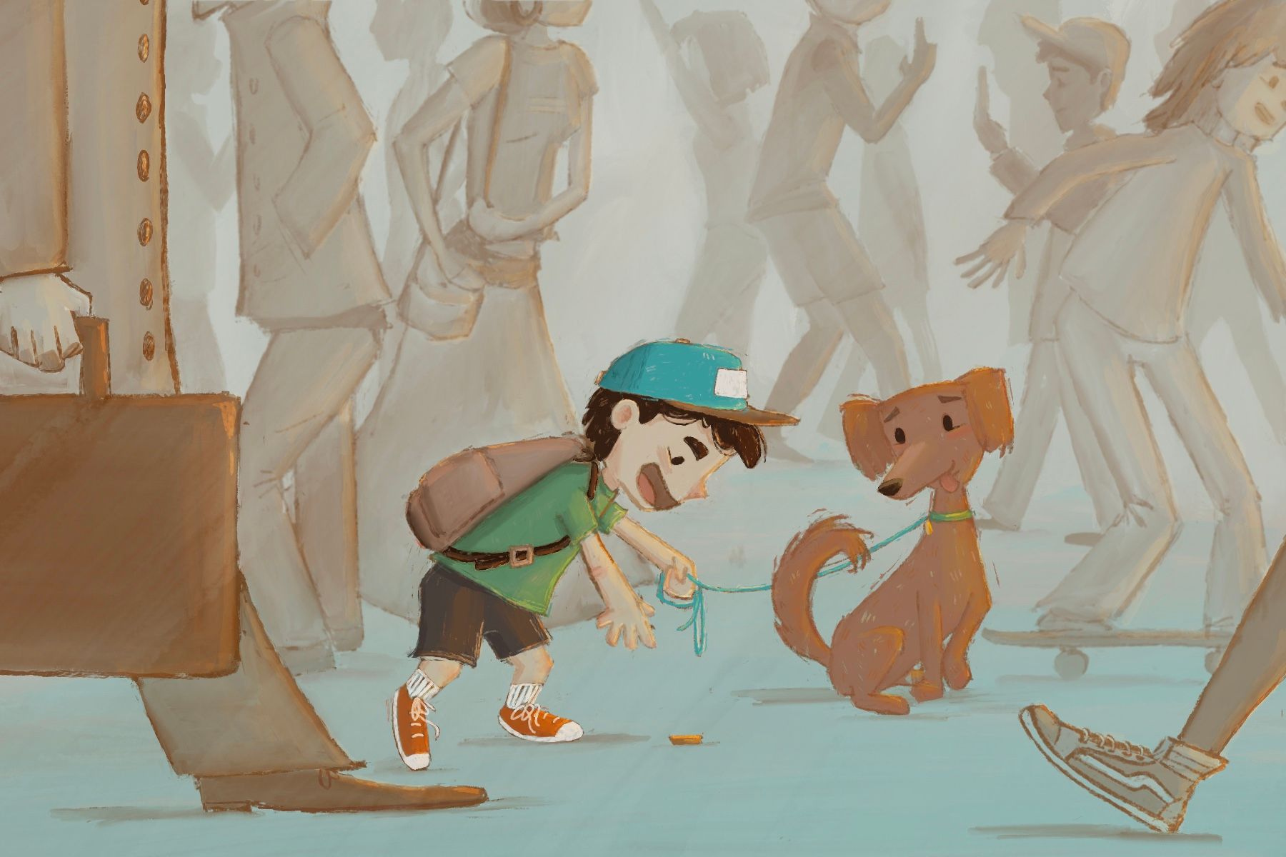
See a penny pick it up, all day long you’ll have good luck! Started this one today, the shadows in the back will be ill defined people and their spots are not certain yet.
-
-
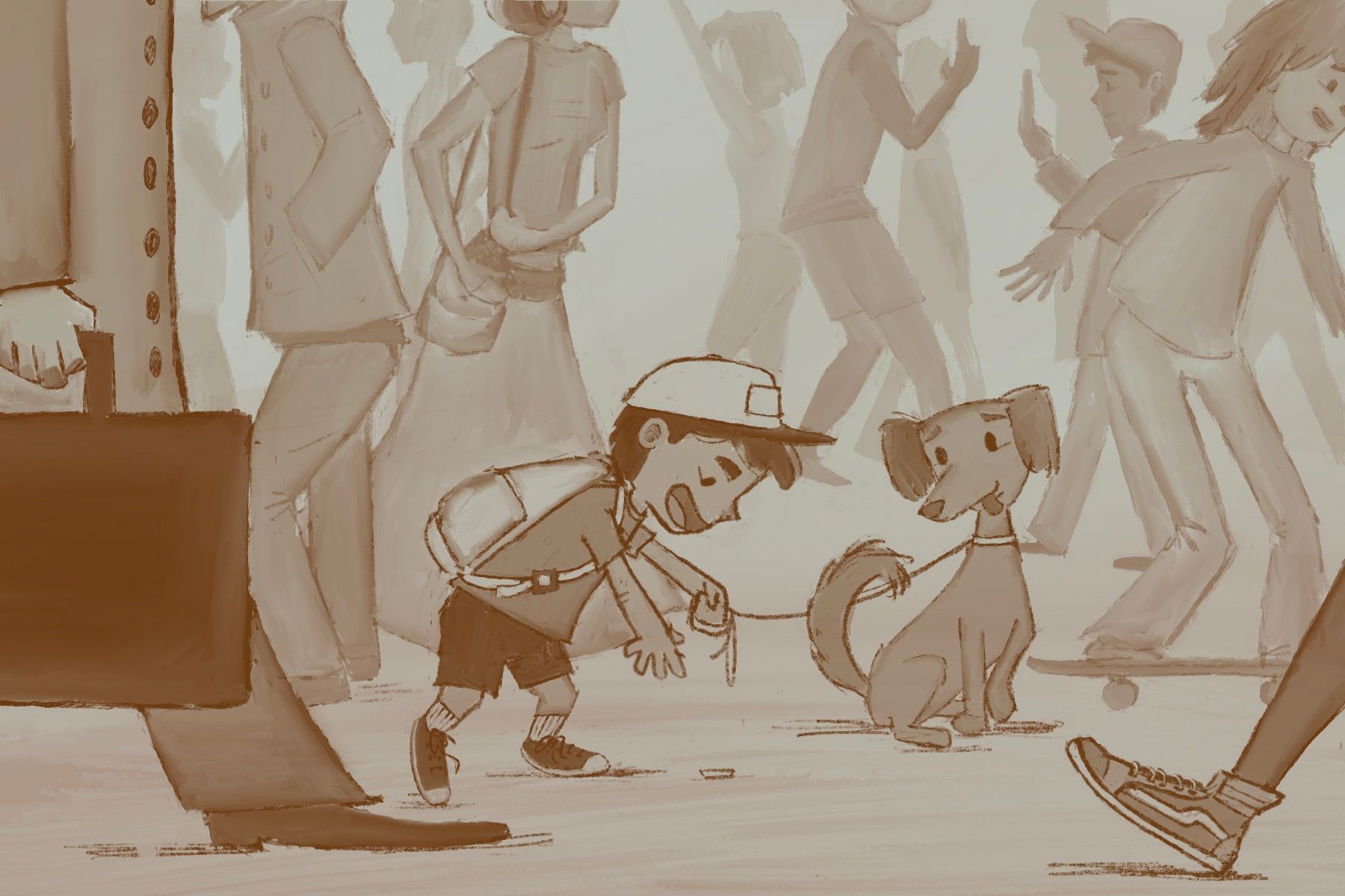
Hey guys I’m wondering if you think I should keep the original or try this blur out. It’s the first time I’ve played with it. My aim it to only color the kid and his dog everything else is going to stay monochromatic values pretty much.

-
Here’s without
-
Ok moving on I think
-
@asyas_illos fabulous!
-
@Asyas_illos your prolific-ness is such an inspiration!! Your treatment of all of these concepts are lovely, memorable and very consistent in style. Sorry to hear of your car mishap.
-
@jenn thanks for the sympathy
 it was a bummer but, these illustrations are the result of the much needed artistic therapy from it.
 -
@jenn I also greatly enjoy the one word prompts it leaves so much more space to be creative.
-
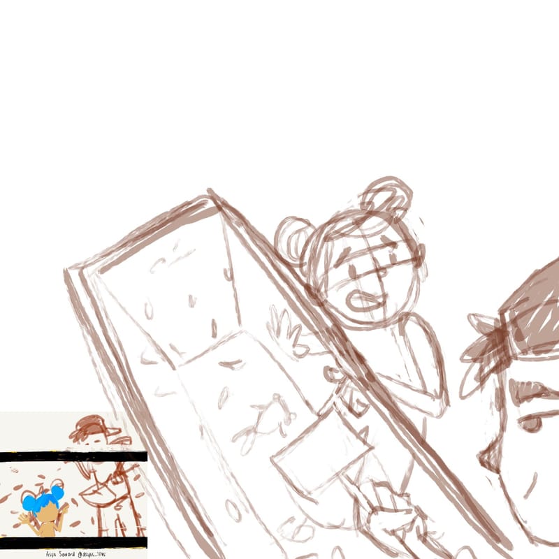
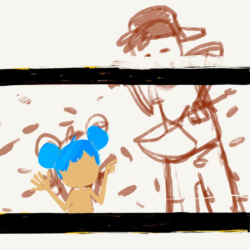
Working on another entry with a lucky goldfish as the theme and I’ve narrowed it down to these two roughs any thoughts on composition or which you like more? They will be spot illustrations not full page
-
Or if there is another POV you think I should try?
-
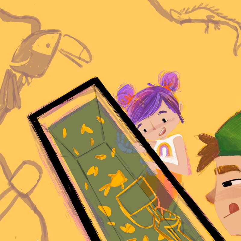
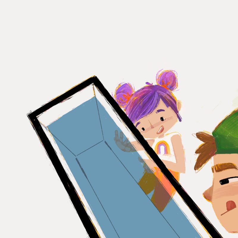
I like both of these view points but I'm trying to vary the povs I do because I tend to do a lot of straight on angles, so I’m going to work with this one for now. So goldfish are known to be symbols of luck and prosperity, my story is this little girl going to buy a lucky goldfish, who coincidentally is the ugliest fish in the tank, so he is also feeling lucky for being chosen. Although that last bit might be a bit harder to illustrate from this angle, I guess we’ll see how it goes! I also am eliminating hard line work except for detailing and just using paint this time and I found a brush that I am loving giving a scratchy feel. Ok enough gabbing…
-
I'm wondering if adding these guys Will distract from the main story and create too many focal points. What do you think? I fell in love with some toucan shoes and now I want to put them everywhere lol, help me! I was kinda hoping the vibe would be like “out of all the things in this pet store she wants the plain old goldfish…”
