Feedback needed - irish dance logo project
-
This is a logo I am making for our Irish Dance school - yes, I am the one mum who can draw but I’m having fun with this and also taking it very seriously and personally. I followed Tannie Smith’s class on logo design and tried to follow the steps as well as I could but now Saint Patrick’s day is close by and maybe we manage to have teeshirts with the new logo on time and all that so time is running short

After some sessions of thumbnail generating an paper wasting …
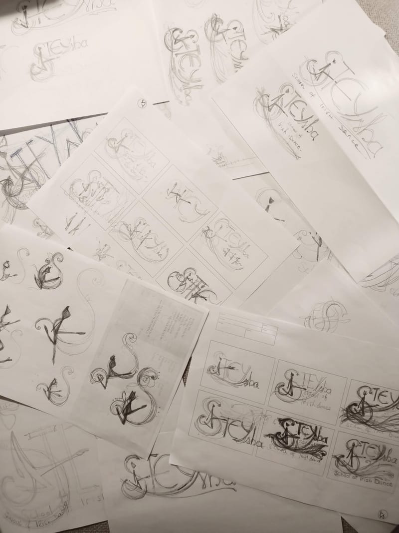
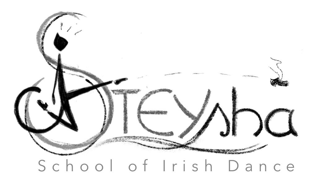
…I got to this part, still a black and white sketch but a cleaner one, to help decide if design choices until now are ok before continuing on detailing and vectorising. First I need to know if this is readable, so please tell if you can make out the name of our school! I would also appreciate comments and critique on the composition so far. What The logo needs to convey - dance, movement, sport, strenght, fun, community, progress. It tries to have some celtic whimsical detail but also stay contemporary.
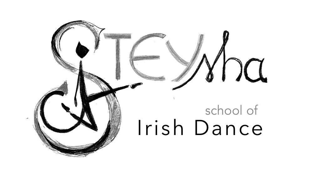
And yes, everyone in the school is crazy about cats!


-
@oana hmm I think it’s a little weird that is a cat but if that’s what they like than kudos, to me it reads Steysha? Is that right?
-
@oana I think this is a pretty good start, and you've done a super excellent job incorporating what they want into the imagery.
I'm worried a little bit about how many fonts this feels like. "School of Irish Dance" is the same font it seems, but you've adjusted the kerning (space between the letters) so that it "feels" like it's 2 different fonts. "Stey" and "sha" are two different hand-drawn fonts, so it's starting to fragment in my opinion.
A suggestion might be unifying Steysha, making the "sha" match the initial lettering, which would give you more horizonal space since those letters are larger, and then put "School of Irish Dance" all in one line, same color, same kerning, below that. I feel like that would really help bring it together, and the character kicking towards that I think will keep it flowing.
-
@asyas_illos Thank you for the feedback! You are right, I too feel that the cat figure is a bit unorthodox and I tried to draw it not too look very cartoonish. (The school also has a cartoonish illustrated cat mascot, my doing also).
This logo will be used on training equipement the dancers wear between dances at events, and when several schools from different countries are present the logo should be easy to read but also memorable. It should also say “dance and sports” to people in my country where Irish dance is not much known, so the jumping shillouete feels like a good way to do it. BUT the jumping shillouette is a bit overused and usually it is a girl in dress and curls. So I hope the cat to be something fresh and also unisex - as not to discourage boys Oh my, logo design is very difficult
-
@jdubz Thank you for the input! You are right, it is a bit of a mess right now with too many fonts. You made a cool observation about the kerning, evidently my eye is not trained enough regarding fonts, I didn’t think it matters much! I tried a variant with the School of irish dance in one line underneath and it does look better, only that variant had some other issues. STEYsha is actually the way the school name is written, the teacher likes this and I tried to incorporate it, but it is tricky, I’ll try to make it more unified somehow, and see if I can get that school of irish dance in one line and font. It is funny that all irish dance schools have to have that long text in their logos so when researching you can feel everyone’s pain in struggling to incorporate such a long stretch of writing (along with using celtic knots)
") I’ll try some more and get back with the result
I’ll try some more and get back with the result -
I like the cat. As you said, it's not your typical dancer silhouette which makes you look twice at it.
-
@oana Glad it could help!
Yeah that's the struggle sometimes with client work; they'll override sensible decisions and really there's nothing you can do about it. What I've done in the past is have them look at it both ways, explain from a design perspective why you want to avoid x or y, but ultimately leave it in their hands to make the final decision.
-
I kind of like it. I think once you get it digitized and rendered, you can play with the value contrast to really make the dancer pop off the page. Nice work
-
After one more day of moving things around I got to this version:
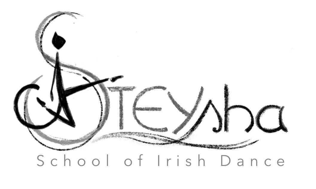
The large/small caps will stay , though it does unbalance the composition a bit to the right and I don’t know what to do about it. but I unified the fonts more and got the “school of Irish Dance” in one line wich is definetely much better. I showed it to the teacher and she likes it very much, but she had an unexpected observation - to her the cat looks naked and she wants me to add some detail so it is clothed I think I might add a separation at the waistline, that might suggest pants?
The suggestions here really helped, thank you! I will return after vectorising -
@oana Aren't cats normally naked?
-
@jdubz lol I thought so but maybe not when they start dancing
Until I figure out how to dress the cat I tried a little something to balance the right side. I would appreciate an opinion on this, especially from not-into-irish-dance people!
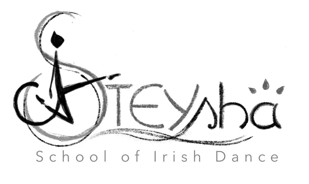
Or I could always go this way

-
@oana I like it but I'd like to see it without the curl coming off the dancer's back/bottom. It's kind of cool but it also looks like a monkey's tail. I find myself staring at it, even from across the room. You can also slide it up higher on the dancer so it looks like a skirt instead of a tail. Just try it and see how it looks.
-
@kim-hunter That's an interesting observation I didn't get before, thanks. I will consider it when working on the final shilouette, the dancer is a cat so the tail stays but I will try to shift it higher. Actually I noticed it looked like the tail of a monkey but the circled shape looked better in the design to me.
-
@oana I don't think you need to balance it on the right side with extra objects. The shoe is funny though.
studiojcd.com
she/her/hers
Insta/Twitter: @chengdesautels -
@jenn After I read that it's a cat I wondered if you added a second ear then maybe it would read as a cat better. Maybe try a more paw-like hand?
-
Update on the cat after some time spent in vector land:
What do you think?
Still working on the letters, painfull process....
-
@kim-hunter You were right, a second ear seems to work and it's not cartoonish as I feared!
-
@oana agreed, the 2nd ear makes it much more recognizable as a cat
-
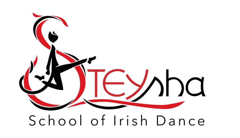
One more step... It's a vector now! I just still feel like readjusting every point a 100 times... and I still need tomake some color variants, this is the red scheme the school already had, I'm not sure which other way to go... Opinions welcome, your previous input was very helpfull!
-
@oana This is very nice and professional looking… Great Job