Swimming tigers (attempt 2)
-
@lizardillo yes ... time!
 Mine's going to be a spot illo this month. It's all I've got time for.
 -
@melissa_bailey good luck with it, looking forward to seeing it.
-
This post is deleted! -
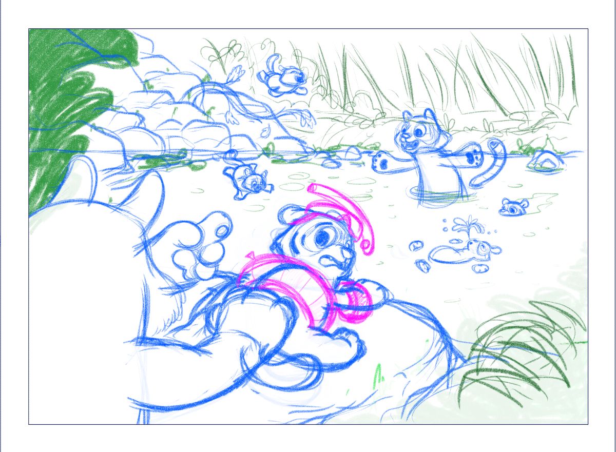
It's a complete mess but it's getting there! Still a lot of tweaks to go
 tiger in the foreground too upright, cub on the rock has weird back legs, one cub jumping in is too low, no idea how to draw a jungle - the list goes on
Will do the next drawover later. I need to look at some jungle plants.
Trying out Clip Studio Paint but finding this to be the wrong illustration to switch to a new app! Back to PS I think.
-
@lizardillo this is your best comp so far
-
Thank you @Asyas_illos

…Although I am struggling with it! I’ve drawn it over and over again with the tiger in the foreground cropped off in different ways and sizes and the positioning of all. But I’m just not happy with it for some reason. The whole composition isn’t correct and it’s just so busy. I keep trying the same thing over and over again which isn’t helping. I added a tree and I shouldn’t have added a tree.
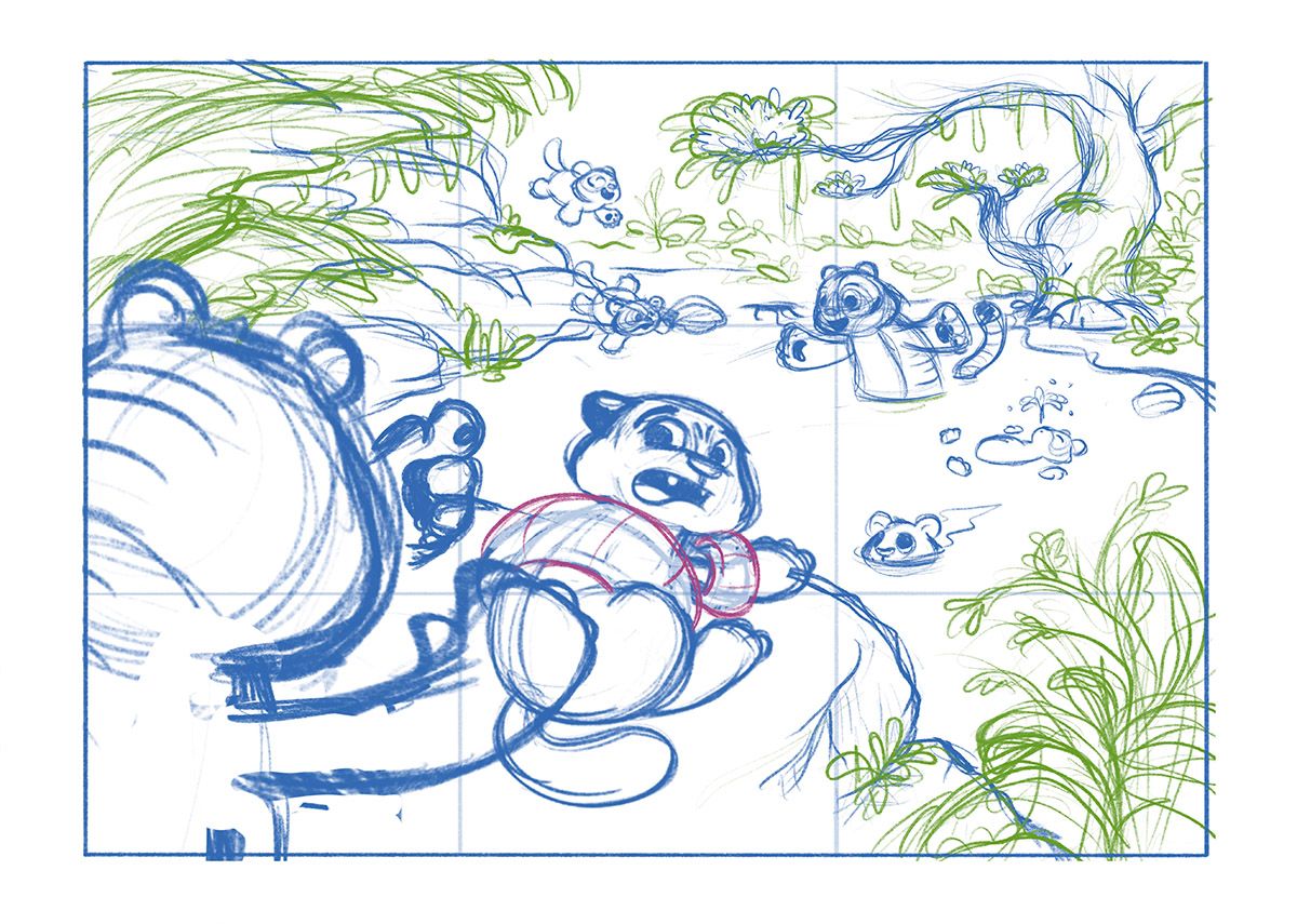
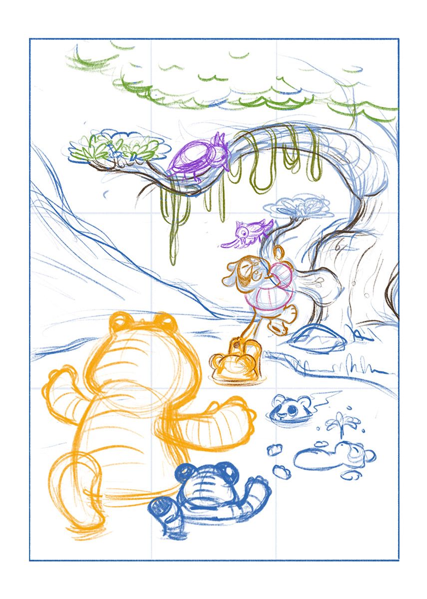
I played around with a couple of other ideas around the same theme. I’ve sketched up a portrait version with the cub clinging onto a branch and being coaxed into the water (although having its tail pulled by one of its siblings!). It’s not quite technically correct, I’m trying to point the focus to the cub. I’m getting a better felling off this one, It feels a bit more ‘me’ if that makes sense. I’m not sure if anyone else has ever had this issue.
I think I need the cub that’s by the parent interacting a bit more tho. It looks a bit like a repetition of the adult. I need to show another emotion so I may do it laughing. The parent should probably be a bit bigger too.
But then I keep going back to the landscape one and thinking “actually, it’s ok, it’s a clearer story”. And then I change my mind. I really can’t decide

I marked out a thirds grid and I seem to have completely ignored it

Thanks, Liz
-
@lizardillo lol you have the opposite problem than me, you tend to over complicate with details and I find myself struggling to add even the simplest of details, your work always looks lovely in the end, I’m sure you will come up with something you are happy with and even if you don’t like it, it will still be awesome!
-
@asyas_illos thank you
 I love your style, especially your recent tiger illustrations. I don’t think you need to add lots of stuff as you are able to show the story without it. I would love to do that, I think I’m overthinking everything and feel the need to cram in as much as possible. I need to learn to chill out
-
@lizardillo and I didn’t mean over complicate in a bad way! There’s always so much to look at in your art and that’s always fun!
-
@asyas_illos I was thinking of how I over complicate the way I do things so no worries. I do love adding the details for people to see, I’m glad you like them. I do love a bit of silliness and a good pun.
To add to my dilemma I’m now trying to think of what swimming aids the cub would wear made out of its habitat as it wouldn’t have normal plastic inflatable ones

-
@lizardillo really like your concepts! Love how you put so much personality and humor into your work.
While I love all the details you sneak in, too, I agree with @Asyas_illos feedback: for this prompt, I think you're getting too complicated.
Hope you don't mind, but I did 2 draw overs of these concept sketches -- to show some suggestions for both compositions, instead of just trying to describe it all. Sometimes words can be hard!
First concept draw over:
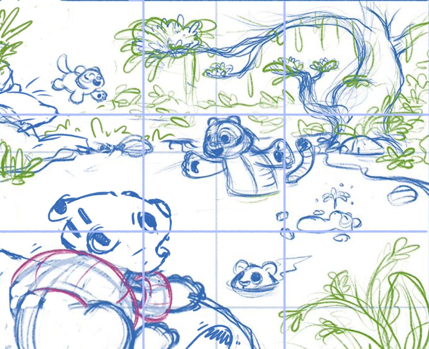
For me, this works better cropped in--more focus on the characters. You don't need all that environment and you don't need that many characters. I suggest erasing the parent pushing the cub --it could be misunderstood and it's drawing attention away from what's going on in the water. Also, if this is for children's illustration, it's always better to show the main character having the agency to act instead of being forced to act. So if the parent is no longer behind pushing, then it doesn't make sense for the cub to be looking behind at what's going on off-camera. Showing Scaredy Cub looking at the water more effectively communicates the story. You might want to add his little claws gripping the rock, or wiggle lines to show him shaking. And please excuse my really rough sketch of Scaredy Cub's face -- yours is so much cuter!Second concept draw over:
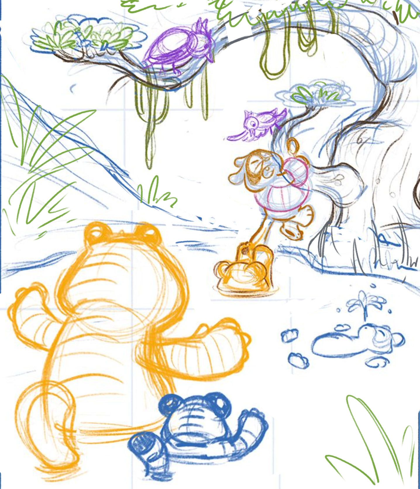
Again, cropping the composition will help. Of the two, this would be my preference, as I really like the emotion you're showing and the encouragement of the parent, even though we only see them from behind. You don't need so many characters, though. An odd number of characters is more visually interesting, and I question whether or not the birds are needed to tell the story. For the background, ask yourself what you really need to communicate that this is a jungle pond. You might not want to have any rocks in the illustration -- mostly jungles are vegetation, and it will also make for a nice contrast in your color palette, orange tigers against a background of blues and greens. This composition also begs for really dynamic lighting, which would add so much to the illustration.Hope this helped and hope you don't mind that I drew over your work. Really looking forward to seeing your entry in Critique Arena!
-
@melissa_bailey thank you so much for taking the time to do this. I love a drawover, I’m really grateful and appreciative of this.
That decides it, I’m going with the new version and cropped in like you have shown. I don’t normally add backgrounds or lighting so this is going to be a good practice exercise to try and not to go overboard take the focus off the main focal point.
Thank you so much for your feedback, you always give such good advice. I’m terrible at trying to explain things but you always get it spot on

-
@lizardillo aww, thanks! Glad you found it helpful! (And that's why there are draw overs -- explaining can be difficult!)
Just a thought: if you decide not to include the birds, you can crop out a little more on the top -- might make for a more pleasing composition.
Really excited to see how this illo turns out!
-
Very rough value study. Does the parent tigers arms need to be outstretched forwards a little more. It looks a little less like a caring beckoning pose and more like it's wading in to attack like godzilla (or have I just been looking at this for too long now??)
The branch at the top might go, I left it in as an experiment but it looks odd.
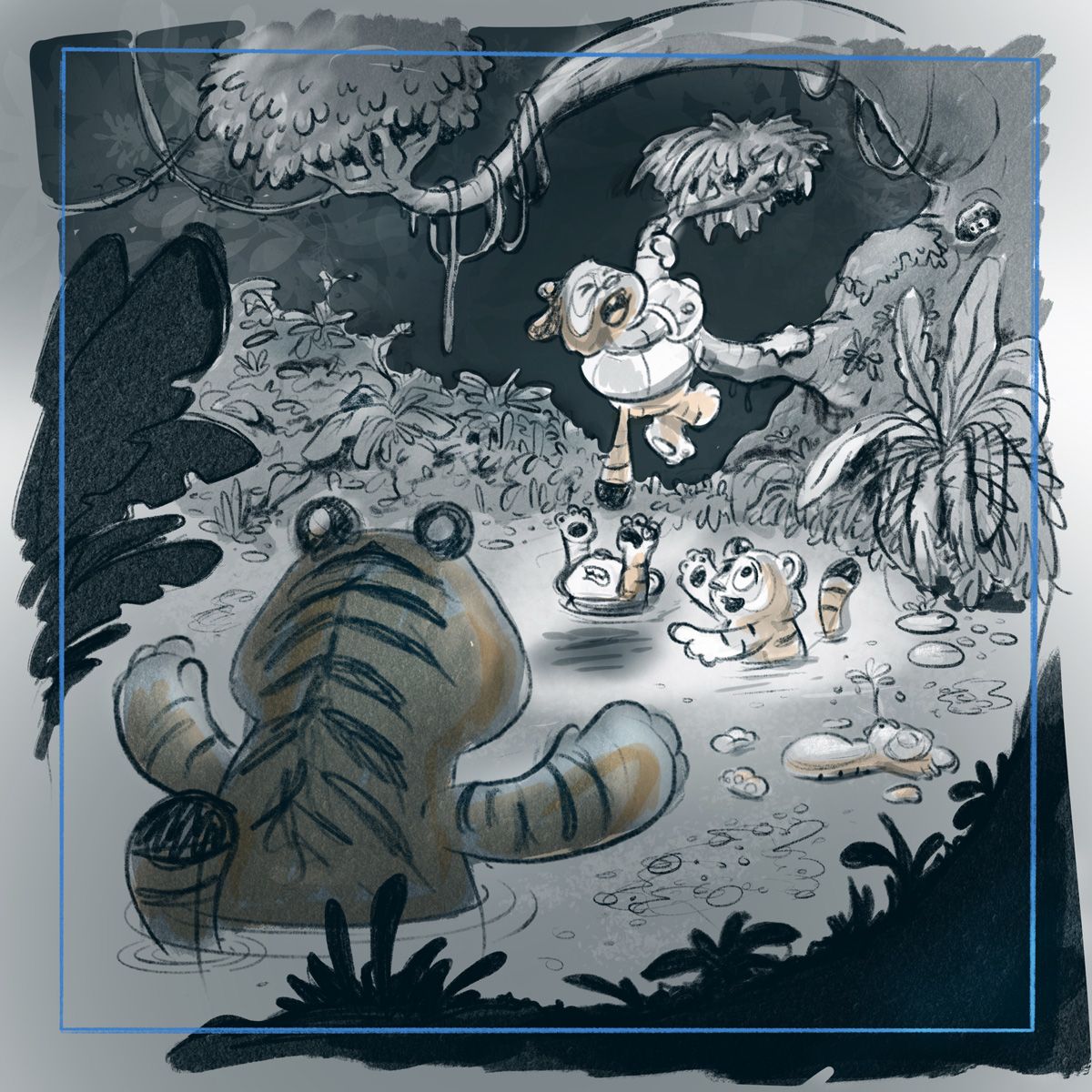
Going to try for something like this...
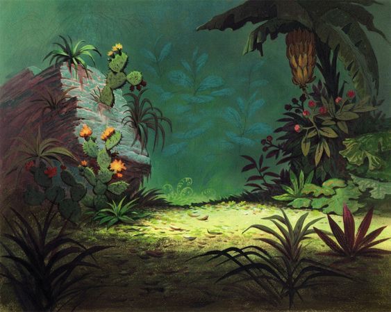
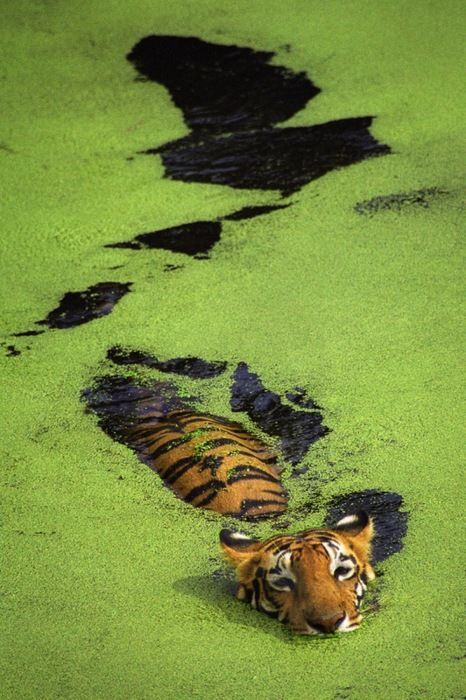
some green bits in the water like this...
-
@lizardillo loving this! The parent does not look like a wading Godzilla to me!
 (You might be overthinking it or looking at it a little too long.) Color will really change the sketch, too. Since time's running out (for both of us! I've gotta get my act in gear!) -- commit and finish. (I'm going to take my own advice too...)
 -
@melissa_bailey I have commitment issues

Thanks for your help

-
Perhaps palms up may read more comforting ?
-
I'm not getting any Godzilla vibes, looks great to me!
 My only other thought is that she could be holding her head in a kind of exasperated way? But I like the way her paws fill the space and lead you into the scene, so probably perfect as it is.
  Good luck! Looking forward to seeing the finished piece.