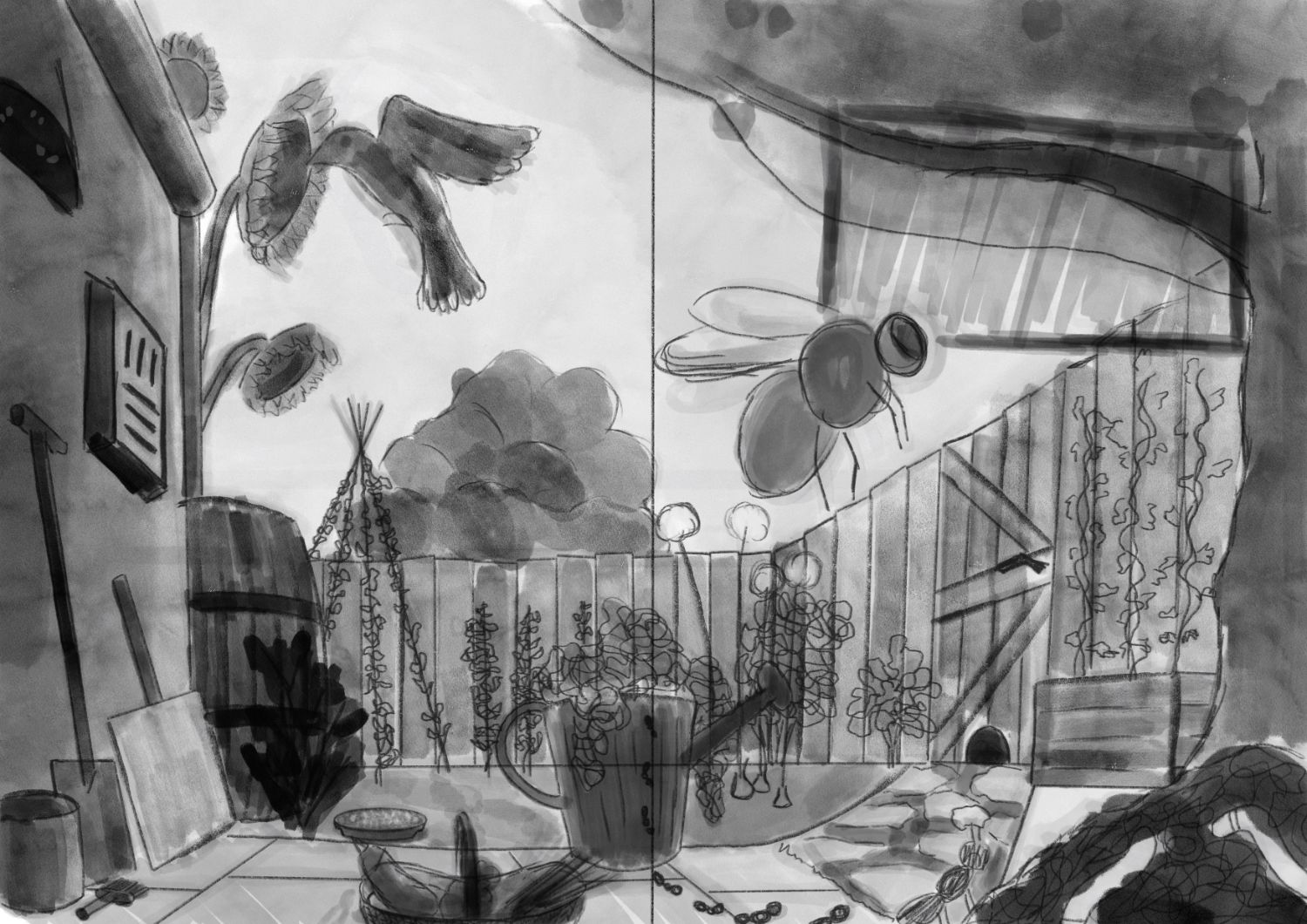
Busy composition
-
I'm working on the initial sketches for a magazine cover. The concept is a kind of utopian small garden with edible plants, habitats for insects and birds etc. The idea is to show off how there are a lot of little DIY things people can do for biodiversity in their garden, and have it look beautiful.
The illustration should work as the front cover separately, but also as a whole (front and back cover combined, 2x A4).
While I believe I usually have a reasonable grasp of composition, I struggle with judging the composition when it's this busy. Here I'm emphasizing the bee as a main focus on the front cover, which I think works, but I'm unsure of the whole. I don't want to simplify too much, as the whole concept is to show off a lot of ideas.I'd love to read your thoughts on this!
(the rectangle behind the bee is space I left for the title. There's not going to be other text covering the illustration except for small print along the top)
-
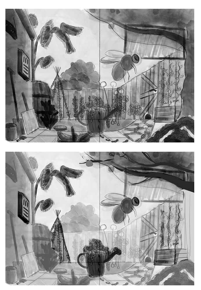
@lize In a complicated image like this I am a fan of using simple shapes and values to organize the composition and direct viewer's eye flow.
The important bits that you want the viewer to look at first, second, third can be darker with a very clear silhouette.
The only other alteration I made was the tree truck hugging the right side of the image. The branches clearly communicate "tree" while including the trunk only takes up space.
Feel free to use what makes sense to you and disregard what doesn't.

-
@davidhohn thank you! Your suggestions make total sense, I'm keeping those in mind for the next steps

How would the darker parts fit into the concept of making things lighter and less contrasted the further away they are, for depth? Especially the bean tipi in the back should usually be one of the lightest things in the image, by that logic. I'm not looking for a super realistic look, but I would still want some sort of believability.
-
@lize You would be AMAZED what a viewer will accept as long as you present it confidently. You mentioned that this image is about:
lot of little DIY things people can do for biodiversity in their garden
In your position I would make the judgement call this this is more important than the illusion of space (which is effectively what painting atmospheric perspective is)
I would feel confident setting aside the rule of atmospheric perspective because you can create the illusion of realistic space using other tools: linear perspective, object overlap, varying degrees of detail, color and hue etc.
Again, use what makes sense and disregard the rest.