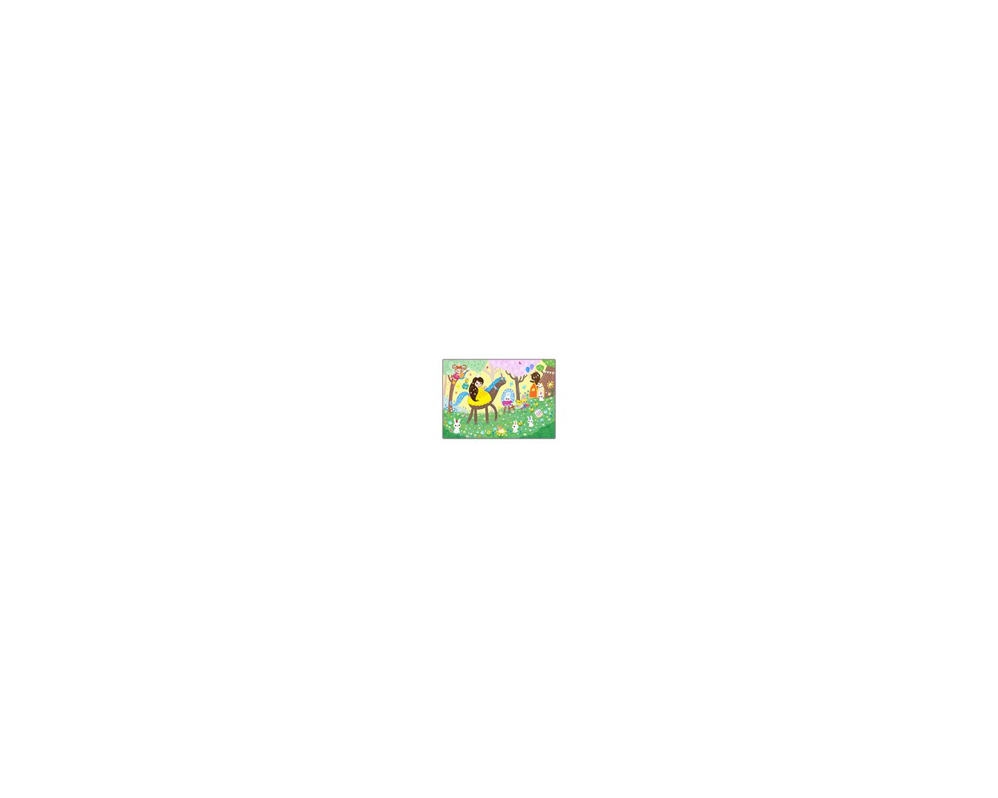
New portfolio illustration. How would you improve it?
-
Is it bad that I think it's too busy? I mean I love the colour and the art style, but MAN if there isn't a LOT of stuff to look at
 I love it but i think it's busy.
 -
Very cute! I love your textures and color pallet but I agree that the yellow dress on the yellow background makes the image lose its focal point.
-
I love this piece. It’s very vibrant, but it is quite crowded. That’s the only immediate thing that jumps out at me.
-
@Cole-Rts @K-Flagg @Kori-Jensen @chrisaakins
Hey, thank you guys so much for responding. You are awesome and I really appreciate you taking the time to help me. Sometimes new eyes can see a problem easier.
Thank you for your kind words about the illustration. I will keep in mind about the crowdedness comments, I have been adding a lot of details recently and seeing how far I can push it.
With the back ground being yellow like the dress, I can change the colour a bit and also double check the levels, maybe do a gradient by hand on the sky, will certainly experiment with it. That's a really good call, thanks. I am sure there is a way to make the princess's dress pop forward.
Really appreciate your comments. Thank you all! -
@Judy-Elizabeth-Wilson Hi Judy! I think it's already perfect but if you're aiming this piece for children's books, my one suggestion is to make space for the supposed text. Maybe beneath the horse or above the princess' head. Otherwise, it's all good!!!
Portfolio: nyrrylcadiz.com
Instagram: https://www.instagram.com/nyrryl_cadiz/
YouTube: https://www.youtube.com/channel/UCbJCF1Im8ZO7hpGWTKOJMuA -
@Judy-Elizabeth-Wilson This illustration is so much fun! The characters are super cute, the colors are vibrant, and it looks like it'll be one hell of a party. The color of the dress is so much more saturated compared to the background, that - to me - it seems to stand out quite a bit. Would another color work? Sure, but it draws my focus as it is and my eyes keep coming back to it. And the fact that the image is busy makes it fun, since there's a LOT to discover by looking around. It's a very interesting and engaging illustration.
-T
-
@Nyrryl-Cadiz Thanks Nyrryl. That's a good idea.
 I think the text would look good on the grass under the unicorn and I can move the birds and take some flowers out and lighten the patch of grass. Thankyou!
 -
@Judy-Elizabeth-Wilson Hi! I do think this is a really fun image and I love discovering all the little elements. I recognize the busyness as definitely a big part of your style/signature look and don't feel it's too much at all.
Perhaps try changing your background to a pale cool blue. That will make the backdrop recede and all those warm colors move forward including the bits of sparkle, those darling birds, and your princess. Also, and this is easily resolved, right now the fairy, the princess and unicorn, and the brown bear read as if they are all on the same plane yet because they are almost the same in richness of color. Yet we know they are not because of other cues in the image ie. Brown bear is behind the trees; the princess is clearly closest to the viewer, and the fairy looks to be somewhere closer to the middle plane along with the party sign. I think if you could just adjust the values of those characters to reflect their position in space it would make it a little easier to read. Hope that helps. Just little things! Composition and content are great.
It's really quite a sweet little image that any child would surely love just as it is! -
This illustration gave me a flashback to when my son was a toddler...he would sit so quietly, entirely absorbed in an illustration like this one, and sometimes go back later to study the picture again. I love your style!
I agree about the yellow dress, but also noticed two minor areas. I wish the snail-carrying-fairy in the upper left had slightly whiter wings (changing the background might handle this). Also, the pink tree behind the unicorn's front legs doesn't seem to line up straight. The bottom of the trunk seems to be a midge too far the left. I think the base of the tree needs to be a bit wider.
I also think you should market a cake carrier like the bees are holding.
-
It somehow looks sparkly! So cute. I think for me the busy feeling is not because there’s a lot of stuff, but because my eye is not sure where to go. For example those two tree trunks keep getting my attention because they’re so high contrast, dark on a light background. Also you made a nice flow with everyone moving towards the door, and I think the dark vertical trunks disrupt that. Lightening them to be more like the other background trees might help.
-
I really love this one, Judy.
")
-
I think it is perfect
I like how spaced everything is, so your eye easily gets lost in all the detail, and the yellow background and yellow dress didnt bother me, but it might be important to keep an eye on if you print it, so the contrast stays high enough to be clearly visible. I like it a lot.Blog: mamatheartist.blogspot.com
Coloring page newsletter: https://bit.ly/Color-in -
Hi @Judy-Elizabeth-Wilson, I think changing the dress from yellow to orange will do the trick!
Or, you can try white/grey unicorn with blue dress to contrast the background.
Also, I would increase the size of the bday bunny hat to draw the eyes to the main character. Just a thought
Fun piece and right up your style!
-
@Judy-Elizabeth-Wilson super cute style! Really fits the children's book market, if that's your aim. Love all the little details!
Going to agree with other comments: it feels like it needs some "quiet" areas. Here's why:
-
Where will the text go? If this is meant as a portfolio piece to show how you would illustrate a picture book, a potential client will probably wonder "where will we put the text?" If you fill every corner of an illustration, an art director will wonder if you know how to leave room for text, which is crucial. The bottom right would be a nice place for the text, in the grass, if all those flowers and bunnies and bugs and birds and minor details were removed. (Could the bunnies be grouped more near the door, as they would be for a party?) And keep in mind, there will be at least a 1/2 inch margin to leave room for bleed and hands holding the book. And text often takes up way more space than you think it will -- you may want to test out some text placement options or even some sample story text (at least at a 14 point) to get a feel for how much space text takes up and how to design around it.
-
Where is the focus? A client will want to see that you can make a main character stand out. Right now, she's standing out because her hair is the darkest value in the piece, but her dress is blending into the background (which is not a good thing!).
-
Is there too much storytelling? A ton of detail can be a great thing -- it adds so much to an illustration and kids love little details. But having so much going on can also take away from the main story being told. Use color, value, design, and shape to make sure the main story is the main thing going on in the illustration, and secondary stories are visually given secondary importance.
Here are a few things to try:
-
Zoom out or stand far away from the illustration to view it as a thumbnail size. Is the story still communicated? Can you clearly see what's going on in the illustration? Seeing an illustration from a different point of view can help you pinpoint what's working and what needs improvement.
-
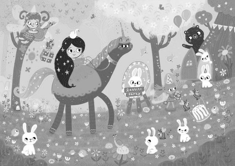
Take away all those colors and view it as a black and white image. Does the composition still work? Is there a focal point? Is the illustration clear? Has taking the color away changed the storytelling? What stands out? What fades away? Are there high contrast areas of light and dark, or is everything mostly mid-tone?
These aren't my own ideas -- they're things Lee White and Will Terry always recommend in their critiques. And they work!
One last funny little nitpicky thing: the unicorn's tail looks like it's growing out of the princess's dress. What if you extended its behind so it's clear that the tail is connected to the unicorn? It might also help the princess stand out even more.
Hope this helps! And please, if you end up making changes to this piece, share the progress. We'd love to see it!
illustrator - author - smiley person
mbaileyart.com
instagram.com/mbaileyart/ -
-
@Melissa-Bailey-0 This is an incredible critique Melissa. Thank you! You have thought of so many points that will make improve areas of this piece. The grey scale image really makes your points clear.
The main bunny at the moment is not really the focal point and now I can see if the values are tweeked this can read better. I am really looking forward to having some time to make some improvements. Yes, I will share!Website http://www.judyelizabethwilson.com/
Instagram https://www.instagram.com/judyelizabethart/
Sharing positivity through art.
-
@Jeremy-Ross Thanks Jeremy. Awesome points, I just realised how the main bunny in the story is not reading as the main focal point. Good call with bunnies hat, I will do something there! And also I like the idea of seeing what colours work better for the dress of the princess and unicorn. Thank you so much!
-
@R-Fey-Realme Thank you Fey. Good point about printing. I am going to double check the values of everything to make sure the right things come forward and move to the background.

-
@KathrynAdebayo Thanks a lot Kathryn!
-
@LouD Awesome point about the tree trunks Lou. Yeah, I think knocking back the tree contrast and maybe adding an extra tree or two far in the back with a very light value is something I can try. Thanks! Appreciate it.
-
@RachelArmington Thanks Rachel. I love busy pictures. Yes, I am going to look at the dress, that is the number comment. I see what you mean about the tree trunk. Lol, the cake carrier only works in this picture!!! It looks cute though!!! Really appreciate your comments.