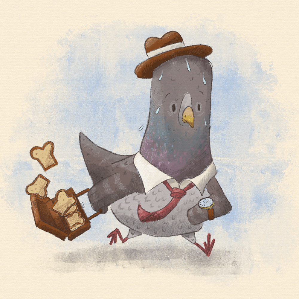
Feedback request
-
Hi all, new SVS member here and would love some feedback from the community to jump into the conversation.

-
@Kyran-Weir Welcome! You've created a really fun character here. Are there any specifics that you'd like feedback on, like construction or rendering?
-
@ajillustrates hello, thanks! I feel like there is something missing from my work that separates it from ‘pro’ illustrations but don’t know what that is, I don’t know if the line work is too sloppy or something. Also if the shading needs to be more subtle or something
-
@Kyran-Weir Oh, I think etchy-broken linework is great, and definitely fits with the style. If I was to tweek anything in this piece, I'd take a look at the collar area. The neck kinda flows into the collar on the right side, and I'm not exacely sure how the tie is supposed to be overlapping itself (at the end where it is bending up). I think they style is fun and solid, and I love the energy and stress in the character.
-
@Kyran-Weir This looks great to me! It's a fun character and I really like the use of textures. I don't think your lines are too messy or anything--it looks intentional and makes him look that much more frantic.
If you want to play with it some more, you might try bumping up the contrast of the image a little and having another piece of bread coming out of the suitcase (but I think those are personal preference things, the image is already great, imo).
-
@Kyran-Weir I like your line work (and style and color palette!): it looks loose and natural.
When I look at this, I see pencil and gouache on laid paper. If you painted this traditionally, I love your brushwork. If you painted this digitally, I'm equally impressed because it looks convincingly traditional. (The one place your brushwork looks digital is on the pigeon's shaded neck...you moved the stroke more horizontally, probably to define the curve around the neck...but I wonder if the stroke were vertical so that it could hint at feather texture).
As far as shading goes, it's more important to have it consistent within the image. It feels as if the briefcase behind the bread is slightly more shaded than the percentage you used on the bird himself. And you probably did that intentionally to make the bread pop more.
I'm really nitpicking here..this is a super, energetic image with a lot of a character with a lot of personality.
-
This is a SUPER cute design! I think the anatomy might be a little stiff? Specifically in the arm that's swinging back. The pigeon feels a little rigid even though he's in motion. I also don't totally understand the bread? I know pigeons love breadcrumbs, but I'm not sure why this guy would have a suitcase full of sliced bread. It's also hard to tell whether the pigeon is human-sized (because the bread is so small), or if he exists in world full of tiny animal-sized things. I love the personality and overall silhouette of the design though.
-
@ajillustrates ah thanks for the feedback, that’s really encouraging. You’re right about the tie and collard now that you have mentioned it I can see the mistakes there. Thanks for taking the time!
-
@miranda-hoover thanks Miranda, I appreciate it! (Congrats on being the featured artist by the way!!)
Yeah I will play with the contrast and such, good idea! -
@RachelArmington thanks Rachel! Good point on the shading, it does make the suitcase stand out a bit. It is digital as well, was trying to use more traditional style brushes so I’m glad it worked haha!
-
@cianamacaroni good shout on the anatomy, I didn’t want it to look stiff so I will keep that in mind.
Well he’s a pigeon trying to ‘make it’ in the business world, and what do pigeons love most? Bread! -
@Kyran-Weir I just wanted to say welcome and he is SO CUTE I love it.

-
@carlianne thanks a lot!!
-
Welcome! The character is super adorable and well rendered. I'd also say that perhaps the neck is a bit too stiff. I understand why you'd draw a pigeon that way, but there is so much haste and action in the image that I think I'd want the whole body to follow suit. Maybe the neck could have bent forward or backwards a bit, or he could have looked quite closely and with shock at the watch.
I think from a storytelling perspective having him **realize ** the time and be shocked might be more engaging than just after he realizes it, when he is speeding up. (this you've communicated really well, but there could just be even more emotion!)
-
@Kyran-Weir LOVE this style! Yes, there might be some stiffness in the drawing or some shading tweaks you could make, as mentioned, but there are successful artists working in a very similar style, so for me, I don't think technical skills need as much attention as storytelling.
Why is your pigeon late? What are the stakes? (As mentioned by @cianamacaroni) WHY is he carrying a briefcase full of bread? Is it lunch? Part of his work? Is he human-sized? Or pigeon-sized carrying mini food?
What if everything was in "normal" proportions and he was dragging lifesize bread? What if he was carrying something else that supported the story? What if there was more background or other elements supplying more context? In short: what is the story you want to tell?
You've got a good foundation of skills. My feedback is to focus on your storytelling.
 ️
️ -
@Kyran-Weir Aww Thanks! Keep up the good work!