Santa's Break
-
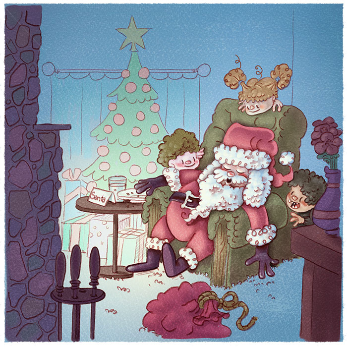
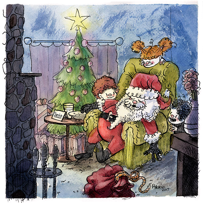
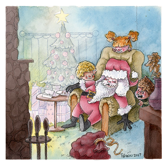
My attempt at a Christmas illustration. Here are three versions I did of it trying out a different process on each one. Never really did get what I was looking for. I actually painted this six times but three of them really came out bad. Here's a digital, pen and ink and watercolor, and colored pencil and watercolor.
-
WOW!!! I LOVE YOUR ILLUSTRATION!!!! Especially the one on top. This may be a bit late, but you can further improve your illustration by moving Santa's sack to the side, closer to him. This way the sack won't be stealing the attention away from jolly St. Nick. You could also darken the vase and table in the foreground to further emphasize depth. I hope this helps. Overall, I'm loving your illustration. Great job!
-
@evilrobot These look great William! There is something about the bottom one that feels just right to me - really nice!
-
Love it! I like the first one best.
")
-
I like the one in the middle best.
-
I also like the first one. Looks great.