Wanted to try and work on one of the thumbnails I did for the last competition (not focusing on fear though ) The concept is an old man who lost his wife and is looking though old photos of there time together. I've done a value sketch, but would like some feedback before I go into color. I'm thinking the cat on the floor might not be reading as well as I hoped. I would like to put it on the sofa, but I thought it might distract from the subtle indentation in the sofa. Any thoughts on any part of it are appreciated
Lonely old man painting WIP critiques welcome
-
Wanted to try and work on one of the thumbnails I did for the last competition (not focusing on fear though
) The concept is an old man who lost his wife and is looking though old photos of there time together. I've done a value sketch, but would like some feedback before I go into color. I'm thinking the cat on the floor might not be reading as well as I hoped. I would like to put it on the sofa, but I thought it might distract from the subtle indentation in the sofa. Any thoughts on any part of it are appreciated
-
This totally tugs at my heart. The point came across instantly. Great shapes too. Beautiful work and execution. I didn't see the cat at first, but I wonder if you can highlight it's head a little more to show his shape.
Can't wait to see it in color!
-
This is really nice but the cat is a little hard to make out. Could it be looking up at the old man with a sad little expression on it's face? I assume you've made the cat's ears flat to make him look a little sad but I think that makes his shape a little hard to read. Put the ears up and I think he'll read better. I really like what you done here. Nice composition! I look forward to seeing the final art.
-
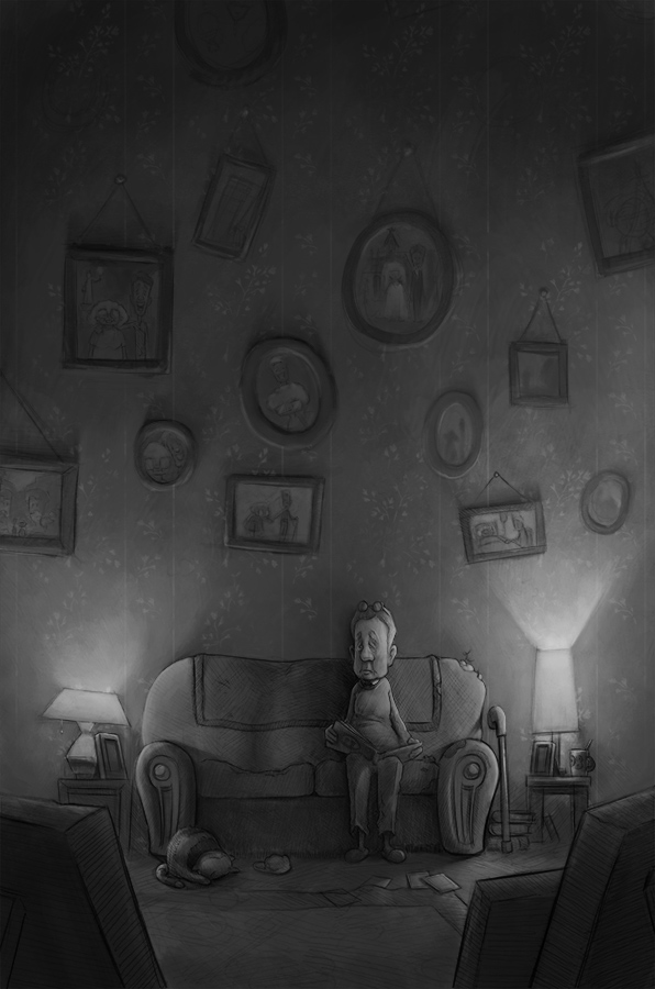
I like this, both the story and composition. You've done a excellent job with the mood and tone of the scene. There are a few things I would change, however. Not to get stuck on realism, but I think the image is too tall. Maybe cut off the top quarter, and bring the photos down to a more humanly manageable level. The photos would work better if they were a bit more organized (and with less tilting on the ones at the top), putting their wedding photo in a more prominent position.
I think the cat would work best in the old man's lap, the cat facing the direction of the wife's cushion, with the cat looking at the old man, the old man looking at the empty seat. And maybe put a pair of slippers on the floor where the cat was. Swap the coffee cup and frame on the table near the old man. And have a couple photo albums on the floor leaning against the couch, with the word "Photos" clear on one of the covers.
Lastly, took me a minute to realize that the items in the foreground were picture frames. I like it, but they need to be made more obvious. Lighten up the back of them and make the supports more visible.
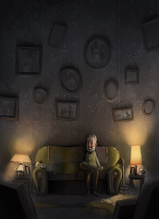
Looking forward to the color!
-
You've made a really sad and powerful image! I personally really like the format and how the frames are tilted, and I think it's an especially nice touch to the have that frame up there on the top alone up there. Love how the foreground frames, frame (haha) the piece. I agree with @IanS about the cat. It was a bit hard to figure out what was going on with it a until I gave it a good look over. Maybe indicate the nose a bit better and play with the design of it's body?
-
Great work overall, I would rework the man's expression to be more sad the way he looks know is almost like he heard a noise and is looking that direction. I would also look at the fall off of light coming from your lamps
-
I agree with what the others have said as well. It reminds me of the movie Up a little.
-
I would not change the height of the image because the vastness of it's current state has the effect of adding to the mood you are trying to capture
-
@rcartwright has a point about the height, but I think it could work even with a bit chopped off the top, moving the darkness down. One more thing I would add is to increase the contrast in the image, making the lamps brighter, and the shadows a touch darker. Right now the image is a little flat.
-
I love the height. I think it adds to feeling of loneliness. Either way it'll still look great as it's a strong piece!
-
Strong comp over all, but the darkness at the top does seem too far away. Especially compared to how dark it gets in the center of the couch. The spacial loneliness lost in height could be compensated by adding a little width. Possibly even showing the side wall coming foward slightly. Great shapes! Love the scene.
-
Nice job! Really nice feeling to it. I would make the cat a lighter tone so it stands out a bit more from the couch.
-
Thanks for everyone taking the time to comment. Your advice will really help me to get the piece just right
My wedding is this month so i'm trying to spend what time I can on this and other projects I have on the go, but I will try to update as soon as I have chance to work on it a bit more!
The height of the piece is something I would like to keep as it is, but I agree with increasing the lights and darks a little more.
@bharris Thanks for the nice comments. I think the cat needs reworking so I will probably find a nice pose for him
@tombarrettillo The cat in a lap is a good idea. I will definitely try that out.
@IanS thanks Ian. Seconded on the cat, it never seemed right to me too.
@TessW Thanks Tess. I think the frame at the top was a happy accident. I might have to move it slightly though as it runs tangent with the line on the wallpaper. I want to try and further tell the story through the photos, without taking away the attention from the old guy.
@rcartwright Yeah I think the expression could be pushed a little more. I didn't want him to look too sad though, trying to go for a more subtle remembering the past expression
@Chip-Valecek That movie popped into my mind half way through working the piece. I might have to steal some color schemes from it
@Art-Dud Do you mean "does" or "doesn't"? Were you thinking that I should make the upper part darker? I didn't want to create too much darkness at the top incase it distracts from the main subject, but I can see where you are coming from.
@Spencer-Hale Thanks Spencer. I will probably just rework the whole cat as it seems the weakest part of the piece -
@gary-wilkinson I love grabbing colors from movies. I use this site which may be helpful to you or others: https://www.canva.com/color-palette/
-
@gary-wilkinson I love this illustration! But, he is so lonely
-
@rcartwright I agree with you, Rich. It is so much lonelier. Also didn't know what the cat was.
-
@gary-wilkinson I meant does, as in it could be a bit closer. I definitely agree it should not get too close as you state.
- 7 months later
-
I'm revisiting this image I was working on last year, but end up dropping. I think it would be a good one for the portfolio so giving it another go. I adjusted the position of the cat and gave the man a beard to give him a slightly unkempt look. What do you think of the color scheme? I want to push the cool colors a bit more and I might dim the lamp on the left side as though the lightbulb is almost out of life. It's been a challenge so far, but I think I can get something good out of it at some point.....
-
@gary-wilkinson I like it! I would like to see a bit more blue in the shadows, just bit. He does look lonely. If you took the lamp on the left down just a notch but not too dark, the puppy needs enough light to reflect on him
I'm not the best critiquer but you seem to know what to do already anyway. I would like to hear what others say.
-
Hey love the picture. I see you have been wavering over what happens to the light on left. How about turning it off altogether and putting in some window light to add some coolness to the missing his wife thoughts of the man.Hope you don't mind the paintover... I added more light to the whole painting which gives you a chance to colour the pictures on the wall, also I added a ceiling to enclose the emotion and maybe send the eye back down to the man?
Just an idea it might help...