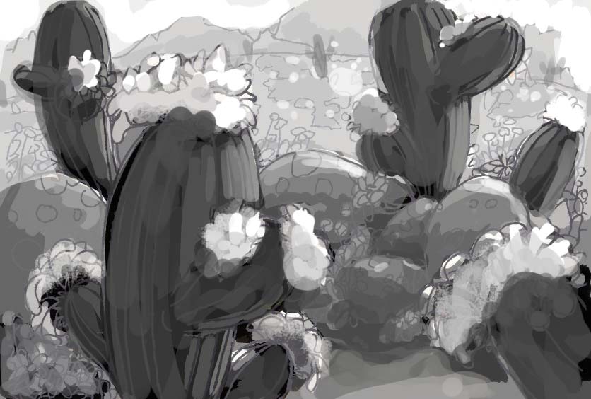
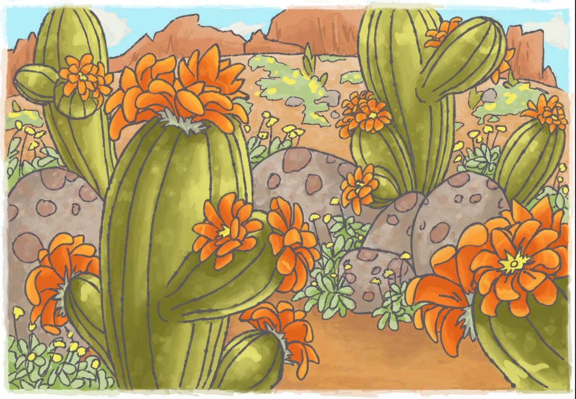
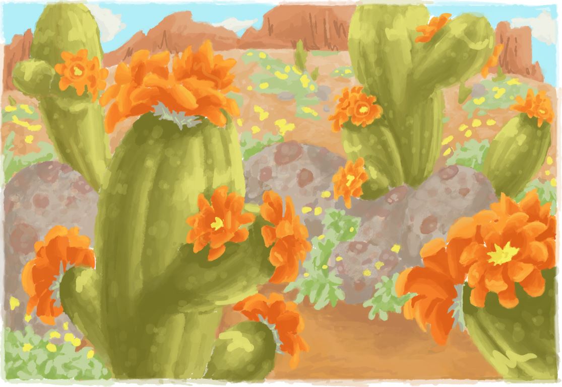
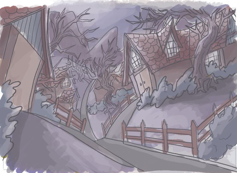
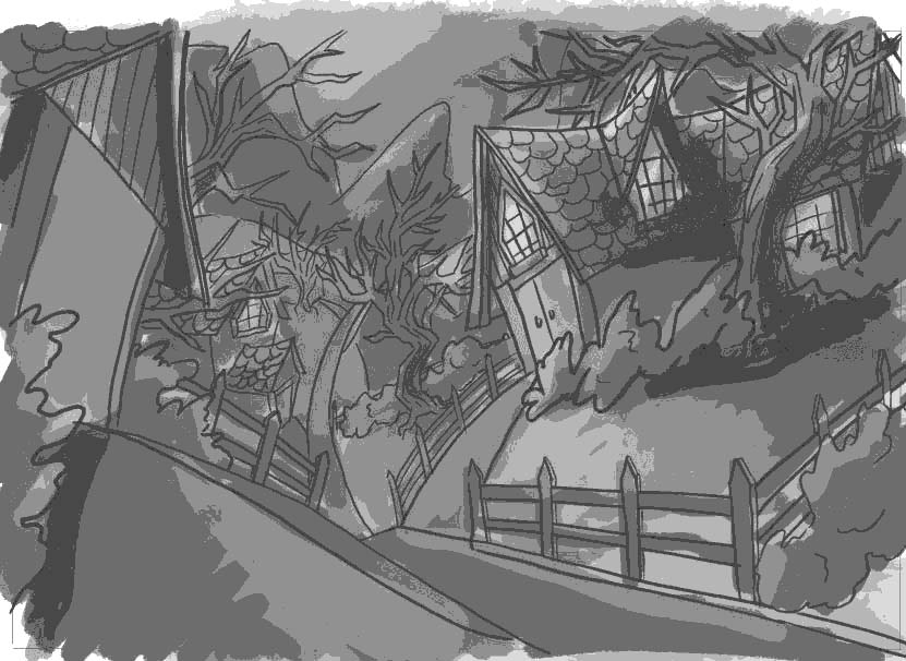
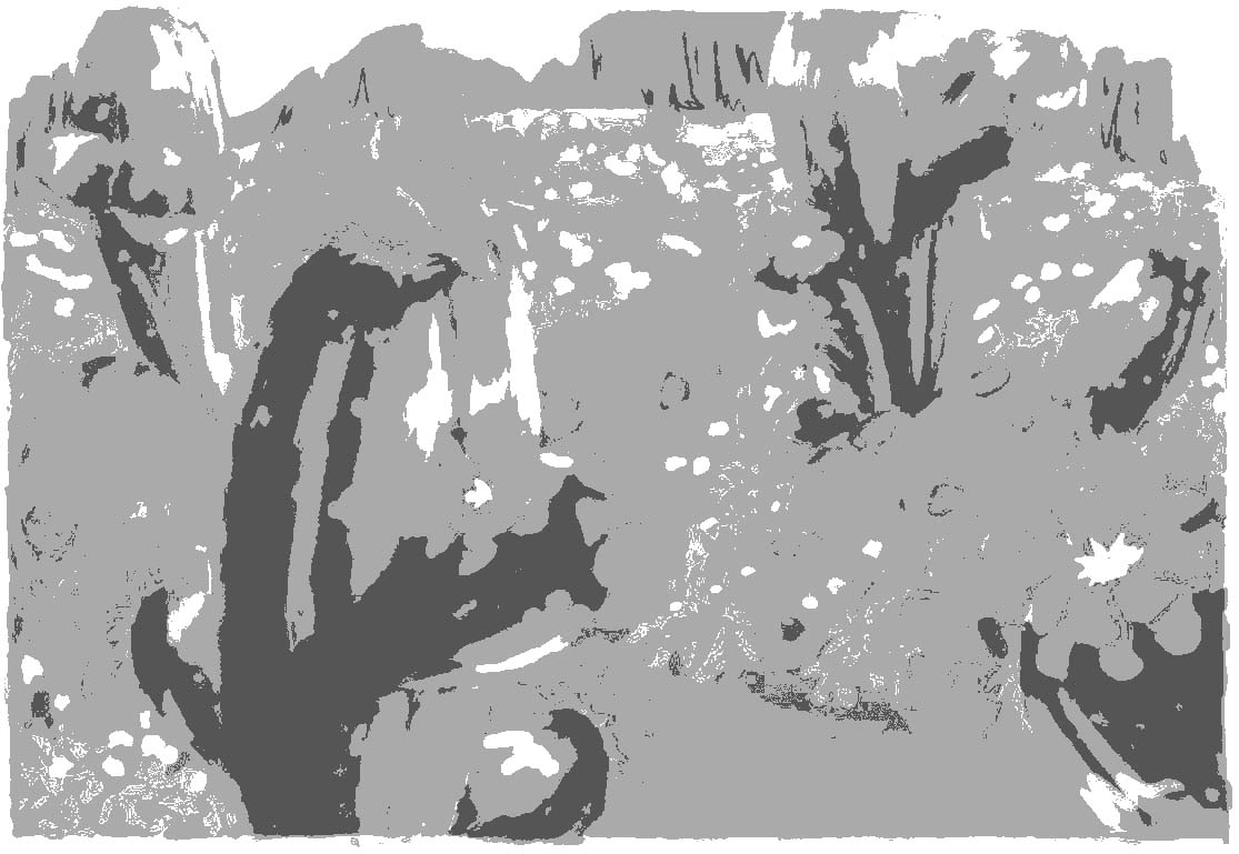
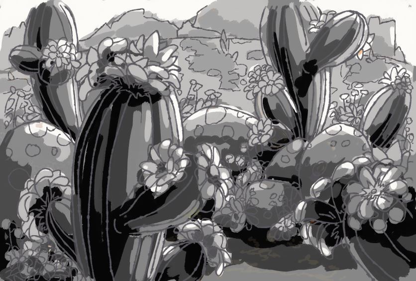
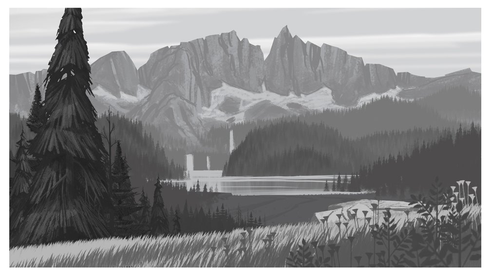
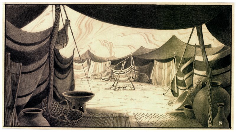
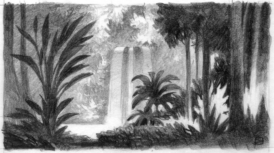
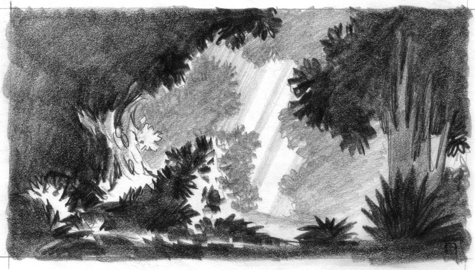
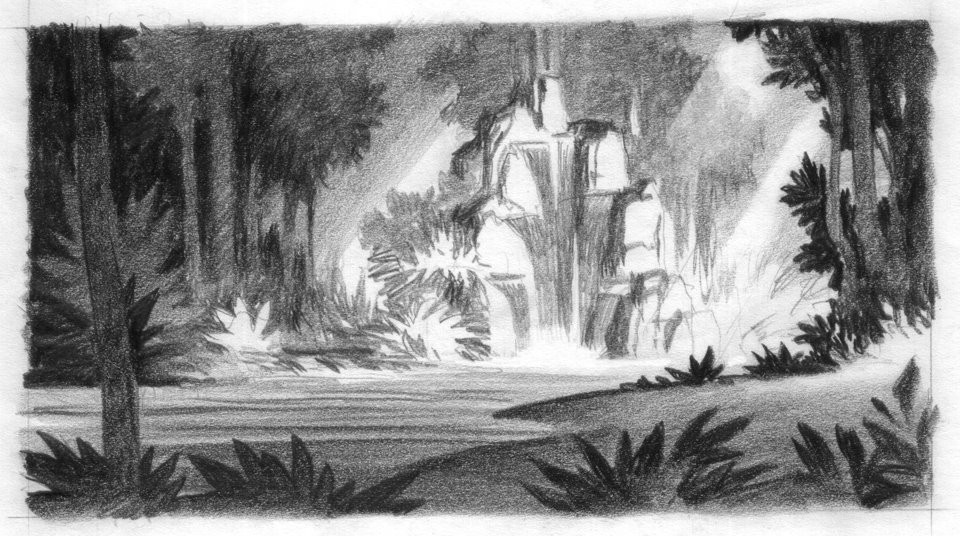
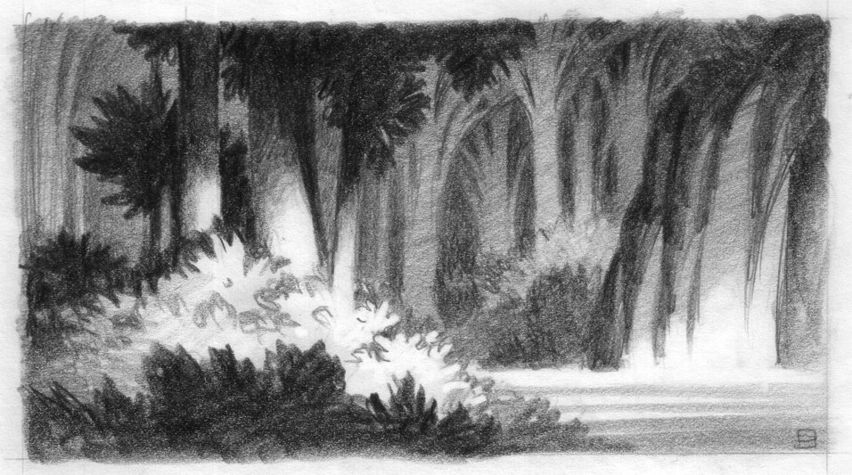
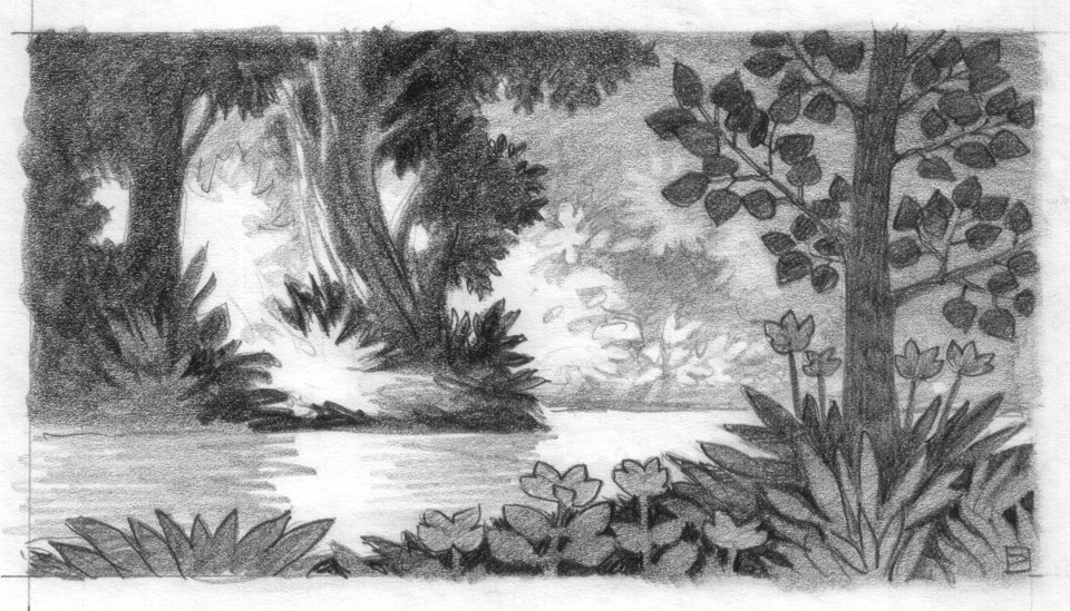
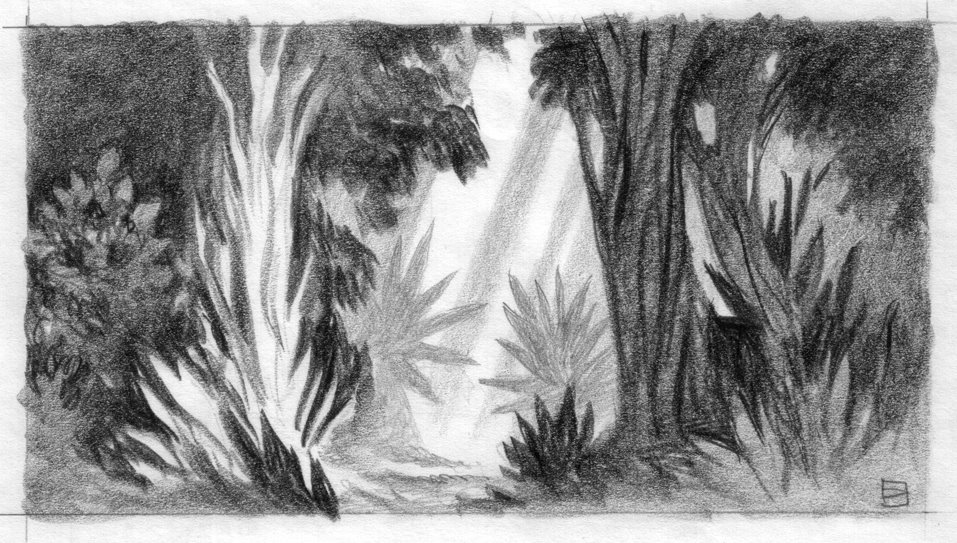
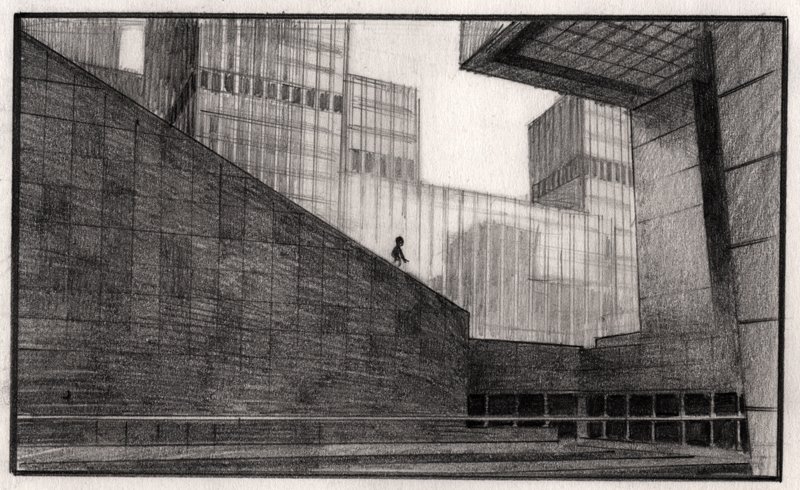
That's getting there. The problem is that you are thinking in terms of lighting before thinking in terms of local value (local color). A dark green cactus, even when lit wont go nearly as bright as a light flower. And a lighter flower will never go to black in terms of the shadow tone. Of course, saturation plays a part in all this, so it's not totally cut and dry. But for ease of teaching, just think of each thing as a flat tone and as yourself "Is this local value light or dark". Then add the lighting on top of that, but try to keep the items separate and make sure they still read when the image is small.
Does that make sense? Here's a quick way to check that idea. Notice that if you make the image very small or squint at it, the cactus shapes stay intact and then there is the darker rocks, and then the flowers and lighter background items. They all stay separate. That's the easy way to remember this and it will really make image making a lot easier. To put it another way, most people over light the scene and then the values are really hard to control.
