Understanding value
-
I think I'm starting to get "value" but I'm really curious to hear how other people are using value practically in their art. I believe I've been thinking in terms of value for many years but I've never really processed it consciously and used it explicitly as a tool for informing my art.
I did a photoshop course about 12 years ago with a successful photographer and I remember him saying "to get the best out of photoshop you need to understand photoshop sees everything in shades of grey". Interesting!
For me - practical application going forward will be to thumbnail my compositions in grey scale. Use shades of grey to help tell my story (lead the eye etc). Then choose colours that correspond to those values.
I'm really keen to hear what other people are doing, please share. For example, how many people are painting over their value to let it do the heavy lifting for tone?
-
I think this says everything ; form, vaue and lightt
-
I got this from Sycra Yasin which might be helpful
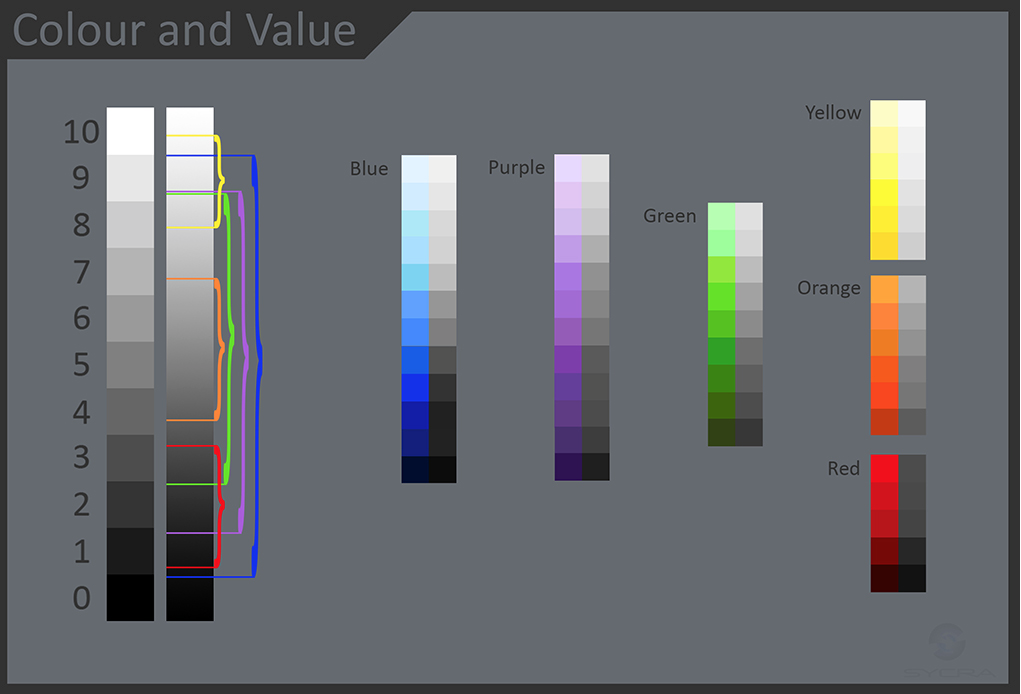 http://sycra.net
 -
Thats a great chart.. One thing that should help you understand value is that value is independent of color, you can have two colors that have the same value. So it is easy for you to paint your compositional pieces or even do a full size image without color, then add your colors later with layer modes.. Did that make sense?
-
@Lee-Holland Thanks! thats helpful!
-
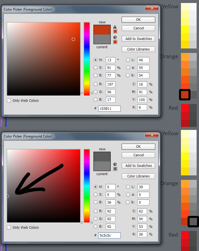
Thanks Lee. It's interesting how the corresponding value in Photoshop's color picker is not straight back to the left, but down about 30 degrees (see screen shot below comparing the deep orange and it's greyscale value). I guess one could reverse this pattern if they start with value and want to find a corresponding colour value of chosen hue (hope that makes sense).
-
Great discussion guys!
I think one BIG thing to keep in mind is that you are actually talking about value vs. saturation. It's tough to make an accurate value sketch if you have something that is actually going to be darker, but saturated in color (which will help it separate in the final color image- such as red. So if I know something is going to be emphasized by color saturation in color, I typically lighten it in the value sketch just so it will separate from the things around it. It's important to understand how that is going to work and not just rely on doing a black and white value study and then color with blend modes on top of it.
Does that make sense?
SVS Faculty Instructor
www.leewhiteillustration.com -
It is always really interesting to take your color rendering and change it to grey scale. If your values are off the image will read poorly. I for one struggle with getting the values right.
-
@Lee-White I know exactly what you mean. I still struggle going from thumnail to color sometimes because I had to use a value that doesnt directly correlate to the color I intended/need because to use the same value in that area created a large unsightly gray mass. It's great to know the struggle is real. Thanks for your input.