Oz feedback
-
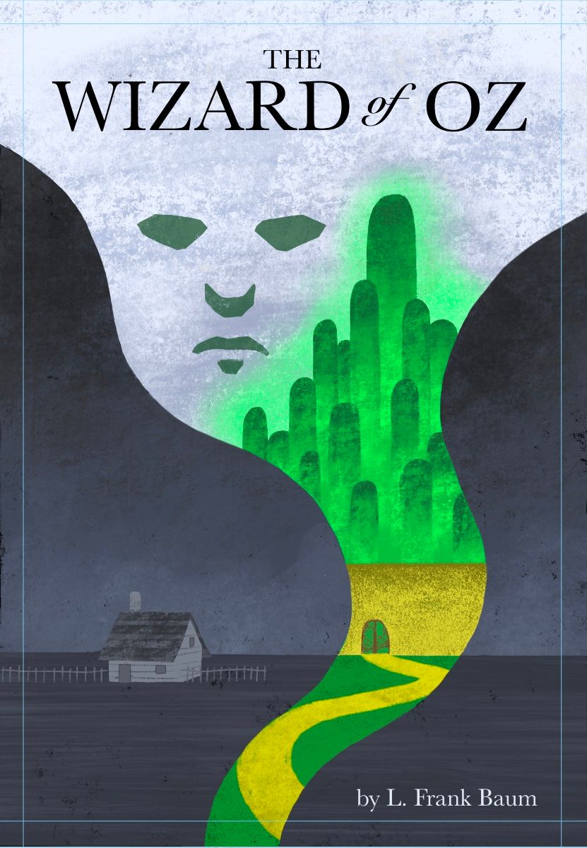
This is pretty near to completion, I feel like I’m in that last 10% and I want to hear what you’ve all got to say so I can incorporate as many changes as I need into this last bit. I feel like the sky and ground in Kansas are a tiny bit too bland and may need more texture or something. Same goes for the wall and the yellow brick road. Just feels like something is lacking. Let me know what you you think

-
Personally I don't think it feels bland at all, and I really like the contrast between Kansas and Oz.
 But, and this could just be me so take this with a huuge pinch of salt, to me the tower in the Emerald city looks like a giant middle finger! Perhaps it'd be worth tweaking the shapes just a little? The face is also a little ambiguous to me, not quite sure who it's supposed to be. But I really like the color play and the graphic shapes, it's a neat composition!
 -
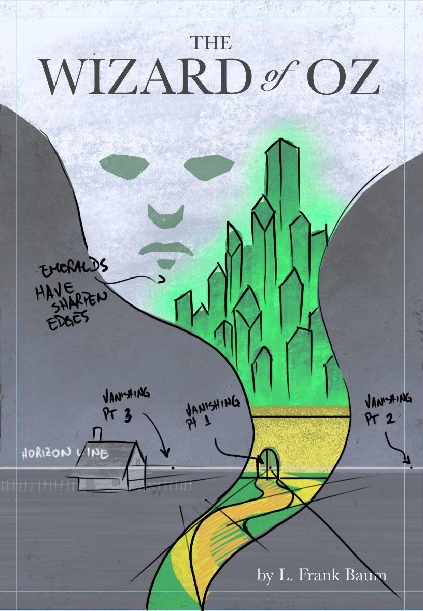
@Griffin , I like the composition and the collor pallete! I agree with @ina that tweaking the shapes, making them with sharp edges, will get rid of the 'middle finger' impression; I would also add that maybe adjusting the perspective can give you more depth in the image: the door is above the horizon line and the yellow brick road is not set to the vanishing point. Also, see if the proportion between the house and the door fits with what you're thinking about. I'm attaching an example of what can be done.
Hope it helps!

-
@Danilo-Silva Technically Emeralds can have a smooth polish too.
 But I do like the angular shapes you added.
 -
@ina the face is meant to be the wizard, sort of like the giant floating face in the movie. I’m okay with it being a little ambiguous or mysterious because that’s fitting to the wizard. Funny you pointed out the middle finger thing! My dad pointed that out last night but up until then no one pointed it out in past feedback but at least I have time to fix it!
-
@Danilo-Silva I really like what you have proposed with the city! I think I might go with those angular shapes. Before I was thinking of getting rid of the middle finger by adding some more tall building around the big one but harsher angles make the city feel a more important or grand. As for the perspectives between Kansas and oz, I’m not worried about that lining up correctly because they are two different worlds. If the gate were at the same point as the horizon line in Kansas then it would be suuuuuper far away haha. So I’m kind of just going for visual appeal and not perfect perspective measurements.
Thanks so much for the draw over! -
@ina , you're right! Just thought it would be clearer to show them like rough crystals :). Thanks!
-
@Griffin , great! I'm glad it helped you. Most important thing is that you put your feelings and your point of view on it. Thanks!
-
@Griffin Funny, I wonder if it's our minds or that people didn't want to say anything...
 The fixes worked really well, great work.