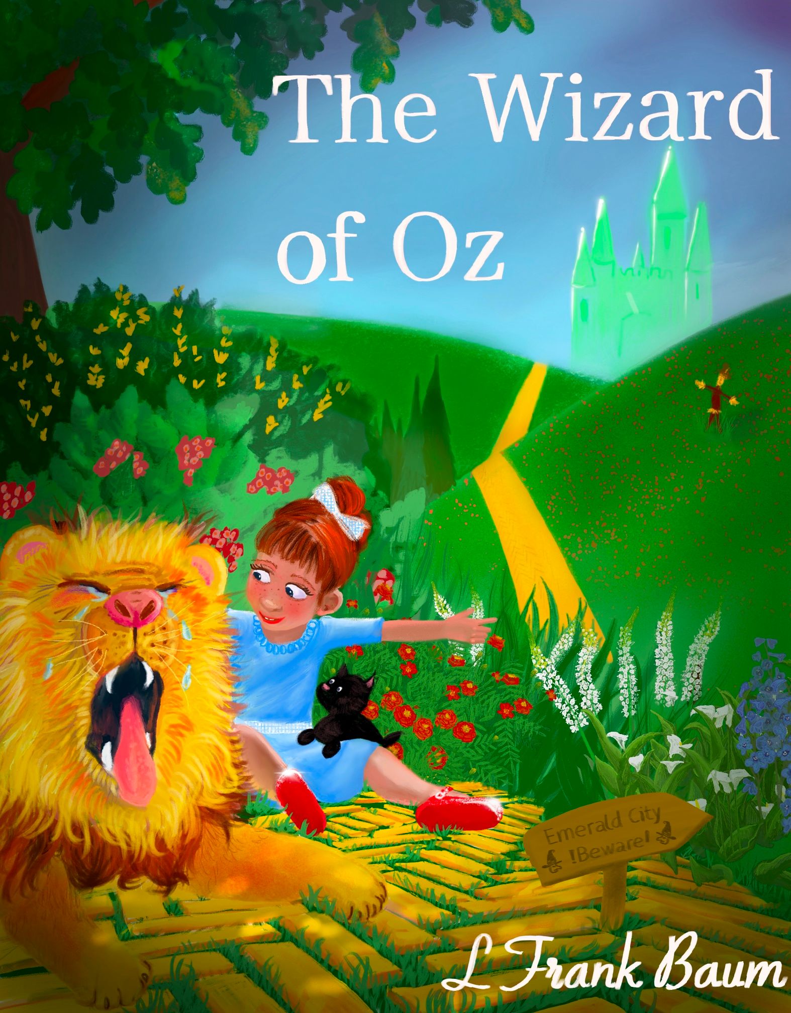
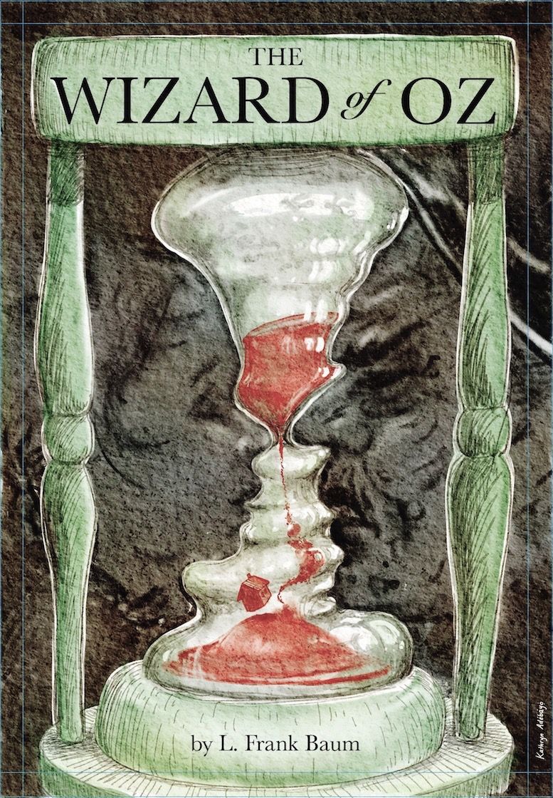
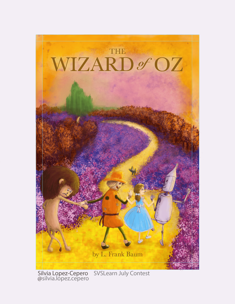
JULY CONTEST: Design a book cover for the Wizard of Oz
-
@alex-hochreiter thank you so much for this nice review!! I loved to read your thoughts about the cover! And all the things you pointed out

-
@Kerisa I really love how you included the city and road into your design!! It works wonderful
 also your monkey is super beautifully drawn!!
 -
This post is deleted! -
So many great designs, it’s really inspiring! I decided to give this a go quite late in the day and whilst I’m a bit iffy on it the podcast gave me a little kick up the bum to get it finished and just learn from it. Looking forward to August.

(Uh, I accidentally uploaded a very slightly earlier edit without the sign so I have swapped it out but if that isn’t allowed...well...uhh...judge me on the first edit? Both were in on time, thank you sorry, sorry)
Laura Beattie
Svs: @mamadraw -
Hi @Marta-Kitka, one word: WOW!
-
@aprilshin Thank you so much. I really appreciate that boost of encouragement.
-
@DKRyland This cover is very interesting just from a graphic design perspective! It definitely stands out. I love the footprints.
-
@Quackamos Very likeable character designs! I like the slightly sepia colors and the subtle way you handled the bricks. Also, cool font choice!
-
@Jordi-Ventura The character designs are so fun and appealing! I like the style of mostly flat colors with some subtle textures and shading. Everything works really well together on this... very unique color scheme, too!
-

-
@Tom-Shannon Really strong, eye-catching composition! Love the expressive title font! And the white silhouette is really effective.
-
@Mary-Toth This one is really fun and different! I love the concept of it, and the watercolor rendering is quite polished.
-
@Megan-van-der-Berg This is truly amazing, from concept to execution. So much to look at... but the eye never feels lost. It all makes sense to the concept and themes of the book. If I saw this at a bookstore, I might have to pick up a copy, even if I already owned the book!
-
@ina This is brilliant, zigging into red when the obvious direction is to zag into green. The bold choice really works!
-
@miranda-hoover I really enjoy your Dorothy design! And the skewed perspective is really effective in portraying that she is coming to a new world.
-
@mag Absolute love the rendering here, and the muted, warm pallette.
-
@Ryan-Ehr So much to love here... the innovative composition, the limited palette, texture of the rendering.
-
@Ryan-Ehr Love this approach!
-
It was a challenge, but I can’t say I didn’t enjoy it!
 so great to get people’s feedback in this forum... so helpful! Love all the designs

-
@mag You incorporated so many elements so well! This is easily one of my favorites so far. Some of the best and most unique character designs (and expressions!), really fun composition, eye-catching and playful typography, and really subtle use of texture and color. Wow.