The Fruits - Educacional Project
-
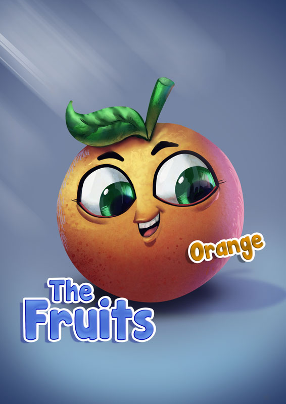
Hello Guys!
I would like to present the new project of my studio.
I hope you enjoy. -
@Felipe-Moreira Awesome!
Were you looking for any crits at all? Forgive me if you weren't but if you WERE....
It might be better to move the "The Fruits" logo away from the orange a bit. Right now it seems tangenty.
I really love all the attention you paid to all the different lighting (particularly the bounce light)--however the top of the leaf doesn't seem to be rendered at quite the same level as the other elements in the image, similarly, I don't think the bottom leaf occlusion shadow should be "black."
While we are on the subject of black: the thing that stands out the most to me, after looking at all the awesome lighting, is the intense black of the eyes. Would it be possible to knock it back some? I get that this is cartoony so I'm not saying eliminate it (though you probably could!).
Finally, I really like the floating "orange" text. But I would maybe play around with it's location more. It also might be cool to have it float more in front of the orange.
Even if you don't do any of these tweaks it's a great image can't wait to see more!
-
@mattramsey Thanks for cristicism.
I really enjoy it.
Best regards!