Portfolio critique
-
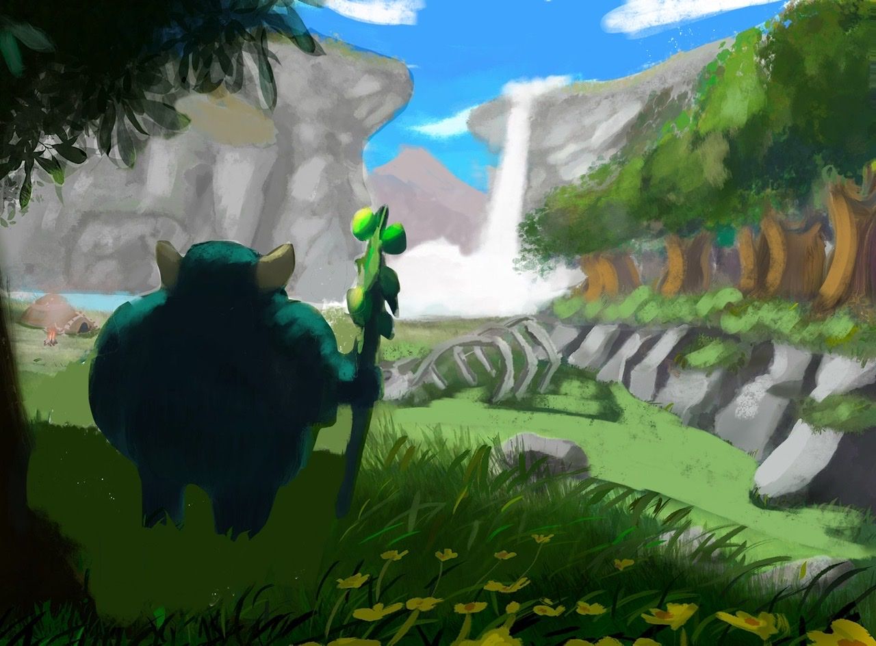
Hi guys this is my new draw For my portfolio, what guys think? What I can do better
?
-
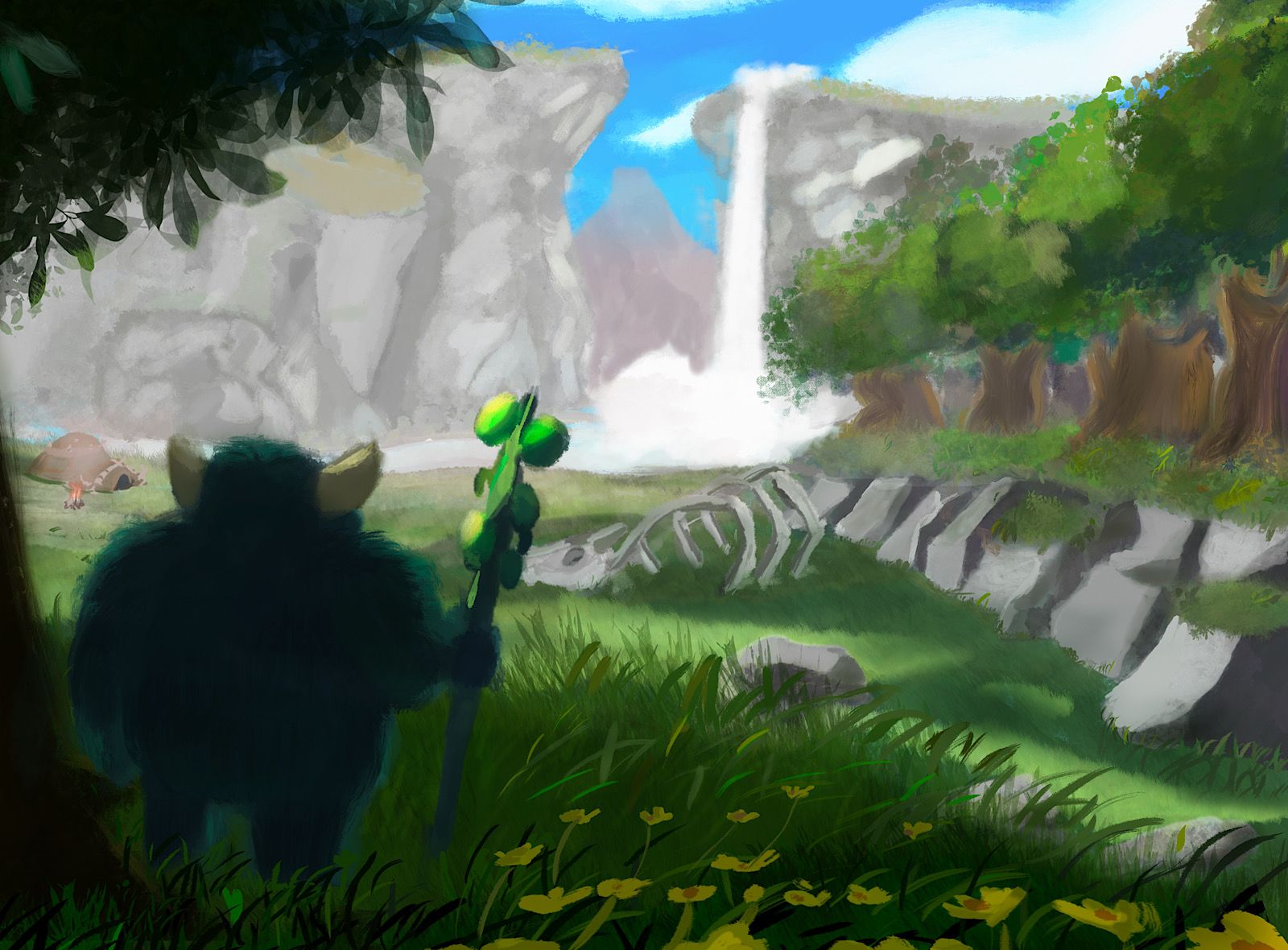
Hi! I’m pretty new to these forums but maybe I can help. I did a very quick paint over to show you some little things that could improve the painting. I hope you don’t mind. The first thing I noticed was that your monster guy was too close to the edge of the canvas and too dark, so I moved him a little closer to the center and highlighted the fur to make him pop and match the lighting on the staff. The next thing I noticed was how the slant of the mountain peeks were forcing the eye up out of the picture. Try to think about using all the lines in your illustration to pull the eyes back to the focal point. I also darkened the nearer cliff face a little bit. The next thing I noticed was you have shadows going in opposite directions. The tree in the foreground is lit from the left, but the other trees seem to be lit from the right, so I fixed the shadows. There are two other little things that I didn’t change but thought I should point out to you, first I would stay away from those stamp brushes for leaves and other highly rendered textures when you are using a more painterly style. The other thing is the hut on the edge of the canvas, I would either remove it or bring it in further. You don’t want important details so close to the edge. I hope this critique has helped you. The concept is fun and I love the colors you chose. I would love to know the story of this guy!