Critique help
-
Hi all. This is an older piece that I would like to re-do in digital. I would really appreciate any advice/ critiques on things I could do to change and improve this before I start on the new version. I like the concept but I think it could be better. Thank you so much for your help, you guys are awesome!

-
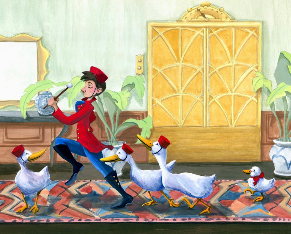
Hi Joanie, What a nice illustration! There some things like, the pattern on the carpet is a bit distracting, maybe take the vase away behind the arm of the bell-boy. It would be fun if there is a bit more action, like one of the ducks falling over? And of course the mini-duck needs a hat. The right leg looks a bit strange, its better if you only see it straight from the side. you go and make it rock!
-
@joanie-stone you may want to play with the angle of the viewpoint more. The wall in the background is quite flat. What if the viewpoint were a bit more to the left where you are looking at the figure in 3/4 with the ducks following behind. When I see the image I am imagining what my reaction would be to seeing this. You could add figures with looks of puzzlement or amazement on their faces. Are they going to help with a guests luggage? Maybe we are viewing this scene as a 3rd party over the shoulders of the guests. Placing the guests and their luggage in the foreground could add some interest and more clearly tell the story.
I did a quick thumbnail on a post-it note for you.

-
Hi Joanie,
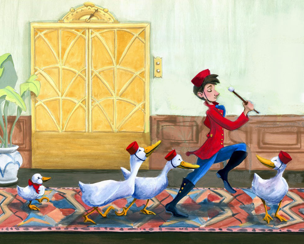
You've already received some great advice. Here are my suggestions: 1. In most sequential art the images need to move from left to right to progress the story. 2. You have such a wonderful gesture in your main character but it's being confused with the plant, vase/bowl, table, and mirror in the background - I don't think you need those to tell your story. 3. The shadows on the rug have a lot of texture which is gaining attention - this is a rendering issue and it's not easily solved in aqueous mediums. Really nice piece!

-
@Will-Terry thank you for the draw over and advice it helps me out a lot. Thanks everyone I'm going to incorporate your suggestions and I'll post my progress as I go.
-
@seanwelty thank you this is great advice.
-
getting rid of some of those elements really improved the clarity. A couple other minor things I see:
The lead foot is probably showing too much sole (it makes it seem like he is kicking it out toward us which I don't believe is accurate unless he is doing some kind of funky dance move).
The duck right behind him seems to have a tangent going where the bottom of the back wall is in direct line with his bill.
The duck behind that duck (the one looking up at the back of the guy's head) seems to have some weird anatomy. I didn't look at any duck references so maybe yours is accurate but that lower belly-into-the-neck area seems a little wonky.
Finally, I think we would probably see some of the guy's back arm/hand.
These would be pretty easy fixes in Photoshop (or other digital program) but I would guess nigh impossible with water color? I'm not sure--when it comes to traditional media I have more experience with acrylic and oils.
This is a really fun piece overall though--like it a lot!
-
@mattramsey thanks for your feedback and I agree with all you said which is why I want to re-do this piece because I know it has some issues.