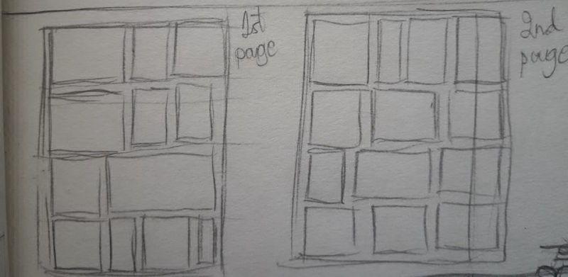
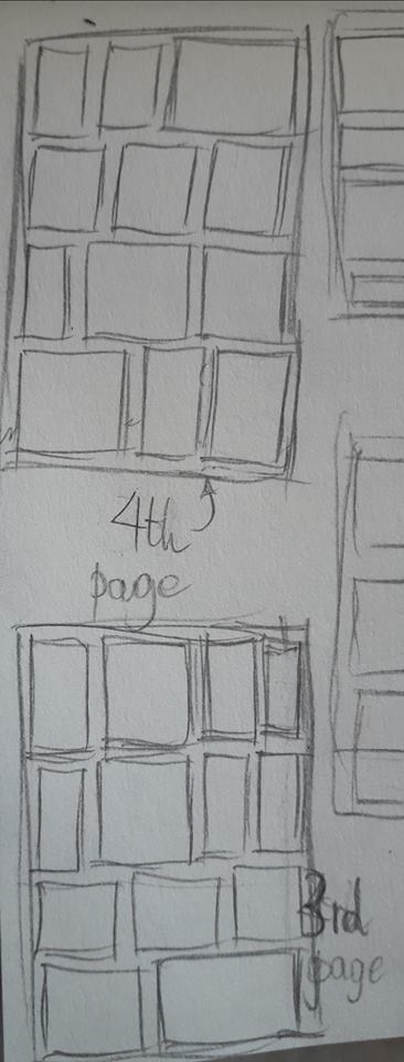
Comic pages thumbnails
-
Hello, hello people.
I'm in the process of making a small, 4 paged comic for a competition here in my country. I was making storyboards-ish yesterday and made miniatures of the pages. I see that most of my panels have the same size. Is that a problem? Does it look monotonous?
Also is that the correct way of doing things? The final pages will be A3 sized, so I thought I'd first make some samples in my sketchbook. If you have a suggestion for the way I do things, I'd love to hear it.

-
Howdy!
It can get monotonous over a long comic, but four pages should be fine. Reminds me of the layout of Herge's Tintin comics.
There are some panel configurations to avoid for clarity (Scott McCloud covers these in Making Comics), but in general you try to avoid ambiguous reading patterns. That is to say, the reader should not be presented with a choice of which panel to read next. The easiest way to accomplish this is to have very clear rows, which you do.
Panel size also can suggest the importance of a panel and the amount of time a reader should spend looking at it, thus controlling pacing and sense of time. Developing a consistent pace / rhythm in a comic is important (which is why a lot of artists use a consistent grid structure for every page), but it is also great to break that rhythm at least once in a comic. Any variation should absolutely relate to the content of the panels.
Hope that helps a bit!
What's the story about?
-
@tianlian said in Comic pages thumbnails:
I see that most of my panels have the same size. Is that a problem? Does it look monotonous?
I suppose it depends on what you're going for.
If you're going for a retro or classic feel, then similar sized panels laid out in simple lines is just fine. If you're going for a more modern actiony superhero kinda thing, then probably not so much. But then again, sometimes it's all down to style, right? If your project is going to scream indie comic, then panel layout could be whatever you want.
That's one of the reasons I love doing comics. Past certain basic conventions there's no 'right way'. Crazy versatile medium.
edit However, if you're going to follow anyone's advice then definitely use Scott McCloud's (thanks @aaimiller ).
It may be a good idea to look at some references. Say 'I want my comic to look/feel kind of like (insert comic title here)' and then see how that comic uses gutters.
As for the 'correct way of doing things' I think everyone's a little different. Do you have a full script? If so, do you have actions and such written in?
-
@aaimiller Hello there!
thanks for your insight. You make some good points. I just feel that it's something I should be mindful of but like you said maybe for a small comic it's fine. I feel like the limitation of 4 pages for the competition limits me. I want to fit everything in a small setup. Perhaps I didn't pick the best story for such a small comic.
So the story's about a robot that's built for war and is supposed to come alive at just the insertion of a coin. Problem is, it doesn't come alive. Instead it wakes up at night to look at the stars unbeknownst to the engineers. How does that sound?@Art-of-B I see. Only once you're actually doing comics you see how much work goes into them. I appreciate the advice. I do have a bunch of comics to take reference from.
-
@tianlian It sounds like a really cool concept!!
-
@tianlian intriguing concept! Giant robots and rogue AI are always great.
-
Thanks a lot peeps! When I get back home I'll check out some of my favorite comics, see if I get any cool concepts for figuring out my panels.
If I get a completed, coherent comic out of this I'll be really happy. And who knows, maybe I'll do good in the competition too.