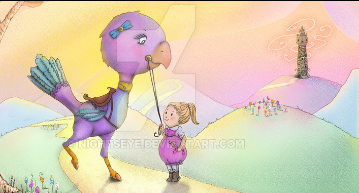
My first Illustration Project
-
I have set myself a project - I am going to create a very short book, as a gift for a family member. I have until 15th December roughly and I intend to created 5 pages and a cover. The project began with a drawing from one of the lessons here and grew from there. I drew the line, popped it into the pc and many hours later I had something I did not hate, and a burning desire to make more.
I have written the 'story/pros' which will inform the images. Its very average but for me it was a joy to make, and I hope the starting point from which my work can grow.
I completed one page today and I hope you find it interesting/enjoyable.
I gratefully welcome comments, questions and ideas.

-
Looking at it now I need to move the shadows and the font is not great.
-
Here's my opinion on going forward.
- Play around with fonts to get something legible and fits the tone of the work. Plainer fonts are fine and are usually easier to read; cursive-type fonts such as the one used are not always easy to read. And legibility extends to color, so maybe go with black.
- Feel free to share thumbnails and planning sketches. I'm sure others can help with figuring out the best composition for each page, and that way you'll have a good foundation to work off of.
My last two cents: maybe try purple in the shadows?
-
@Asatira said:
Many thanks for the feedback.
I will be editing it tomorrow and add some purple to the shadows, liven things up in that corner of the picture.
The font is just blah and I will try black. I wanted to maintain colour balance but its not worth losing the text.
Very grateful for your time and input~Nightseye x
-
Replaced the shadows and changed the text
Many thanks @Asatira for the advice about the purple and black text.


-
take off that watermark. its killing the picture.
-
as far as the image is concerned, you might want to try cropping the image a bit. There is a lot of negative space on the right hand side. Here is kind of what I was thinking.

Also the shadows on the ground are very harsh. When you are playing with light and shadow you've got to think of where the sun is coming from and what sort of shadow and highlightit would produce. There isn't a very strong sense of shadow in the rest of the piece besides on the characters. You might want to add shadows to the valley areas in the distance. That's my 2 cents.