Kasey's Sketchbook
-
Hello all! I'm new around here, so I thought I'd start up a sketchbook to keep track of my progress. Here I will probably just post random works in progress, sketches, assignments from the SVS classes, etc. I welcome any and all feedback as I, like you all, am here to improve and connect with others. So thanks for stopping by and taking a look! It is very much appreciated.

-
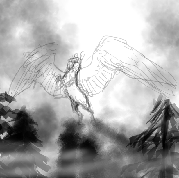
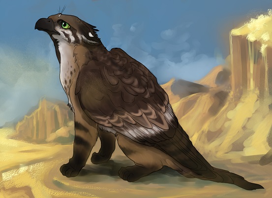
Some WIPs I've got circulating on my computer right now. I prefer to start gesturally/with value and build up my illustrations that way, but sometimes if I need to get an idea down quickly I will go for the faster, more graphic/cartoony/whatever-you-want-to-call-it look. I'm not sure if my work is at all marketable for book illustration right now, but, well, that's what I'm here to get advice on.

-
Hey nice, work. Love to see more stuff!
-
Yes let see some more of your work.
-
These look great. I'm still trying to get a handle on working digitally so it's good to see some sketchy stuff to guage how I'm doing.
-
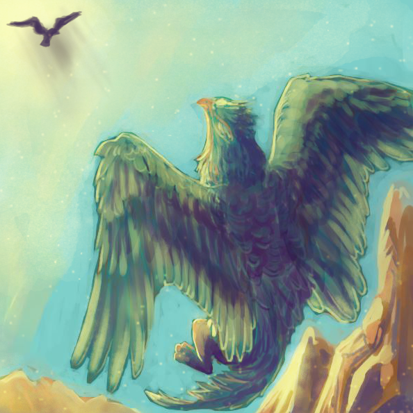
That griffin looks sweet. I also like the looseness of the sketch above and cant wait to see what that looks like when you are finished.
-
Thank you all for stopping by, I really appreciate the feedback. I'll try and be better about posting more frequently around here now that I am all moved in to my new place and (mostly) settled.
@Jonathon-B Oh man, I dunno if I'm a good gauge for what you're supposed to do digitally. My work never seems to reach that "finished" stage and usually retains a lot of that sketchy looseness when I feel like it's completed. I don't know if it's that I just have a hard time pushing the finer details or if I just get bored with it once I feel I've gotten the message across. Maybe a bit of both. But I guess if it is of help to you to see someone else who has no idea what they're doing, well, then I'm glad to be of service!

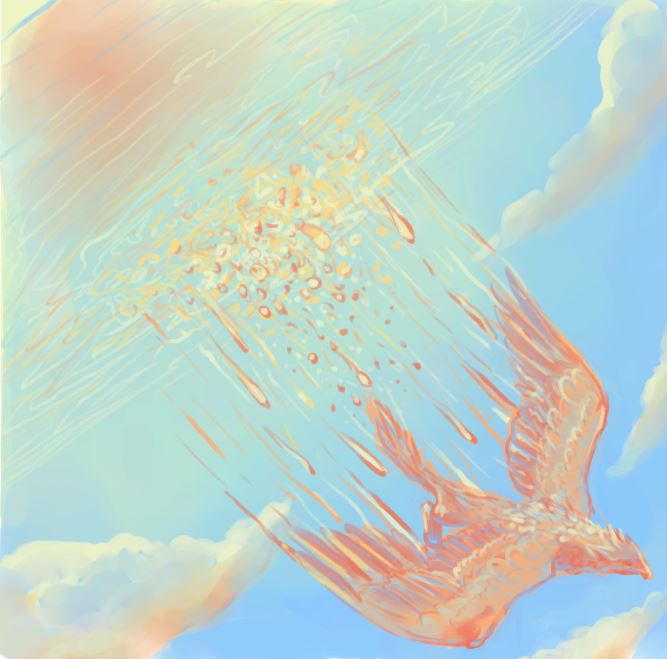
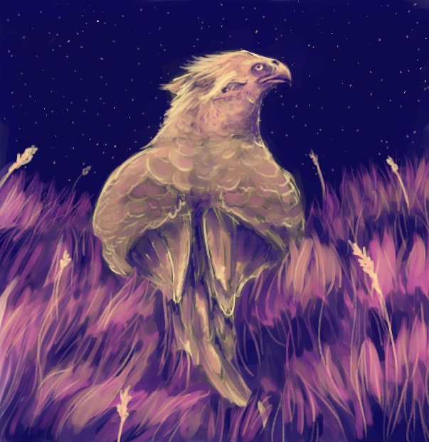
Here are some warm-ups I've done over the past couple of days. I'm doing this thing called the 100 Palette Challenge and chose gryphons as my topic since I have a side project going with mythological creatures. Figured it'd be a fun way to stretch some creative muscles.
I haven't made it back around to work on that black and white winged deer sketch I had posted earlier, but I should probably work on that so I can show some progress. -
It's been a while! Life's been a bit crazy for me this past month. I did my first convention (following in Will's footsteps, as it turns out) about a week ago and spent most of October preparing for that. Here is a picture of my set up:
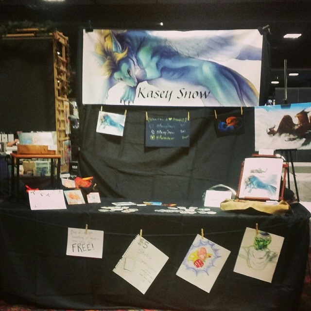
It went pretty well I think. I made my table back plus the cost of getting prints and other products made. Didn't make back the banner/backdrop, but hopefully now that I have an inventory I'll be able to go to the next con and make that back and maybe even some profit! Really though the main goal was to pass out a lot of business cards and do some networking, which I think was moderately successful. It was a smaller con so there weren't a TON of people looking to hire artists, but I did get some who were interested in contacting me for future projects, so hopefully some of those will pan out. I'm thinking my next stop might be Denver Comic Con in June. It'll be nice to have 6 months to prepare as opposed to only one, haha. Oops. Live and learn.
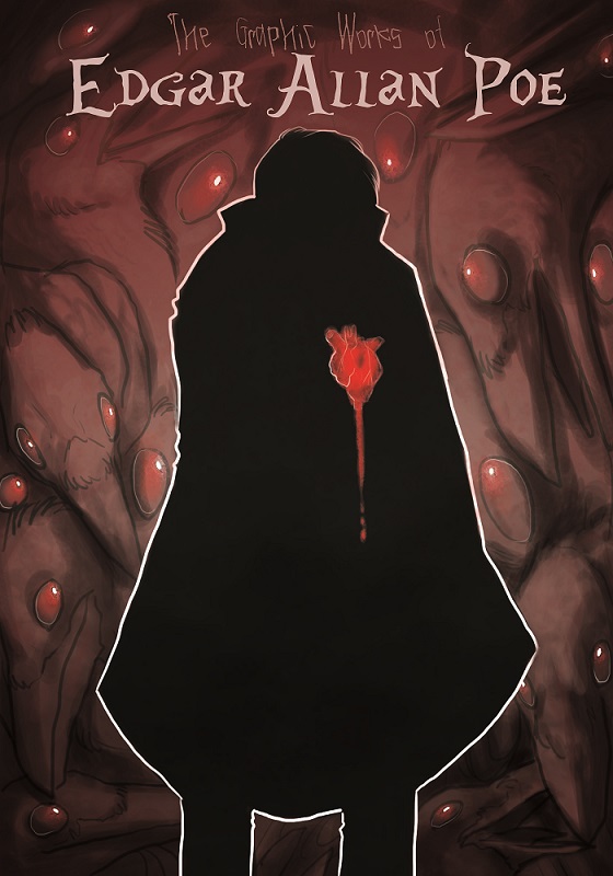
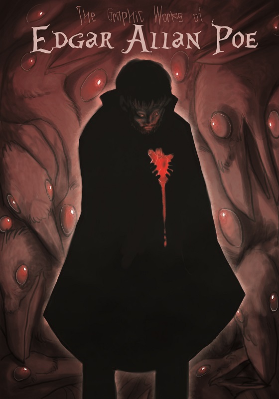
Anyway, here are my thumbnails and sketches for this month's 3rd Thursday. I really probably should've fleshed out a different thumbnail (I was actually more partial to the third one) but I ended up going with the first one because it looked more book cover-ish to me and had a fun graphic novel feel to it the more I worked on it, so I just pushed that aspect a bit. Hopefully it came out okay. Because I've been MIA for a month I didn't realize that the deadline for this month was tomorrow. Ugh. And here I thought I was getting ahead, but really I ended up scrambling to finish in time anyway.
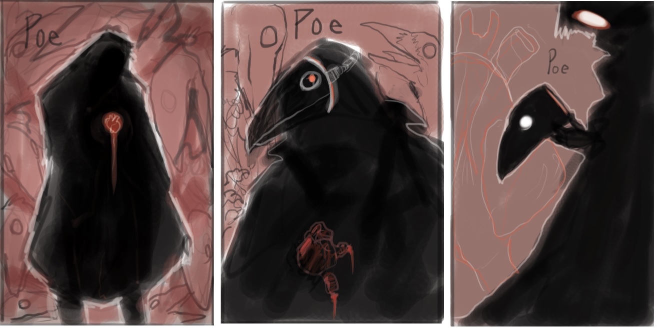
I will happily take any critiques you have! Even if there's not much time left to alter anything for the contest I can still adjust for my portfolio! Who knows, I may revisit those other two thumbnails tomorrow for my warm up for the day and just see what happens. So feel free to comment on those as well.
As always, thanks for stopping by! Hopefully now that the convention is over I'll be able to post more frequently around here.

-
@Kasey-Snow I like the concept of the ravens in the background. I would like to see them more fully rendered. Just be sure not to push the values too much. I would keep a low key and not exceed a value of 5 at the high end and 8 at the low end if 10 is black. The composition is very symmetrical and with the figure facing straight forward, the silhouette is a bit boring. Maybe if you turned the figure to more of a profile it would add interest. I like the center thumbnail above your final image for this reason. I also think that the white surrounding the figure is distracting. If you think of the white around the figure as a rim light from slightly above (Maybe the ravens red eyes are the light source) it will add rather than detract from the image. I would also stay away from using pure white. The brightest area should be around the head and the value should decrease from there. Shift the rim light color to the warm red of the ravens eyes for more continuity.
-
@seanwelty Thank you very much for the feedback. I was worried about the composition being to centered and boring, that was my biggest gripe about that first thumbnail and why I didn't originally intend to try and flesh it out more. I was afraid if I rendered the ravens too tightly it would distract from the image but I will mess with it a little this morning and see if I can come up with something better because yes, it does look very unfinished. I also agree with you on the white line and am playing around with it again now. Thanks again for all of the crit, I'll see if I can get any of this stuff fixed in time to submit.
-
Hm, made some of the changes. Added a face I'm not sure about to kind of help redirect the attention back to the figure and away from the ravens. Thoughts? I may submit this one instead since I do like the toned-down white better.
-
I like this, it is creepy and interesting, and so much better with the amendments! It really gives a focus to the piece. I like the glowing heart shining light up on his face... Btw your gryphons are great too - they look like fun to draw..
-
@Dulcie Thanks! I'm glad it works better now. Creepy is not really easy for me as everything tends to come out looking more fantastical or cute, so I'm glad you think it's still got that spookiness to it.
And yes, the gryphons are fun.
 I need to get back to that project, actually. Thanks for taking a peek in here at my doodles!
-
Very cool.
-
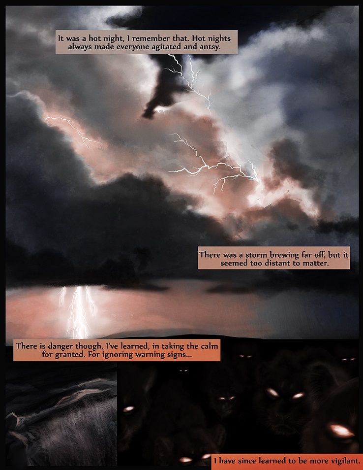
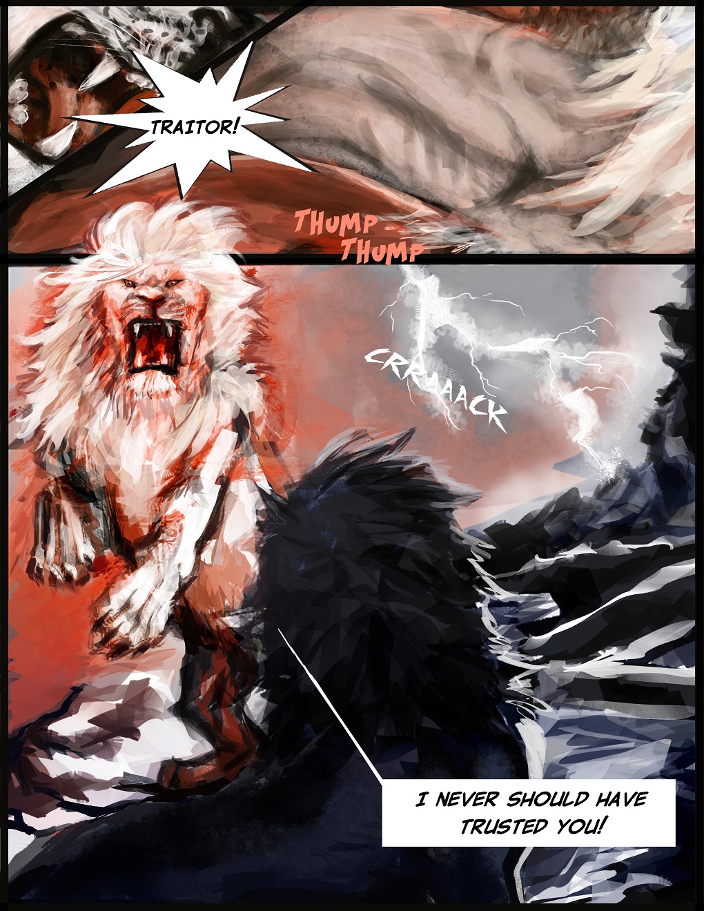
So I've been trying my hand at comic pages lately. Wanted to pick something I felt comfortable drawing relatively quickly, so...animals. Also wanted to play with a unique style that would look different from the typical comic page.
Clearly I do not know what I'm doing with type. I really need to take a typography class, ugh. Also, sorry these shrunk down versions saved at different sizes, not sure how that happened. Too lazy (and my connection is too slow) to bother changing and re-uploading.
-
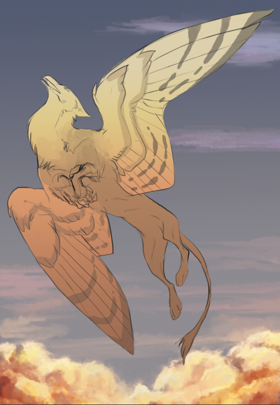
Trying to figure out lighting and photoshop and so I have a bunch of unfinished drawings like this one scattered around my computer. I got fed up with my lack of photoshop ability and so abandoned this one for now, but maybe I'll revisit once I have a better understanding of how to achieve the look I'm going for:
-
@Kasey-Snow said:
Trying to figure out lighting and photoshop and so I have a bunch of unfinished drawings like this one scattered around my computer. I got fed up with my lack of photoshop ability and so abandoned this one for now, but maybe I'll revisit once I have a better understanding of how to achieve the look I'm going for:
I don't know if I'd focus on "photoshop tools" as much as I would just try and study up on lighting design in general. Yes, Photoshop has some cool layer styles and filters but people who solely rely on those to do their art come up with some pretty awful stuff.
I am certain that you can achieve all you want to achieve with a simple brush on a normal layer style. Once you've really nailed down light/color then you can sprinkle in some PS tools to sweeten things and get a polished effect.
I love this drawing of yours and it looks like you already have a good idea of your local color. We can work on taking it a few steps further but first--can you post (or reference) some artists or images that you like and/or would like to emulate?
That will help me/us push you in the right direction. I've seen your work so I know you can do this.
-
@mattramsey Thank you for the feedback and encouragement. I was just frustrated when I posted this I think, haha. I'm not necessarily trying to rely solely on filters and effects for photoshop, but I know there's ways to apply them tastefully to get the look I'm going for and I'm just getting fed up with myself for not being able to do what I see so many brilliant digital painters doing. I tend to work only with the brush tool to make all of my work, so I'm trying to broaden my skill set and force myself to learn how to use some of the tools photoshop offers. I feel it would give me more versatility with what I am able to provide clients. Does that make sense?
Anyway, as far as the look I'm wanting to achieve, I don't really have a specific artist or style in mind, though I certainly have influences. The way James Gurney and N C Wyeth use light in their work is something I'd like to get a better grasp of. In this case, I was attempting half lighting ( examples: [1] [2] [3] )
As for a look, I had to do some digging, but these are some of my influences in style. [1][2][3][4][5][6][7][8]
I wouldn't say that I'm wanting this image I'm working on to come out particularly like any of these styles, but I am definitely inspired by those works listed.
For my drawing, I was going for a graphic novel/2D animation still type look but still with some "painterly" elements, if that makes sense? I think I just got stuck at the local color/lighting on the creature (which is funny that you said you thought I got that part right). I really just need to deepen my understanding of how light works. I've been going through James Gurney's Light and Color book a lot and using it for art prompts; this was just my response to his section on dramatic lighting and how the color tints the scene.
-
I don't think your own work is too far from the 8 examples you posted. Some have tighter lines, there are ways to achieve that. Some of them have a limited color palette with color contrast as the main focus to make the subject stand out. The light you want to achieve can also be done in layers.
Will Terry has to me a ground breaking lighting technique in Photoshop I never knew existed until I took his 10 Step digital paint course. In it he is able to brighten sections on a separate layer that would save any artist HOURS of reworking by hand. I've been using it like crazy for the past 3 weeks since I learned it. It's one of those things that is so simple you never knew it could be that easy...
But Photoshop is the KING of doing 1 thing 10 different ways. It allows people to do what's most comfortable for their work flow, and or understanding, much in the way a traditional painter would just put in the time. So fear not, all that you're looking for is out there, well you know cause you've seen it in people you admire of course.
The half light effect you're looking for can be done with gradients. I've seen a version of it created by one of the artists in the Painting in Photoshop course. I think his name was Kevin Keele. He basically did a gradient map of his original piece, and began painting over it... but he was able to alter various areas in seconds that again would take hours to do normally.
I think the misconception of using filters and effects is what sets apart real painters in Photoshop from the button pushing of beginners. I know I have been there. I have clicked one too many filters like it was going out of style, because I thought THAT was how the effect was done, but those filters I would say are 80% there for photographers and editors. It's not for the look you're going for, and even in comics, over using them is the sign the colorist is a newb.
And I'm talking about the motion blur junkies, and the lens flairs and over use of color holds to tint lines. None of that is used outside of comics, but there are tools in Photoshop and techniques that will add to your repertoire. It's not all painted by one brush, even though the best of the best make it look that way. Yes they do use a select number of brushes and do not rely on texture brushes to do all their work.
It's a mash up of what's comfortable really.
Sadly some of this CANNOT be taught. Each artist is their own original master, and what they bring to their work comes from who they are, not what they have spent using over and over. Style can be emulated but not given, it can be borrowed from and morphed into your own originality but not turn you into the next NC Wyeth or whomever. In linework you can have clone artists, but when you start adding color, composition, texture and detail, those are distinct skills that can only be done with a thorough appreciation for, it won't make you that artist.
You will be a better artist garnering inspiration from those you admire, so that is really something to shoot for...
I hope your time here is productive, and you get closer and closer to your answers. All the best.
-
Some great tips for Cleaning up your linework in Photoshop from various artists... I am gonna try the making my image larger and resolution higher. My own goto technique was lowering the flow and opacity on a hard round brush. Anyway hope those help...