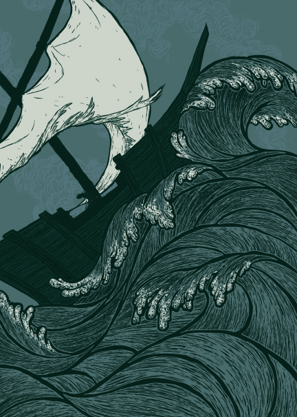
Ship in a stormy sea
-
I've started on a new piece and wouldn't mind some feedback as I get further into it.
The basic idea was to draw a ship in a stormy sea. I wanted it mostly to be about the storm, and have the ship be a fairly simple design--not something with several masts and sails and ropes everywhere. There are the thumbnails (along with some doodles):

I chose the one I liked the best and printed it slightly larger several times on the sheet so I could have room to play around with the waves. I wanted something really design-y, not exactly realistic.
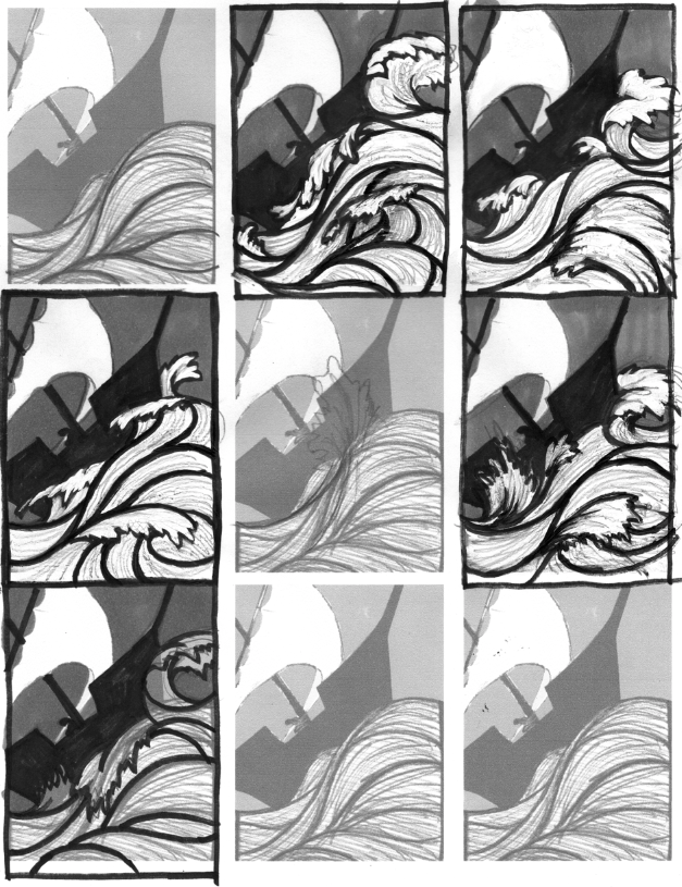
I chose the top center as the one I felt looked stormiest.
Then I did a larger, cleaner drawing of the whole thing with a brushpen.
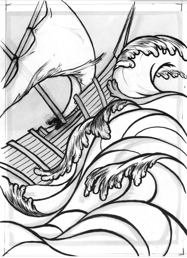
You can see a figure by the mast there. I don't want the eye to go there first, but I'm hoping that it will be seen later after looking for a few seconds. Is that working?
Any other comments are encouraged! And please mention anything you think IS working along with what might need to be changed, so I know what people like

-
Wow I love your drawings, I have not critz keep up the good work!
-
@Sarah-LuAnn I definitely noticed the figure by the mast but only on my second read. Success! My eye went first to the detail on the wave at the center of the image, then the flick at then end of it pushed my eye up to the figure.
I don't see anything I would change. I like how the torn sail echoes the thrashing waves and yet is obviously not made of the same stuff. You've got lots of really interesting negative shapes. And I'm definitely left with a stormy, topsy-turvy feeling. I think ti's great.
-
I love this image, the movements flow really well. The only thing I would do is to throw the poor guy a life jacket.
-
Really great drawing. Are you planning on adding color, it looks like a really fun piece to paint. Great flow and movement. My eye did go to the figure first I think because he is the darkest thing in there, but I think once you get the color in there it wouldn't be as noticeable. I also really liked the storybook borders you had around some of your roughs. I'm looking forward to seeing the finished piece.
-
Wow, thanks for all the encouraging comments, guys! I'm really trying to move slowly and make good decisions with this instead of just rushing into the final (as we all sometimes do, am I right?). Its nice to know that it is working out.
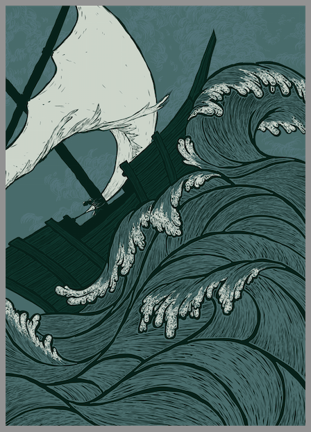
I do need a little help now though. I went forward with the drawing I had. I wanted to keep it really simple, working with just three colors--a dark green, a medium blue, and a light grey. Each layer is on multiply, however, so they interact a little bit to create some in-between values. I experimented with putting just a suggestion of clouds in the background that weren't in my sketch. Does it work? Is it better with this simple style just to keep it flat? Any other comments?
-
@Sarah-LuAnn Really beautiful. Love the waves and the figure in the middle. There's something with the sail, it looks wrong that its tight to the side of the ship, for the rest, no critiques. its very beautiful to look at this picture, thats what its all about. XD
-
@Sarah-LuAnn I like the cloud texture better than the flat sky, but I think it needs to be refined. I'm not sure how... maybe bigger swooshes? Or group the marks into more discernible clumps, like you have below the sail?
-
This is a fantastic piece! I agree with @Maile-McCarthy about the clouds... some sort of stormy texture in the sky, or even a slight value change (like, lighter at the top, darker near the horizon) otherwise the sky almost "sticks out" as being the only flat surface...
Is the figure tied to the mast? Like Odysseus??

I love your work! Keep it up, can't wait to see the final!
-
Hey, this is me, but I isn't letting me log in through my facebook anymore so I got fed up and made a new account. Thanks for the feedback guys, I think you're right--I'll see about improving the cloud texture and post the finished piece here when I'm done.
Yes, the figure is tied to the mast. Like Odysseus, except there aren't any sirens ;-).
-
LOL Sarah's got the same problem as me. But hey your image is stunning I really love how you handle the waves!!! Great job
-
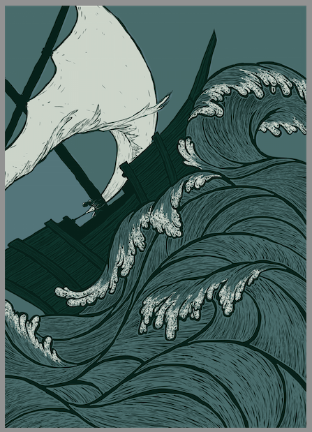
OK, here is my second try with the cloud texture. I grouped the shapes more, so there are places with more and less texture. Better, worse?
-
I absolutely adore this! Just how fluid, simple and beautiful it is is...is, well, it's stunning is what it is!
-
Really great line work and technique! I like the clouds better in this last version. Some of your other sketches were great as well. I would explore some of those options as well.
-
This is looking really good, I would highlight the waves a little, and add some shadow to them as well, so they pop.
-
@SarahLuAnn I keep flipping back and forth between the old and new images. It's so hard to decide, but I think I prefer the newer version with the grouped clouds.
-
Love the work, that texture is so satisfying, the only comment I would make is in regards to the way the sail passes through the man tied to the mast, it appears to be a part of him. It feels like a tangent... maybe you could attach the sail to the mast? That way the sail still carries the eye down to the man? Beautiful work either way!
-
have you ever checked out Yuko Shimizu's work? She was what I first thought of when I saw this. BTW, what portions are by hand and what are digital or is it all digital? I do think the clouds add something but at the same time everything else on the page is lined in black. The sky does need something....
-
This has turn out so nice I always admire people who can awesome line work because I suck at it.
-
I am familiar with Yuko Shimizu's work, I follow her on tumblr. I'm flattered that this reminded you of her work!
I go back and forth a lot between digital and physical--I don't have a cintiq, just a tablet, so the actual drawing parts are easier for me with pencil and paper. So my process starts with thumbnails on paper, I scan those and enlarge my favorite thumbnail, print that out, draw in more details, scan that in, make any needed fixes, print a pale version which I ink over, I scan THAT in, put the scanned inked drawing into illustrator, and then I do the full colored detailed version there. So ultimately the final piece is all in vector, which is really nice for re-sizing and such
 And I end up with a lot of physical printed-then-drawn-over versions of the picture, which I just stick in a box, for lack of anything better to do with them.
As far as line work goes, I was terrible at it not so long ago and I'm still trying to get better. A brush pen helped me a lot to vary my lines and give them a more natural flow.