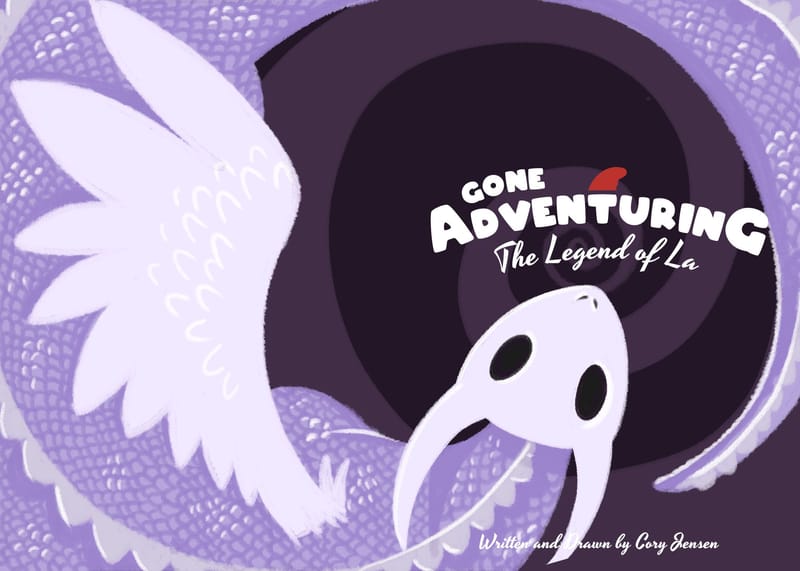
Gone Adventuring - A Graphic Novel
-
Hey guys!
I am working on a new graphic novel that is called "Gone Adventuring".
Its a story about a small gnome that finds himself pulled away from his quiet home for the sake of a cowardly king. As the danger of a ferocious dragon threatens his abode, our poor hero is forced to take a long journey to save the kingdom. He also makes the acquaintance of some new friends along the way.
I wanted to know what you guys think about this cover and what you would change or add.
Please let me know!
-
@cory-jensen Sounds like an interesting story. However, the cover needs some work. Your title is a bit lack-luster as it is not one that immediately grabs your attention, which is what you want on a cover. There are so many (so many) books out there that you have to compete with, so you have to use the cover to get the limited attention of readers. I would use something like "The Adventures of [your protagonist]" or "[Your protagonist]'s Adventures", or even better, come up with a unique name based off of the land this takes place in or the kingdom's name, or just your protagonist's name as the title.
As for the art, your dragon needs to be more menacing (and a less of a pastel purple), based on the context of your story summary. Perhaps faded behind your gnome, or as a shadow covering your gnome. The cover art need to be just as attention grabbing as the title. I have included a few covers of other books that I think point to where your cover needs to go.

Lastly, I would choose some different fonts for the title. There are tons of free fonts out there either thru Google fonts, or other sites, that you could create some really cool type treatments once you come up with your final title. Don't just settle for what you have on your computer.
-
Hi! I like the title, for me "adventuring" feels like a fun word, and I like the font with the little gnome hat too. I also like the general graphic look of the composition. I would think it is a good base. As pointed out, feels too bland for a cover though. I think a cover might relay just on a very simple strong graphic, or be a rich detailed image and I think yours is too inbetween. And being a children's book cover you probably want to go more towards the "rich"? Maybe by adding some more personality to the dragon and textures? Now the dragon looks a bit nondescript and there is too much blank space everywhere. By "nondescript" I think I mean he does not have any expression, he is not fierce, not cute either... If you don't want to depict the hero in the image, at least the dragon should have some character... Or the dragon could be just a graphic suggestion but Ii think in this case you should show the hero... The spiral around the title is too simple and brown... I think it stands for "the adventure," so it might have a forest texture or some interesting light.. Some detail...I hope what I said makes sense and is helpful! Good luck! :)))