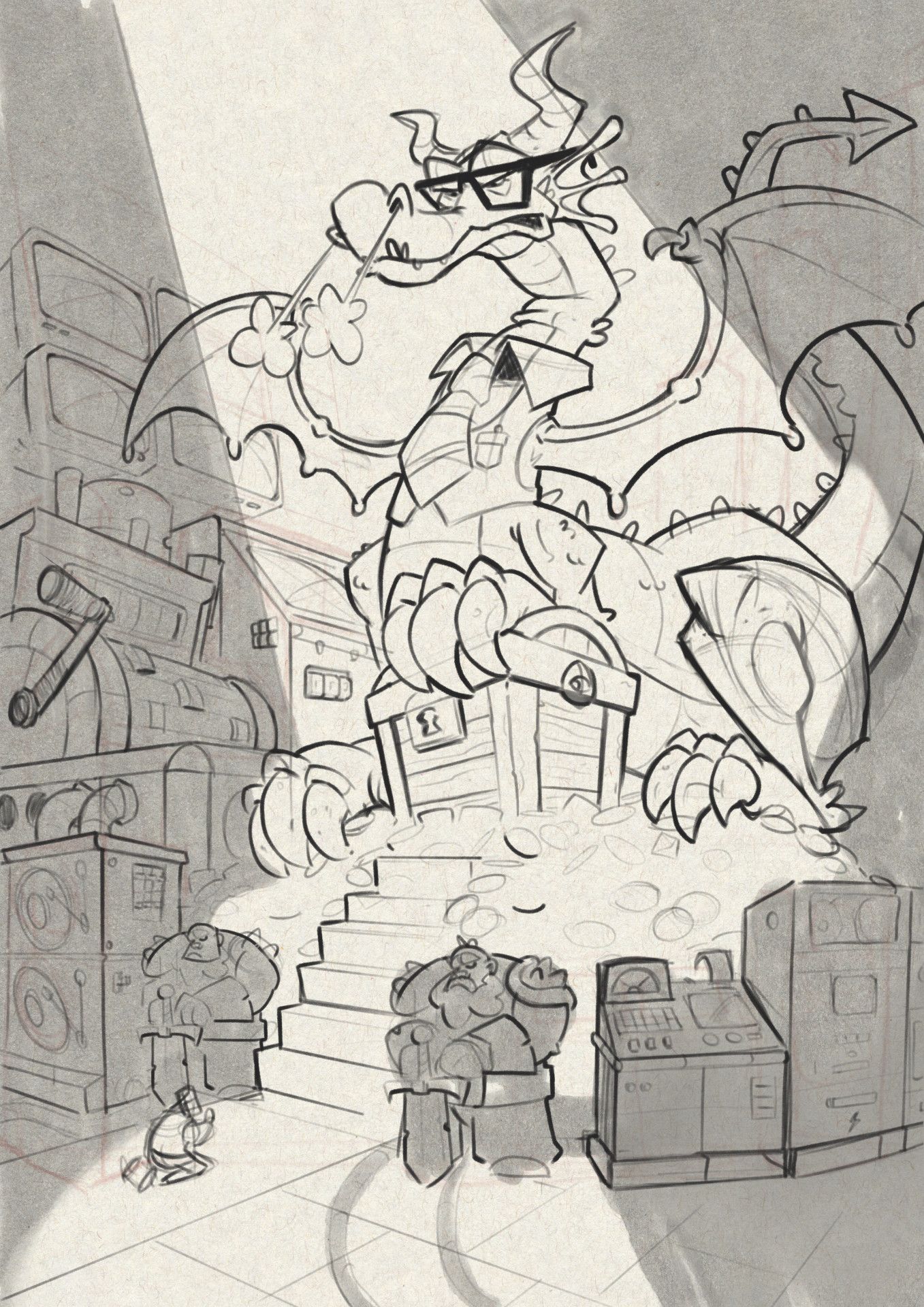
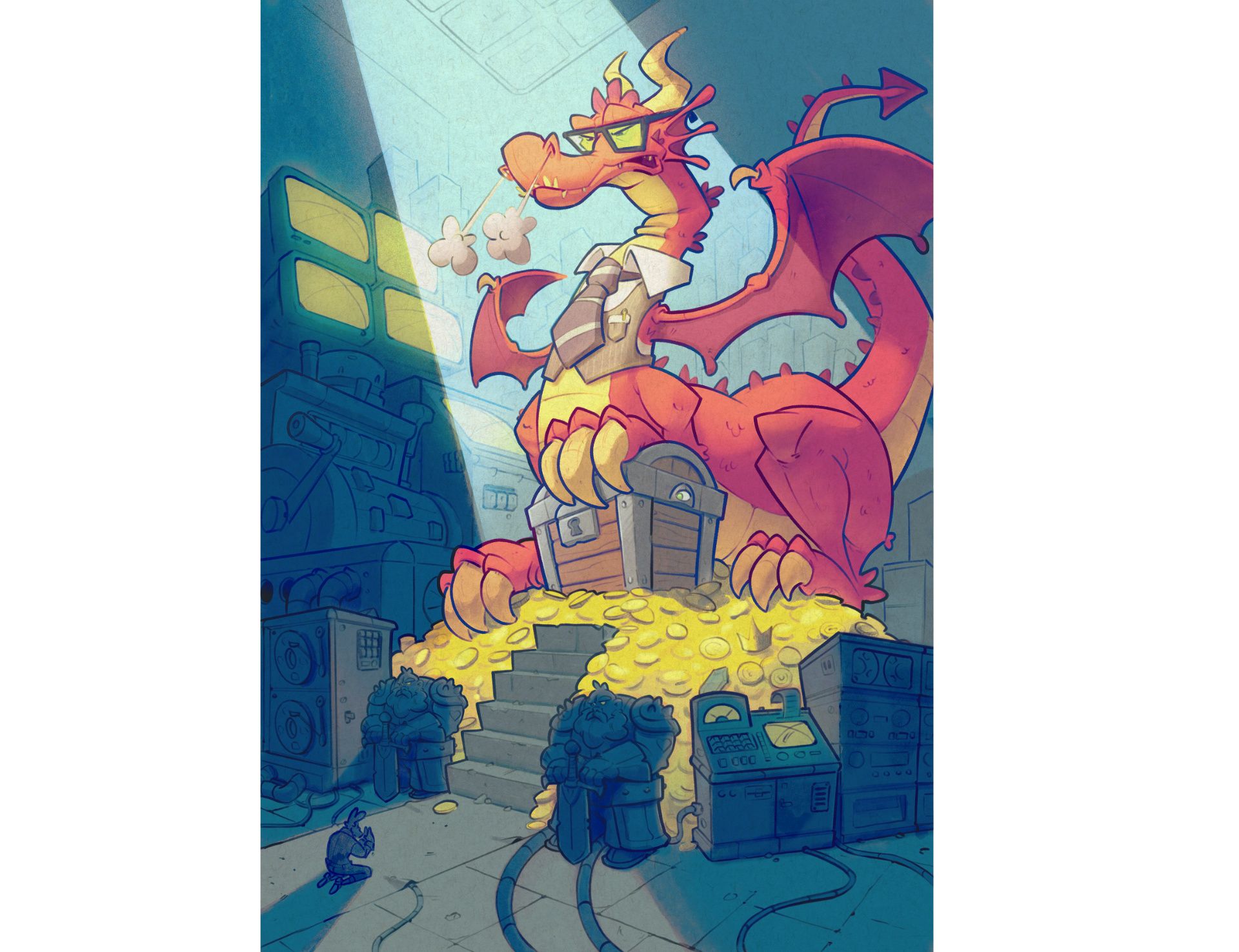
Illustrating a Stylized Financial Director.
-
Working on a new illustration for a board game, specifically the characters' cards.
Here is the sketch for the "financial director".

-
@Geoffrey-Mégardon hey mate this is great. I love the design of the dragon and the shapes you've used.
-
@Geoffrey-Mégardon This is great! I love it!
-
@Geoffrey-Mégardon Great composition with that mountain of coins and the chest and the low angle looking up at him, it all adds to him looking powerful and in control.
-
@Geoffrey-Mégardon LOVE this! Magnificent composition, great character, great use of lighting to direct the eye- I can't wait to see the finish!
-
Thank you all for your nice feedback; It really motivated me to finish it!
I had a rough start of the year and also started a day job to pay the bill so I only now had time to progress on this picture. Here is my first attempt to inking/coloring it:

Click here for Larger version.I'm still unsure whether to call it done:
- might need to make the light/dark composition clearer as in the sketch
- not sure about the color palette
- not sure about the color of the tie/jacket
If you have any idea to improve the light composition and/or colors, please let me know! Also any small corrections/improvement on the drawing side can still be done.
Have a nice day!
-
@Geoffrey-Mégardon awesome! To have a different view of it you can use the game card color/texture that will be the frame and see how it would look in the end.
Of course if they are using a frame or text box in this case
-
@Geoffrey-Mégardon i love it! The secondary characters are hard to make out, maybe they would benefit from a slight amt of low contrast light on some of the face planes/arms/swords? Two thumbs way up!