WIP HTFYA April - Jack and the Griffen
-
Hi Team,
This is my first time posting any SVS work. I saw the prompt for April HTFYA. I was really inspired and started drawing. I am very new to drawing and not sure where to go with this. I like the concept but I wonder if it reads well. I would be apreciative to any and all feedback. Does it even look good?Please help this newb get is first finished work posted for SVS. Thank you!!
-
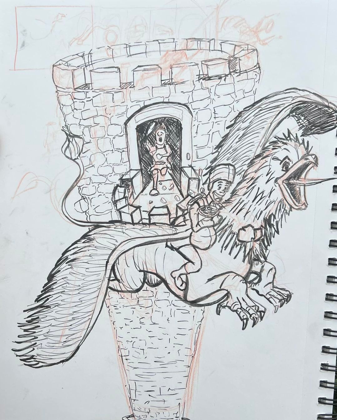
@Mike-Babich You have a good start here, though I think you could push it even further to increase the excitement/tension.
Since the griffin needs to be the focus of the illustration, I would put more separation between it and the tower, taking the griffin higher above the tower, with the guy running standing at the top of the tower waving whatever it is he is holding.
Stretch out the griffin's legs and neck so he looks more like he is in flight.
You also need to fix the right wing, as it looks like it is more part of the rider than the griffin.
The rider's left arm would have to be super long to be able to reach around the griffin's neck like you have it. Maybe have the rider holding reins.
Above all else, your story needs to be super clear as to what is actually going on. You can fix all this other stuff, but if you don't have a clear story, then the illustration won't work.
look forward to seeing updates.
-
@tom-barrett Thank you so much for your comments. I appreciate your input. Everythin you have said makes sense. I will keep it all in mind for the reworks! THANK YOU!
-
Hi there, as a start, I’m going to make a comment based on past critiques from Jake, Will and Lee. You have picked a straight on view of the tower with the knight coming right out at us which is tricky. Try moving the tower to the left with a 3/4 view of tower opening with knight running out. Good start at the story telling. Perhaps a knight/s with weapons of some sort to create more questions to the story…will they get away? etc.
-
Hi! This is a wonderful start!
Before I talk about your piece here, I want to mention some good artist habits that might make it easier for you to make artwork down the line. I can see where you are drawing right on top of your sketches with the ink. There is nothing wrong with that, BUT I have found that it actually makes life MUCH easier down the road if you use a lightbox to ink your lines onto another piece of paper, therefore preserving your sketch. That way you can always make tweaks without losing your original sketch. Also, it makes your final work look cleaner in the long run without you having to worry about erasing the lines and maybe accidentally smudging ink or ruining the paper. I can see that you did some thumbnails at the top, but I also think doing more thumbnails would probably be a good idea. I always try to shoot for at least 10 where I rotate the "camera" around the scene to find the most interesting view. I can see that several others have mentioned that so I wont harp on this.Onto the piece:
The griffin and the rider have wonderful expressions. I like that you are varying the line weight between thick and thin. moving the griffin away from the tower a bit will help this to read better. Working on larger paper will help you do this. I always sketch in a 14x 17" sketchbook so I have plenty of room to stretch out. Or drawing smaller on the page you have would help as well. Also, eliminating most of the lines around the stones in the tower will help clarify the image a bit as well. You only need a couple here and there to suggest that the tower is made of stone. Having the lines from the wings over the lines of the stones makes a bunch of visual noise that makes it harder to read. I think adding shadows will help you clarify the forms in this.
I think you did a brilliant job overall! The story is clear, the characters are engaging, and you are already developing a look for your work with the linework. Keep it up! -
Hey, I agree with Larue. I would do some more thumbnails using 3/4 view. With this straight on view, it was really hard for me to get a clear read that Jack was running towards the Griffin. I think that maybe another angle would describe that better.
Great work so far and I hope to see more work from you!
-
I agree with @Nxndraw on changing the angle of Jack. I feel kinda silly because I thought he was missing a leg (and was looking for it in the griffin's claw) until I read through the comments. I am also echoing the others' praise for the expressions on the characters.