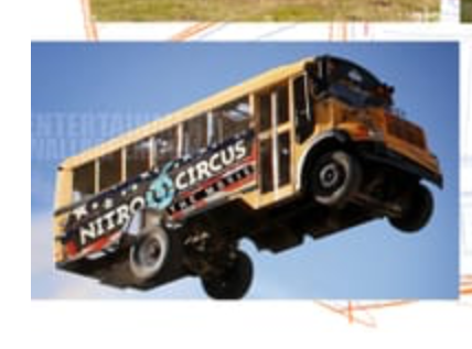
WIP Portfolio piece: farm animal field trip
-
@tom-barrett What he said ^^
I'd do the shorter one too. Looks way cuter. @kayleenartlover -
@tom-barrett I see. I used a reference photo for the tire placement but that was for a bus that is completely flat on the front. Other buses have it in the engine part but that would make the front "nose" wider. Should I do that?
-
@kayleenartlover I looked up some photos and see what you are referring to. However, remember that as illustrators, we have a bunch of creative license to modify elements to fit our style or story, or both. On a flat-nosed bus, the wheel behind the door looks balanced, but when you add a nose to the bus, it makes it look odd with so much "unsupported" at the front. On your sketch, it appears to have enough room to place the wheel up front without making the nose any longer. Or maybe you could make the wheels smaller to fit. Or you could make the nose even less long (just a hint of the nose) so the wheel behind the door works better.
And keep in mind, this is my subjective opinion.
 You have to do what works for you. Once you place the illustrations on the page, then that becomes what busses are in that world. So, in the end, not a huge deal either way.
-
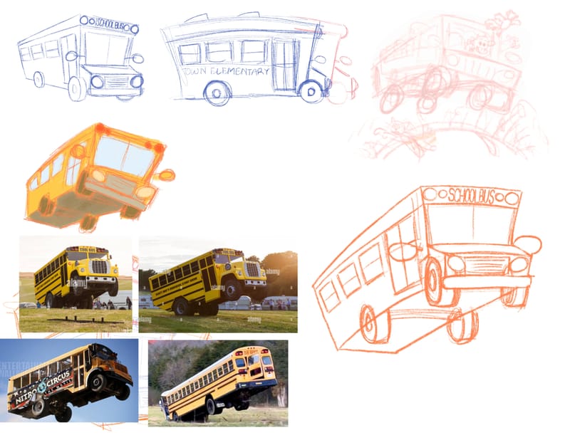
Update: bus design
-
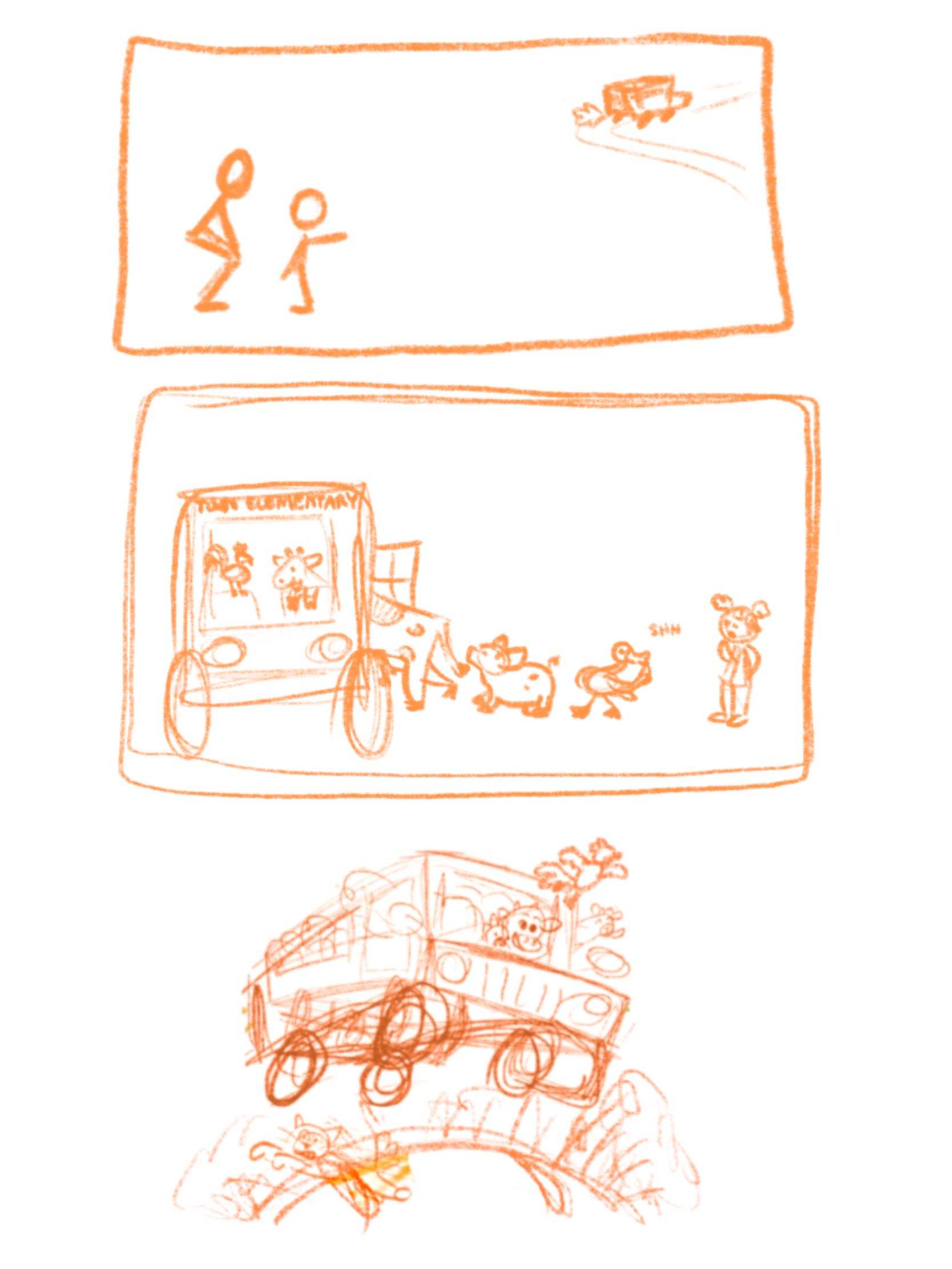
@kayleenartlover I love how this is going, and it is hysterical that you found so many pictures of buses getting air! I had a thought about the teachers and students, if you are still brainstorming a plausible distraction. Maybe they all got out to take a picture with the scenery or some landmark of educational value, and are standing facing away from the bus. The photographer is the only one who is facing it but might not even notice that the animals are getting on because everyone else is in the way. Then you have the one kid in the back who sees it happening.
-
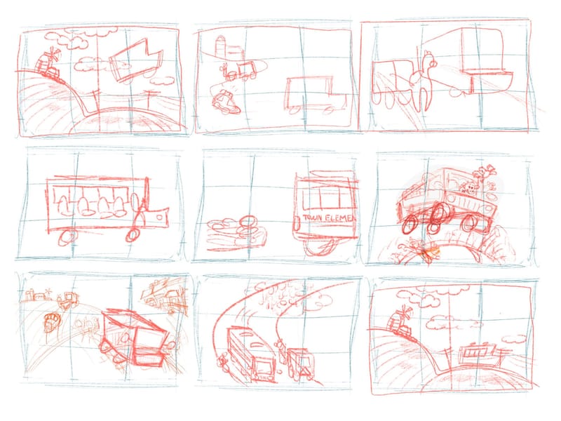
@jenn I couldn’t get it to work including more details for this particular page and it to still look interesting. Many thumbnails would’ve made either the animals hard to see or the people hard to see. If this leads to a book I would definitely do that as a setup before this one.
-
@kayleenartlover love the updated bus design and how the story is progressing! I like the small colored bus in your thumbnails above. There is a lot of character in that drawing with it being slightly skewed in the jump.
-
@tom-barrett which picture are you referring to?
-
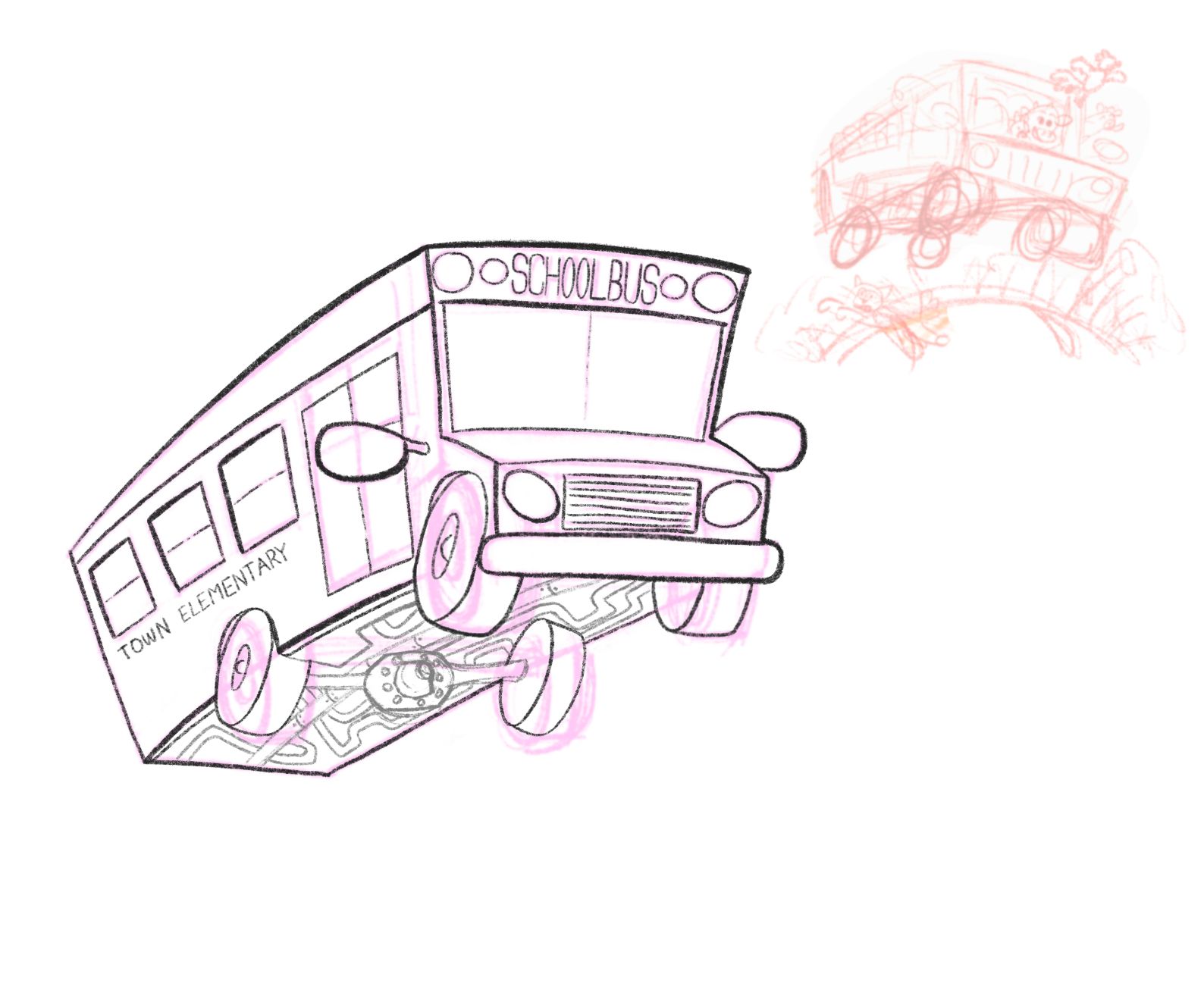
How does this look? I tried to exaggerate the tires so it wouldn’t look stiff. Any tips on the line weight? Should I make any lines thicker?
-
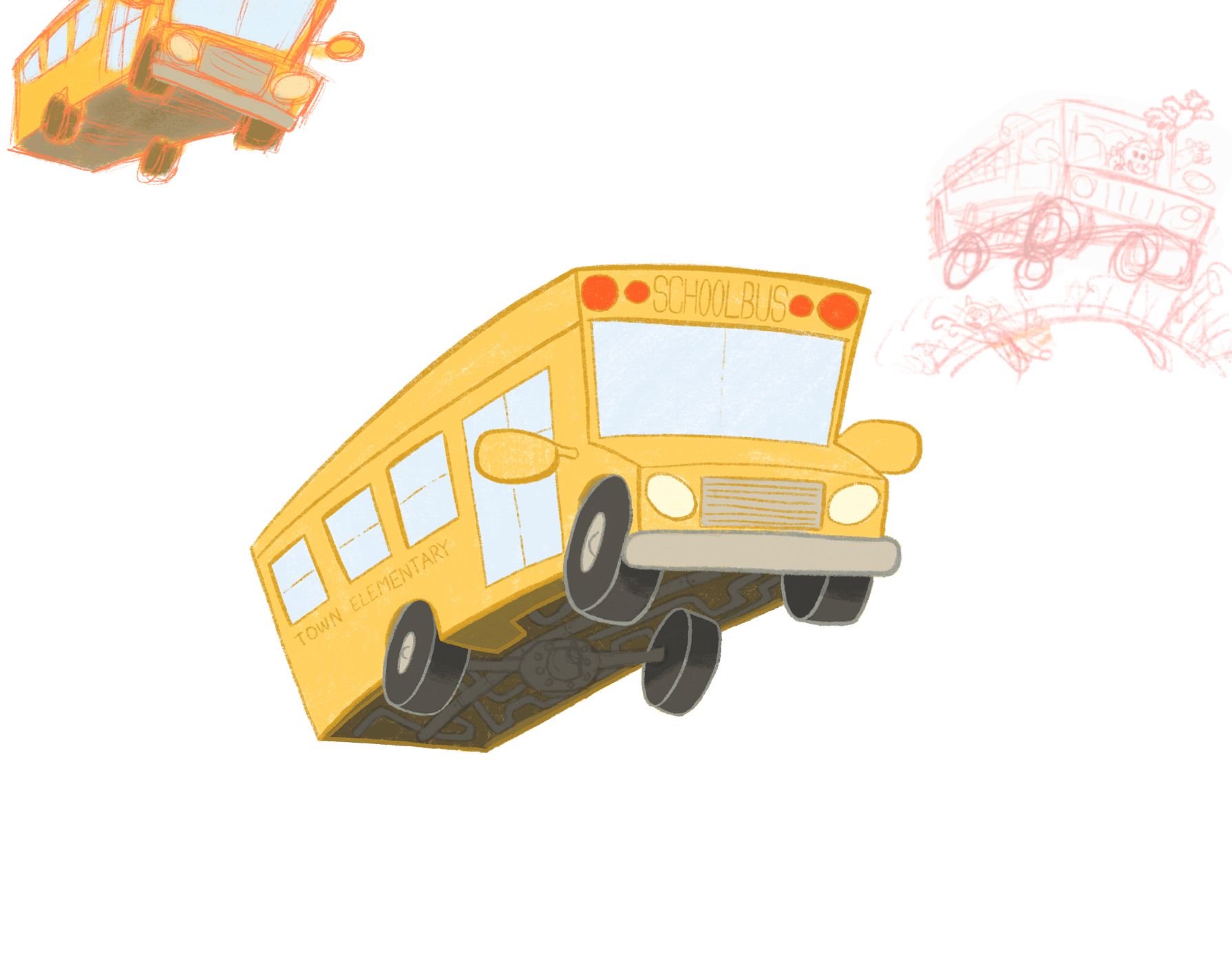
Here’s the colored version of the bus. If it doesn’t need any changes, then all that’s left is the animals driving/riding it and other details like in the thumbnail.
-
Should I move the back right tire where it was supposed to go perspective-wise or would that make it look more stiff? Does it look like there is movement happening if I leave it the way it is? I plan on adding a hill below it like it's catching air going over it.
-
@jenn yes! Those flying buses are soo rad lol
-
I think it should look a bit like this, its off the ground so the wheels are not compressed against it
-
@makekong I haven't drawn the ground part yet, but it's gonna be kinda bouncing up, but I'll draw a sketch to compare
-
@makekong oh wait do you mean the tires are actually lower than the body of the bus?
-
@kayleenartlover yes because the springs extend like a frog jumping
-
@makekong oh that's a really cool way to describe it! Thanks!
-
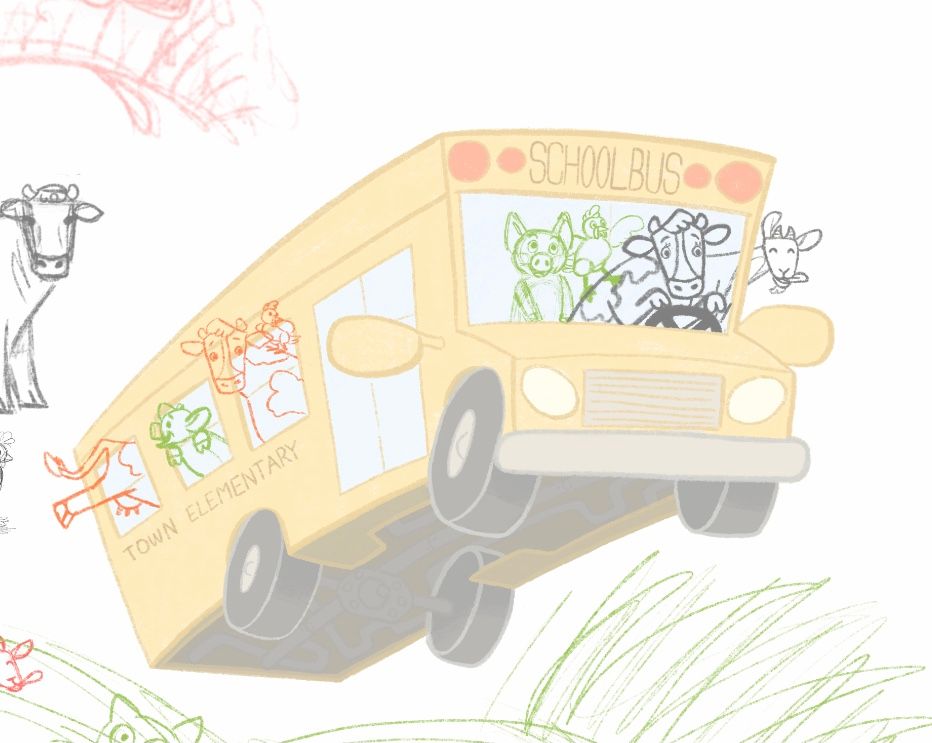
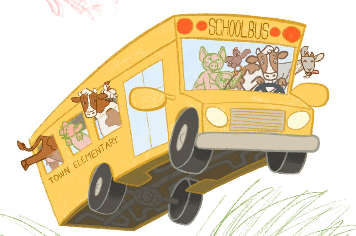
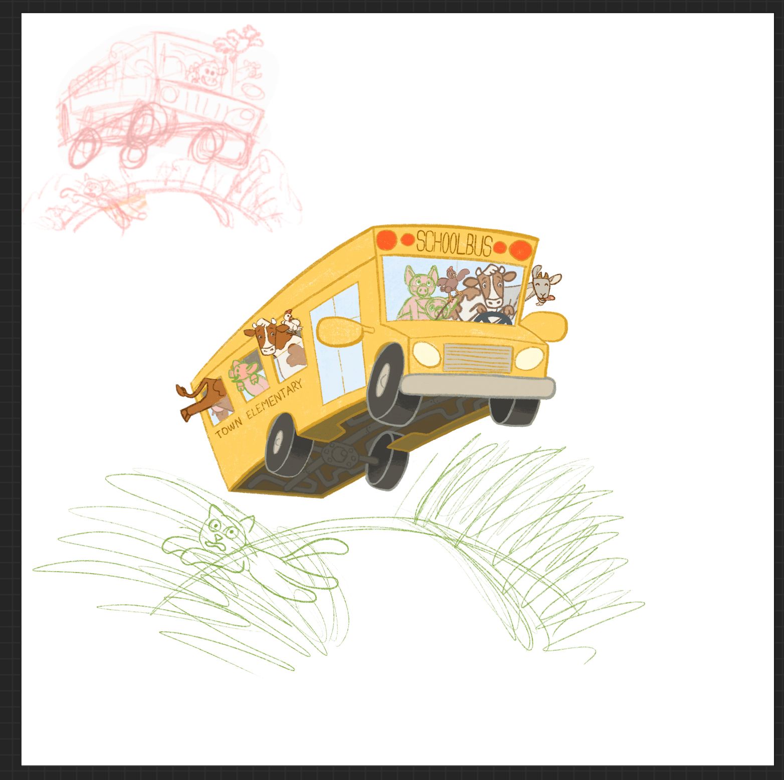
I'm back at this project again. How do the animal sketches look? I want the bus to look full of excited animals making a getaway to go on their own field trip. Do the sizes of the animals look correct?
-
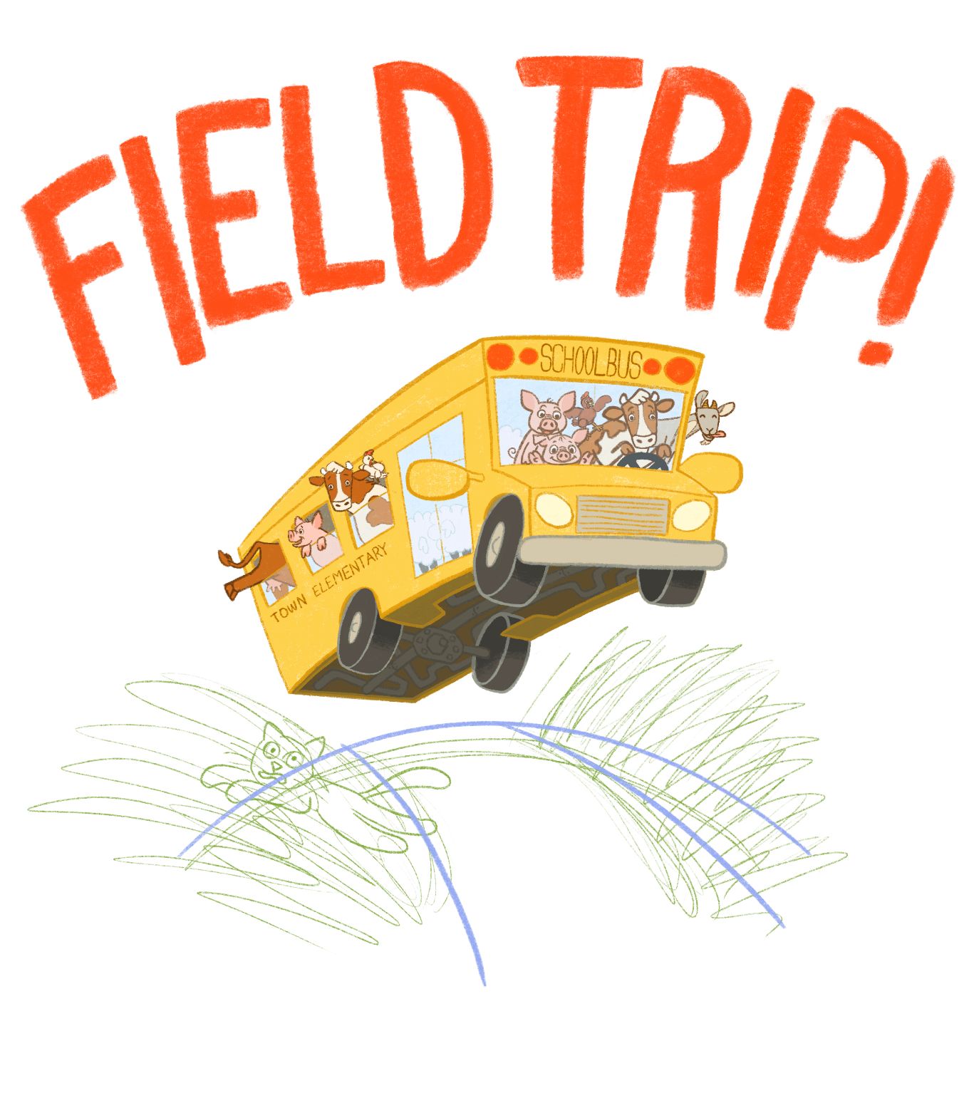
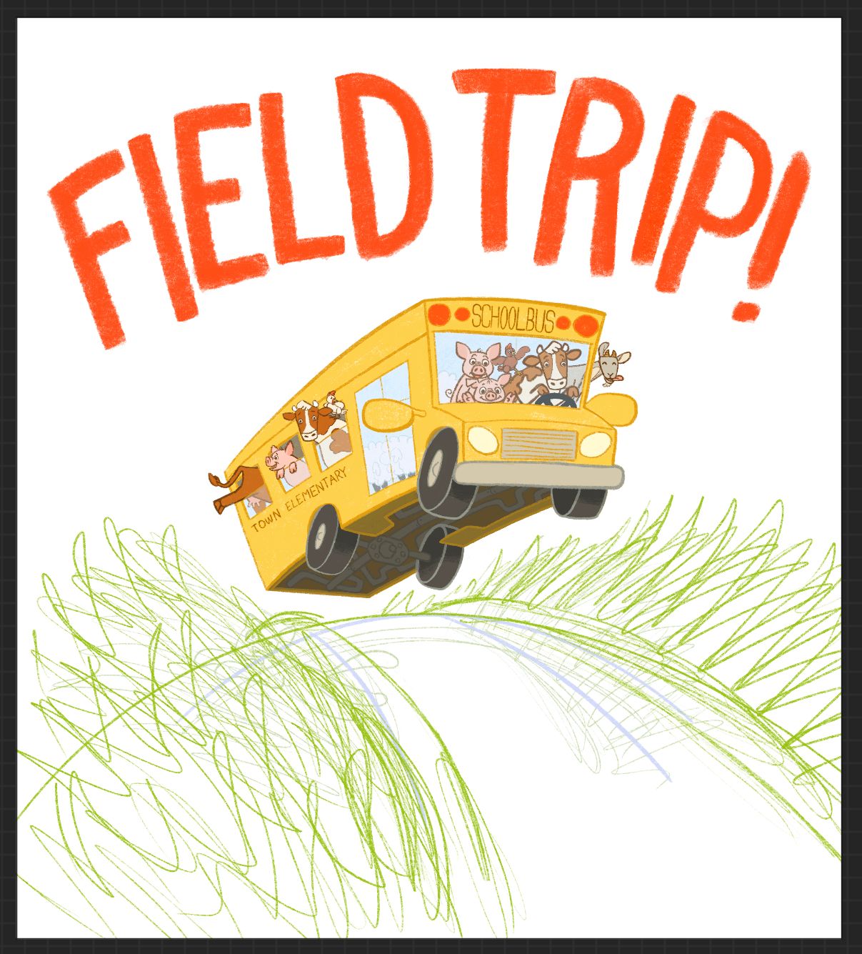
I’m so close to finishing this… How does the lettering look? Should I make the drawing bigger and have the road drawn to the bottom of the page, or keep it a centered vignette?
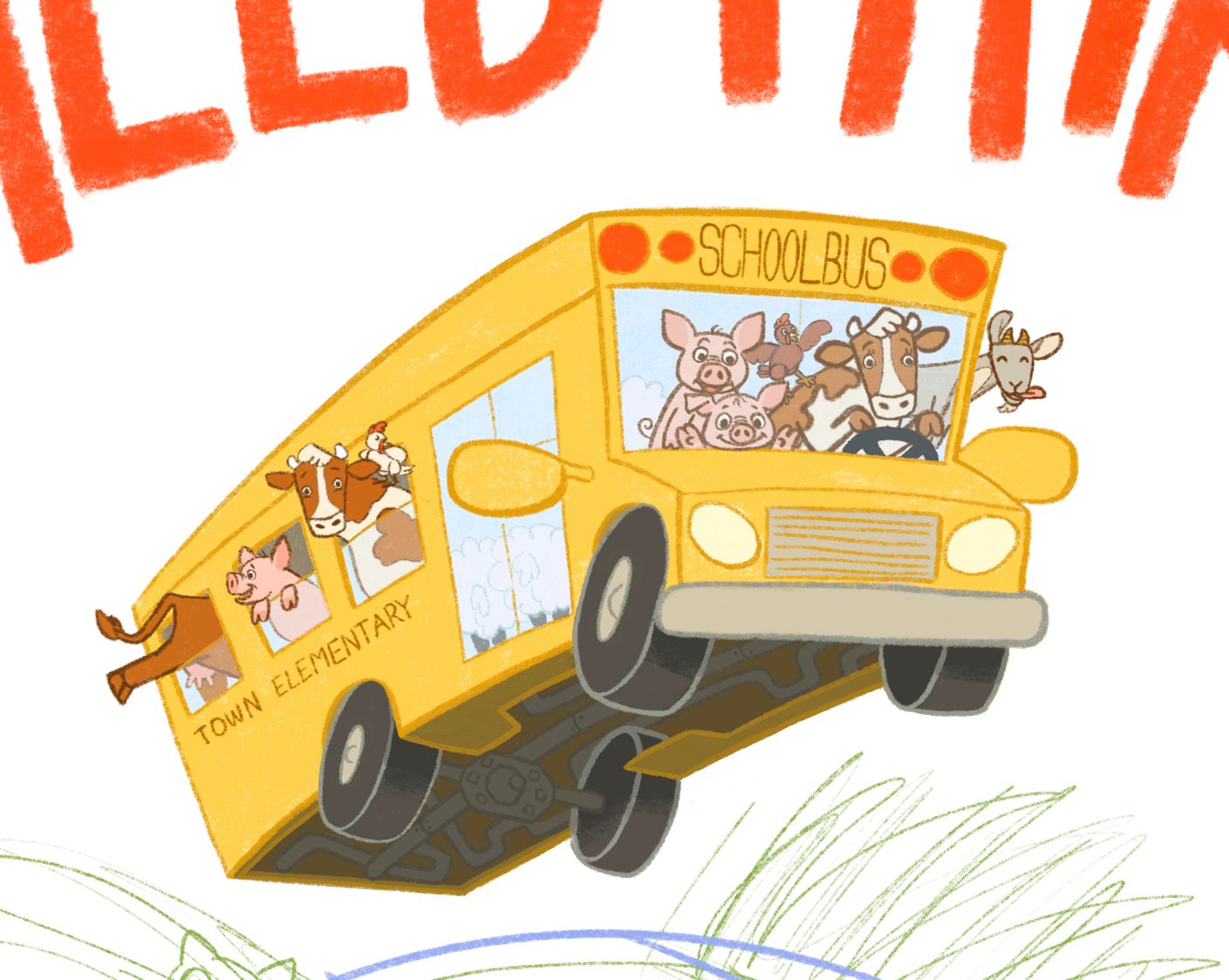
Here’s a closeup of the bus:
-
This post is deleted!
