First Post, I would love some feedback on my artwork
-
I am an aspiring children’s book illustrator and have applied to several agencies to have only been rejected by all of them. I am a bit dejected because I’ve been working on my portfolio for months following advice online about what to show in my work. I was wondering if I could get some pointers as to why my work has been receiving lukewarm response?
Here’s a link to my current portfolio:
https://hrthoma4.myportfolio.com/work?fbclid=PAAaazKmWcBn0myVPNlGq7L-XHAkQnITAmj63cmK7H9UXBmdztXSkgb8NiOgA_aem_Affqv2bl9rcCDrxlmu_dg_FLv5dJR1TUWv1LeCe4bfFOlAcJroUBu1VQkeqx9D_6FloHere are some recent favorites!
-
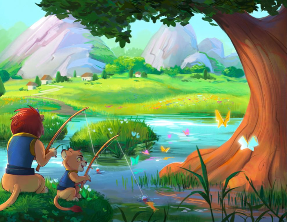
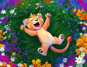
@Haley-Thomas I don't know why you have been turned down exactly. I do like your lion one a lot. I like how the kid lion seams to be distracted by the butterfly, I also love the scenery behind them.
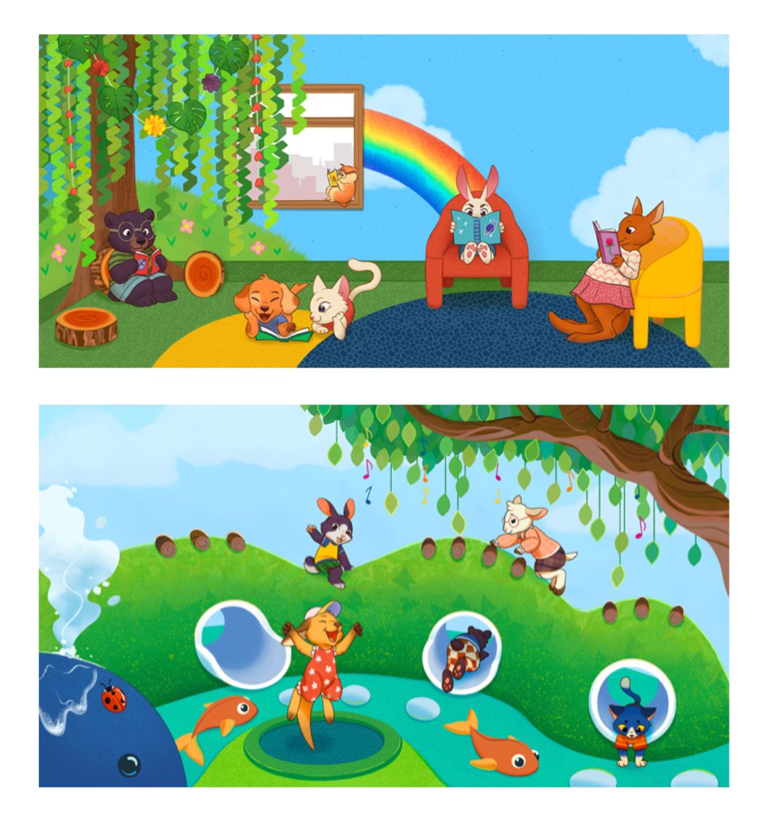
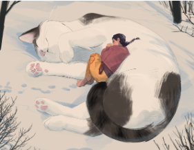
The two pieces below feel a little distracting to look at. I think if the background behind the reading animals was neutralized with softer colors it would just help the animals pop more.
Also I think if the white tubes were a more gray instead of bright white, it would help the eye focus more on the Charecters.
I really like your art!
I hope things work out for you with your goals! -
Hi @Haley-Thomas, I resonate with you. I’m struggling to find an agent, too!
Here’s my advice:
- Pay for a portfolio review from SVS or reputable subject matter expert in kidlit illustration.
- Ask agents what about your work didn’t resonate with them. If I had to guess, they probably say your work is too commercial.
- Incorporate feedback on your portfolio critique and keep getting better.
- Make something for yourself and put your work side by side with illustrators already making it in the industry to see how you stack up.
- Don’t give up!
As a side note, I might not be the best person to share advice since I still haven’t landed an agent nor received a traditional book deal, but that’s my goal.
-
@Haley-Thomas I am SO impressed. You have EXCELLENT Drawing skills. Everything is proportioned correctly and CUTE CUTE CUTE characters. I really enjoyed looking at your website.
")
My advice:
- Try dulling down the colors on the things which are NOT the main focus. There is so much to look at, it can be overwhelming - at least for my 50 year old brain. I don't mean with Tints (adding white) or Shades (adding black), I mean bringing the hue more toward neutral. Then you can let the star of your work Shine with Brighter / Truer colors.
- What about a different Point of View. The majority of your work is from straight in front. Try adding a few more POVs of characters, maybe.
- My dog LOVED the Cat Landing video. LOL
- Adult Themes. If you are looking for Children's Book work, you might reconsider showing a drunken "Red" in her night robe.
 ** insert sheepish grin ** I like the idea of a cat trying to get away from its overly affectionate owner, but maybe "she" could be a little girl (say 3 or 4 years old); a little less riskee.
 - The Balcony background needs to go. It just doesn't look "right". I don't think all of the perspecitves match. Sorry, but I'd take this one out until it is 100%.
I hope this is helpful. Please share more. I found your work and your website very inspiring. aAnd please consider my thoughts just that - MY thought. Again, I hope its helpful. Thanks for your bravery to share!!
-
@Haley-Thomas first of all it looks lovely. I agree with the fact that we all need to keep working and refining and that a professional review will help you find a guideline.
In my humble view, your images need to separate the foreground, mid ground and background a bit more as they look a bit in one dimension.I think you have a great shot at “How to fix your art” if you enter the december contest for the three guys to also give you more pointers on a specific piece of art that will help you understand where you are.
-
@MerryMary Thank you for the feedback! I do agree looking back at the bottom two that the background colors could be more neutralized. I tend to wanna make everything bright and colorful which can be a detriment to the focus of the piece. I’ll keep this advice in mind for future artworks! Glad you like the lion artwork!
-
@Jeremy-Ross I’ll look into getting a portfolio review by a professional as I have no had much luck getting feedback from agencies who rejected my artwork. Thank you for the advice these seem like some good steps to follow as I kind of got stuck about what to do next.
-
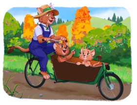
I’ll just add on that your characters aren’t interacting with each other. I know as illustrators we need to get the viewer to feel some emotion when we look at the scene and I think that may be missing in a few of these.
-
Hey there!
Right off the bat, your style and consistent drawings are very very strong! And I'm sorry you're getting agency rejections.
I'm perfectly fine with you taking my 2 cents with a grain of salt (meaning you don't have to take my words as solid advice) But I did hope my suggestions were helpful.
Some Critiques Right off the Bat
POSITIVE!-
Your style is prominent! I think you follow the general principle of discovering what you're strong at, and keeping that consistent. Your brand and your identity in your pieces. They express who you are as a person.
-
If I were asked to describe you, I would say "Haley Thomas is a bright and colorful person! Full of life, and full of character!
-
My favorite thumbnail on your website portfolio is your animals piece. It's not a square fame but more painterly, and if you accomplished that appearance it would really make your site stand out more in a subtle but significant way.
-
I was drawn immediately to your "Background Art" section as well. Your color schemes are very bright, and appealing to look at! If you're shooting for Kid Lit, this is a strong section of your portfolio, aesthetically.
CONSTRUCTIVE
-
On this Page (https://hrthoma4.myportfolio.com/work), "kids" I think should be Capitalized. You have "Fantasy", "Animals", "Background Art" all capitolized, but "kids" isn't. Also, is the "kids" section, kids art? Kids books? You might want to clarify that.
-
Your style is very very very strong, I want you to remember that. Don't let anybody tell you to stop what you're doing. However, I would like to mention something in the kid lit realm. From my perspective I don't see a lot of "anime" influence on kid's books. Your style is very anime in its influence (not a bad thing), so this might be a reason for some (not all) rejections. It could be that the market is not looking for your style. HOWEVER, judging from your Fantasy, background art, and character design sections, you have this ability to convey character, and appearance. If I was a concept artist recruiter I might be interested in your content more. So what I'm noticing is that you have the huge potential of creating maybe a few other NEW sections: "Costume Design" "Video Game Character Rotations" "Full Composition Illustrations" (complete story with one picture). I'm gauge this assertion from your Animal Section. Your animals are bursting at the seems with character, and if you dressed them up with villians or maybe heros or family contexts, that would begin to sell your style more.
-
I said this to a different artist on the forum, but I'm not a fan of portfolio websites where you have to dig. Example of this is, you have an EXCELLENT book cover in your books section. But I didn't see it when I scrolled and clicked on the main page, and I almost missed it. I've heard a rumor that portfolio readers, are usually skimming pretty quickly. So they might be missing this section. A suggestion would be to pull ALL of your content to the front main page and present all of them with small thumbnails. This Gal's website is the best example of what I'm talking about. https://www.beatriceblue.net/. No digging required. You can just endlessly scroll.
-
You might want to explore your style more. What would happen if your characters were being persecuted, or in a hardship, what colors and moods and emotions would you convey? Scary story? Epic topics? Do you have human characters you'd want to develop more? Can you draw all kinds of environments? I think your style is very strong (I'm repeating it so you remember), and it has this potential to be pushed more and more and become even MORE strong!!
Below Are my favorite and what I think are your strongest pieces:
Hope this helpful and gives you more motivation!
-
-
@TheresaMuth Thank you for the advice! I do agree that my work can tend to be a bit saturated in colors. I’ll keep that in mind for future artworks to tone down unimportant areas. As for different points of view, I think that is a great idea! Ill try to be more creative with how I compose a scene next time! Also im glad your dog loved the Cat Landing animation haha!
-
@alexw Thank you for the amazing advice and taking the time to review my artworks and give your two cents! I feel a little bit more hopeful that I could be on the right track!
- I think your advice about arranging my portfolio in a more accessible way is a great idea and I love the example you showed! I will try and arrange things in an easier way that isn’t obstructed by pages. I will also fix the lowercase “kids” I didn’t realize it didn’t match the others. Thanks for catching that!
- New sections about characters would be very interesting to do! It would be fun to explore more character concepts and villains. I’ll have to look into doing that!
- I do agree I could give the characters more interest and explore different things about them as they are currently all smiles. It would be interesting to show more emotional moments too.
Thank you again for your advice, it helped me figure out what I need to do next and I feel a bit more motivated!
