Portfolio WIP and what to do next?
-
https://phoenixyipart.com/portfolio
Hey everyone I've been working on a portfolio for animation, although i'm still trying to decide what I want to do in animation, I think I would need to start out as a storyboard revisionist or a background designer. My dream job is to be able to direct and write my own stories. Vis dev could also be cool. I would love to hear what y'all think about my portfolio and what i can do to improve it!
Also, I'm sure a lot of you can relate to this but I'm really struggling with what to do next. For so long I've been just trying to get more skilled but beyond that I don't really know what I'm doing or where to go. I know networking is very important so I've been reaching out to people and trying to show up at art related events along with putting together my portfolio and linked in profile. luckily I'm 18 and am blessed with little responsibility but i don't think that will last for long! If you have any wisdom to share I would greatly appreciate it. Thanks!
-
@phoenix-yip After looking at your website as a whole I have a couple of thoughts for you. Take all of what I say with a grain of salt since this is your artwork and website. There are two points that I'm pretty critical, and I mainly made the statements so that you can have the best website possible for your portfolio. Again, this is more submitted, so you can do as you wish with my suggestions.
Right off the bat, on your shop tab, https://phoenixyipart.com/store-1, I would suggest strongly to change "I smell profit".
1. It's a confusing statement
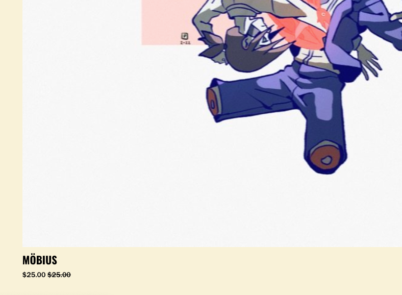
2. it comes across as like your scoffing. The vibe its conveying is too close to "I smell blood".Overall, I think this is the weakest page, and probably needs more tweak done to it. You also have a picture for sale for $25, but it's slashed on sale for...$25. (not sure if this is a browser issue or a pricing issue in your website database)
I'm getting the bad news out of the way, and I want your website to be successful. However, I need to be blunt with this next critique.
The line where it states "I take your hard earned money and you get something cool in return!" I think I get what you're trying to say here. However, with my background in marketing, this wording communicates the wrong message. If you're trying to sell your artwork, you never want to use words like "I take..." or "You give me..." cause then it's all about you, and with only one piece of artwork for sale, I immediately move on. And you'd want to build a relationship with your customers / clients and communicate to them that you care about them. Making your sale to the customer about THEM is a better option to consider.
BUT there's a lot of positives about your portfolio overall. The strongest aspect is your consistent style. I wanted to explore all of your content!! I was very interested in watching your animations! You have a pretty clear direction with your style which communicates who you are as an artist. I would say you're a true artist and have a strong sense of motion, animation and would be hirable!
This is more website editing I'd suggest:
If you take a look at this gal's website (https://www.beatriceblue.net/), you notice immediately you're presented with artwork. The only requirement of the user is scrolling. If you're interested in an art piece, THEN you take extra steps to click and explore. This is a very handy thing to create a sense of convenience and ease for the user to explore your work. Their thumbnails are also smaller so you can pack in more content and create a sense of infinite scrolling or a sense of verbose content.
For your website, you have a lot of work, but I had to go dig for it. Yes, you should segregate your artwork into categories, but there might be a website template you can utilize that "filters" the pieces you made by Illustration, Layout, etc. after you click the tabs. So in a sense you'd immediately have "All", then the other categories. I think people want to consume all of your work to get a feel of who are at the start, and then when they want to explore your portfolio, the begin the research process and dig deeper. (that's an opinion, I have no hiring experience, you might want to research how hiring staff read portfolios)
I would remove "Why are you reading this. There’s nothing here for you to see." at the bottom. Random statements like that for the user could communicate your site is incomplete. The blurb is a little too arbitrary.
OVERALL: You have a great website, it communicates and showcases who you are and what you've done! You're a great artist and you definitely want your website to match your skill level!
-
@alexw Thanks for taking the time to look through my website! i honestly really forgot about my store page XD There is a lot I need to update and currently my store isn't active because I can't afford that subscription. I definetely agree about the sections, my portfolio page already acts as a way to categorize my important pieces so that other stuff might be arbitrary. I think easier access to viewing my art is a great idea, thank you sm for the critique this helps a lot!
-
@phoenix-yip have you tought about putting your stuff on an external store and just having the placeholder images in your website? Like etsy, gumroad, bigcartel?
Stroogle.xyz (webcomic)
-
@makekong that's a great idea, thank you!