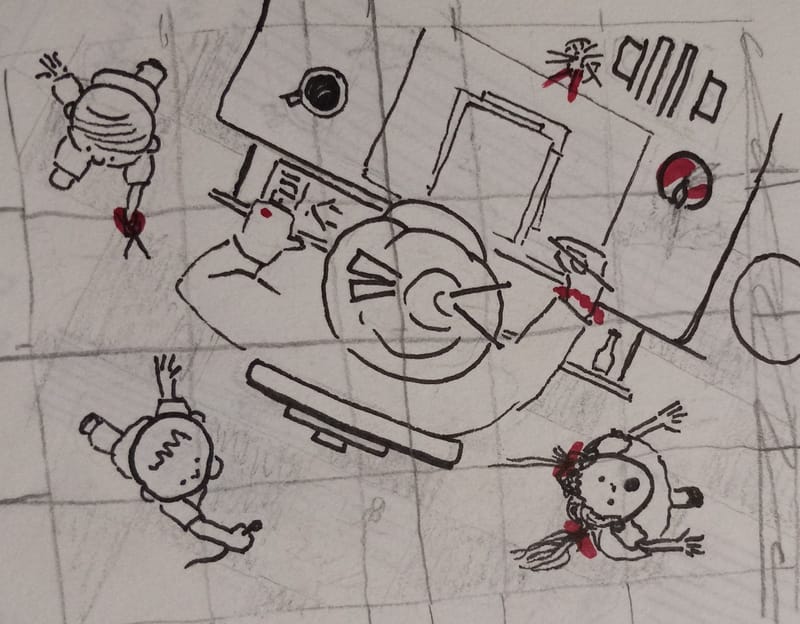
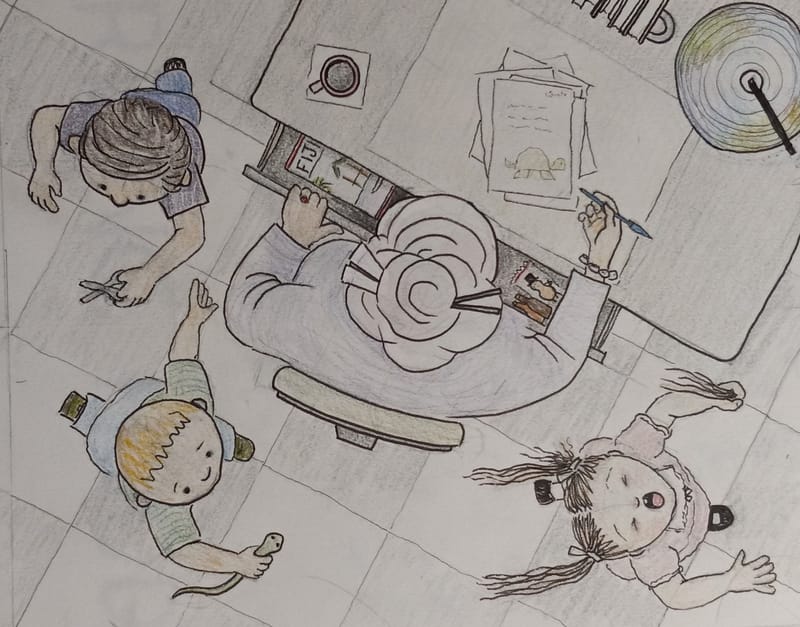
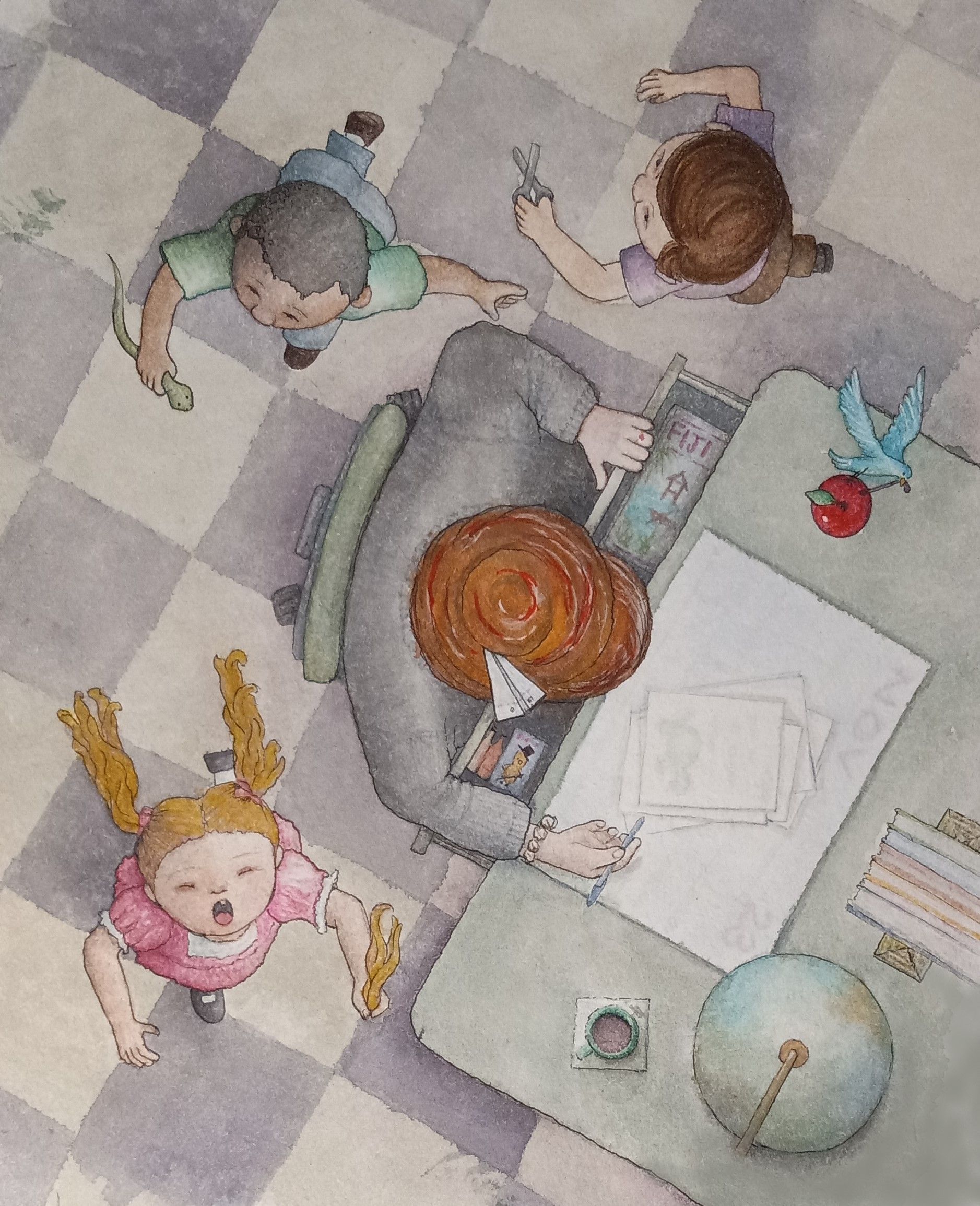
WIP-Nov23-HTFYA Value help / Readability?
-
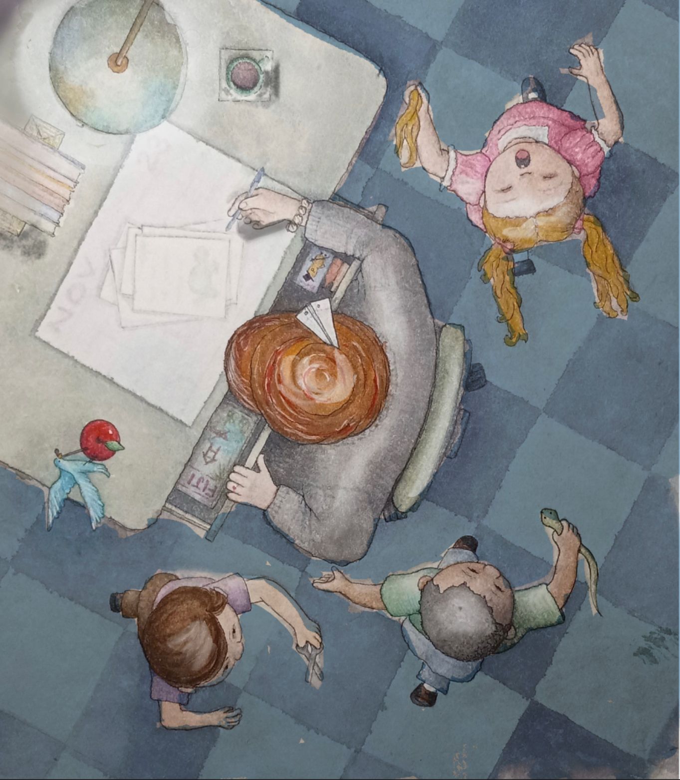
Hi Everyone! I would really appreciate feedback / thoughts / guidance on the values here. My intention was to have the light emanating from the teacher, but I'm not sure it reads that way. Plus, I'm loathe to darken it for the sake of "shadows". - but should I? Also, most of the light is from overhead, which would mean the shadows would be underneath the objects - mostly out of view. ....or do I simply need to pick ONE and go with it? Right now, the papers and the airplane are the lightest... is that distracting or okay? Again, I need help and all comments and suggestions are welcome. Thank you!!
-
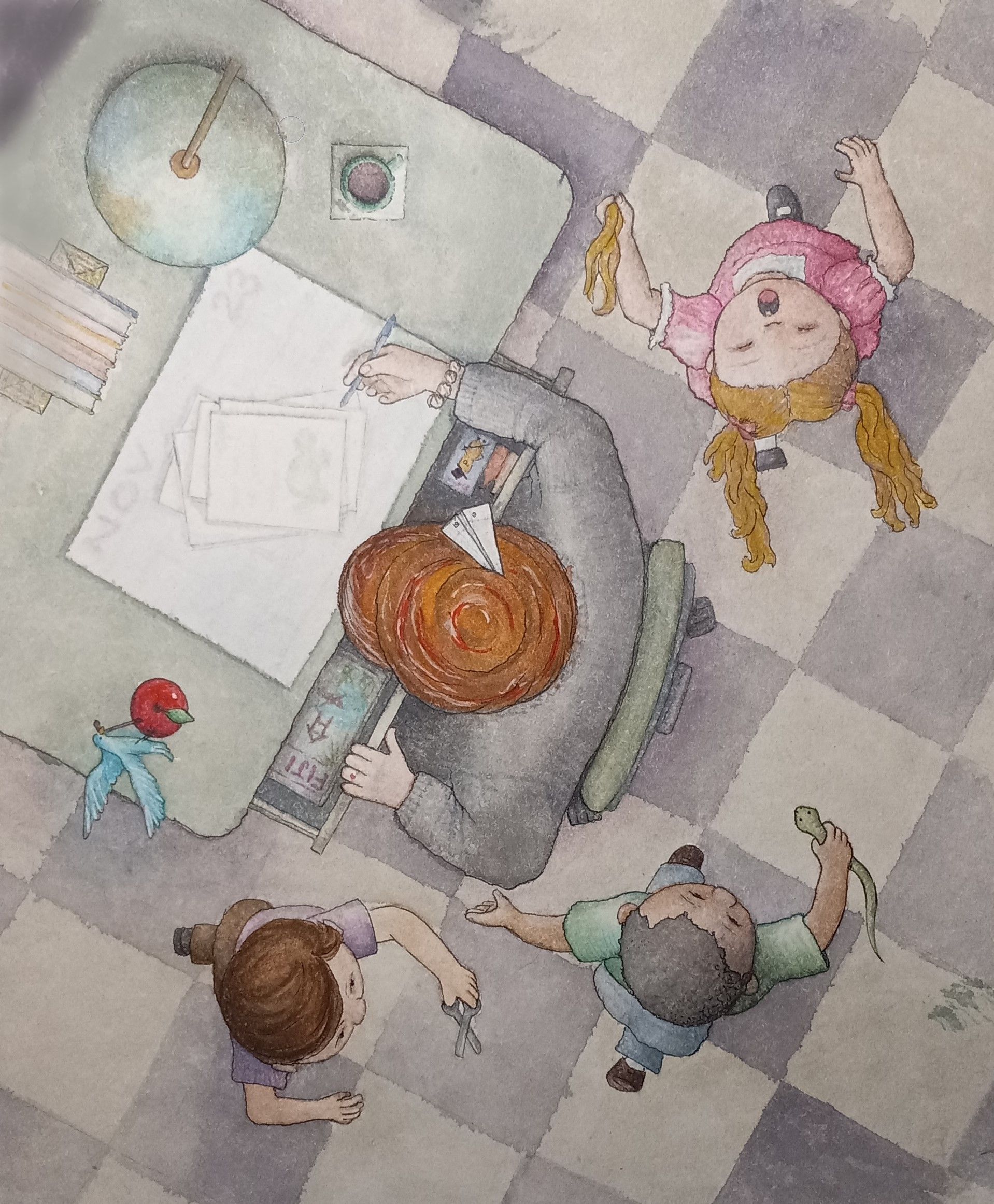
I love this, interesting view point and love the story telling. I did a quick adjustment to darken the floor so there’s be more contrast . I put a glow around the table light and put highlights on their hair to show light from above. Just my try at it based on your description, ignore if you’d like:)
-
@Larue Thank you SO much for your time and input! I really appreciate it. I have started a new version in which the floor has less contrast (more uniform color values). I think that may have been the issue I was seeing. But now that I see the highlights you added... YES! Those {LIKE} make it more dynamic also, and I will be incorporating highlights in my next version - Thanks to your example.
 Thanks again!
 -
@TheresaMuth No problem. Looking forward to seeing your adjustments!
-
Here are some versions of this, from initial sketch, adding color, and the first watercolor attempt. The final version was submitted in the contest thread.
