The new SCBWI Website is a disaster
-
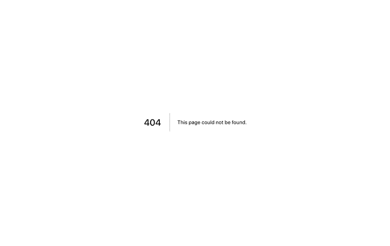
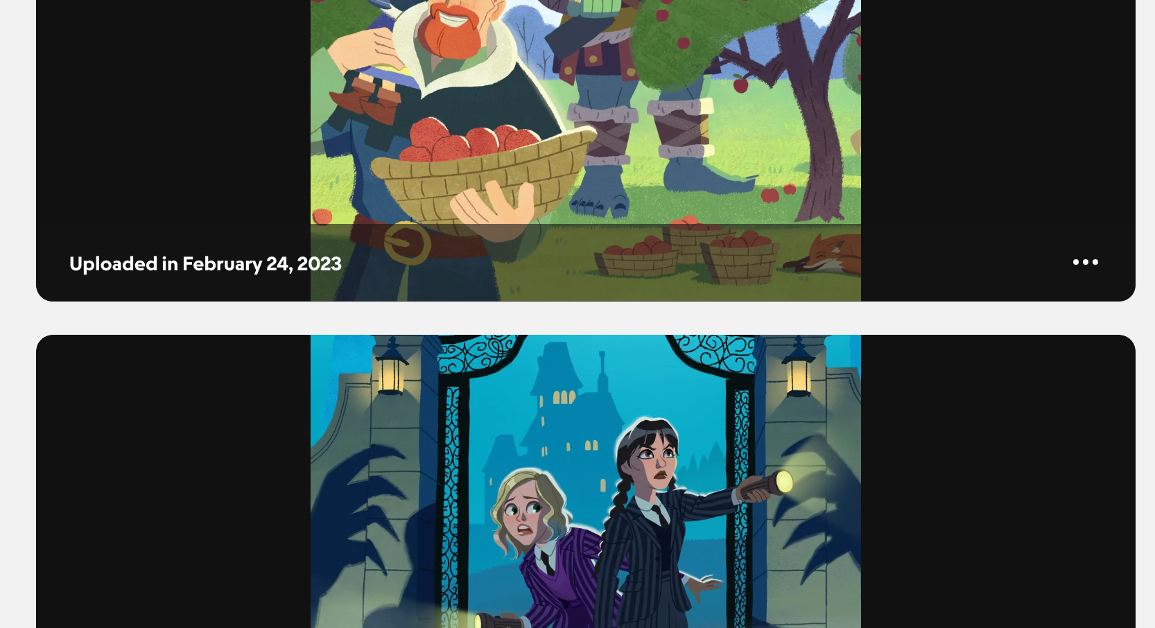
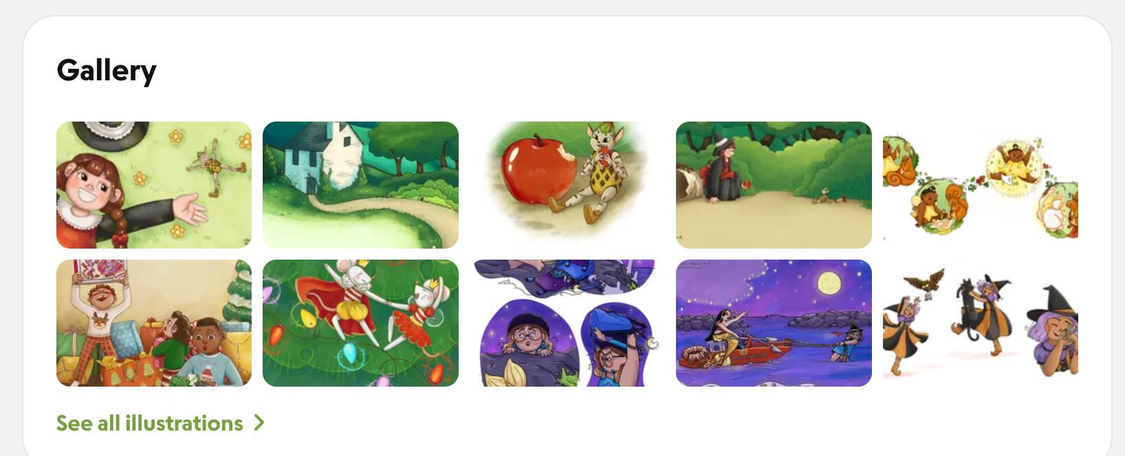
You may have heard from SCBWI recently that that were going to update their website. They have been hyping it for weeks or maybe months now so I was expecting something really quality and polished to justify the long wait. However after visiting the new site it seems to unfortunately be the opposite of that. The website looks marginally more modern design wise and is slightly more coherent in terms of the login process and your member profile. However those are the only things that improved that I can see. The illustrator gallery is now harder fo find and navigate and the way the images are displayed (the whole point of the illustrator gallery) are now tiny and squished in a small area and extremely cropped. Whats worse is that when diving deeper into the website to find some more specific information I came upon page after page of 404 not found errors. These were supposed to be pages for submission guidelines for awards, lists of grants, faqs and other resources. I'm shocked at how badly this rolled out especially after they have been talking about this for so long. Anyway what are ya'll's thoughts on the new website?
-
Seems fine to me. No 404s, illustration gallery has large photos and plenty of space. Perhaps the launch of the new website got botched somewhere. That usually happens after a migration (my day job). You hold your breath hoping everything transfers correctly only to find half the site doesn’t work like it did in staging.
Overall nice design.
-


Hopefully they will fix all the 404s but design wise it's still a big downgrade in how the images are displayed. First image is supposed to be the guidelines for featured illustrators. Second is ugly big black bars when viewing illustrations and third is the tiny cropped illustration gallery. The old website had such a beautiful light box with nice white borders it made all the illustrations look better than normal and the gallery view took up most of the page so this is what I mean when I said downgrade.