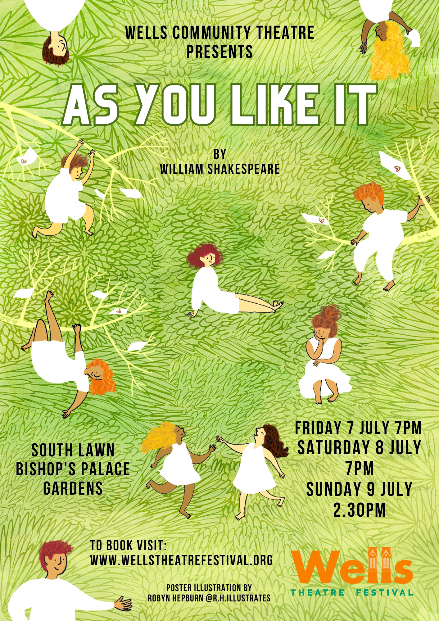
Just venting my horror...
-
Hey,
i did take a closer look and the progress is nice so far.
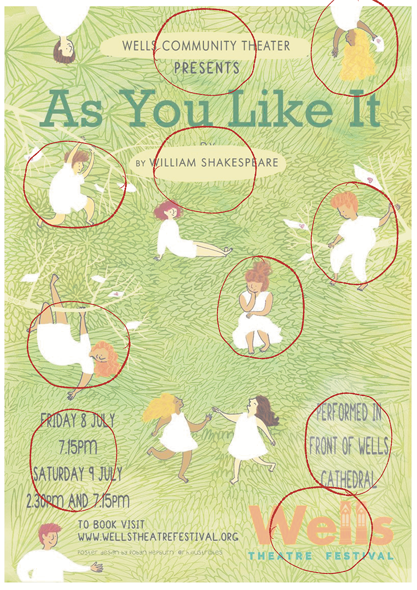
I have some suggestions though. ( i went forward with the suggestions of @NessIllustration )I will show two suggestions.
The one with the circles is showing, that everything is kind of using the same space.
Every part of the poster is as big as the other, the Font, the People.
you can absolutely work with different kind of sizes. maybe the guy on the tree is nearby and bigger then the others or something like that. it could make it more interestingYou also could google sizes for fonts on Posters.
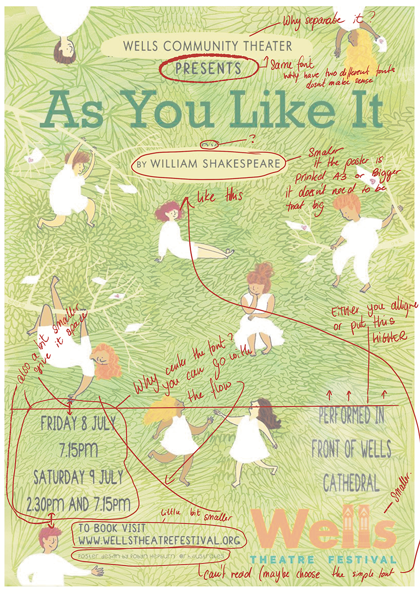
I don't know how big the poster will be printed. but if its around A3 its big enough to make some fonts smaller.
There are suggestions out there you can use for your design.Also the Logo of the Theater is BIG. it dosnt need that much space. Its not the most important object, still you choose to make it bigger than other parts on the Picture
I would recommand to google for posters though, mostly they choose to go big with the font or big with the visual element.
You Choose how much time you will put in for free, but now it's gonna represent you out in the wild, so i would choose to shine like @NessIllustration said.
Website: www.von-Nimmermehr.com
Instagram: https://www.instagram.com/von_nimmermehr_illustration/ -
@von_Nimmermehr @NessIllustration
Thank you both so much for your feedback. I appreciate how much you've put into this (for free too!)
Because I've pretty much left the typeface/text/info choices up to them, I hadn't really thought much about all that, but I'm definitely going to use a few of your suggestions before I hand it over to them:
I'll make their logo smaller and maybe even cheekily add my own!
I'll add a lighter green behind some of the text; it looks really nice how you did it.
I'll also make some of the people larger and smaller to show some depth.
Thank you all again for all your invaluable help with this! I'll be sure to post the finished poster with the autograph.

-
Thanks for all the help all you guys gave me. I managed to get it all done in 5 days! Thankfully they were easy to work with and knew what they wanted without over-directing me.
This is the finished poster (no more criticism please!)