picturehooks montly prompt
-
Hi everyone,
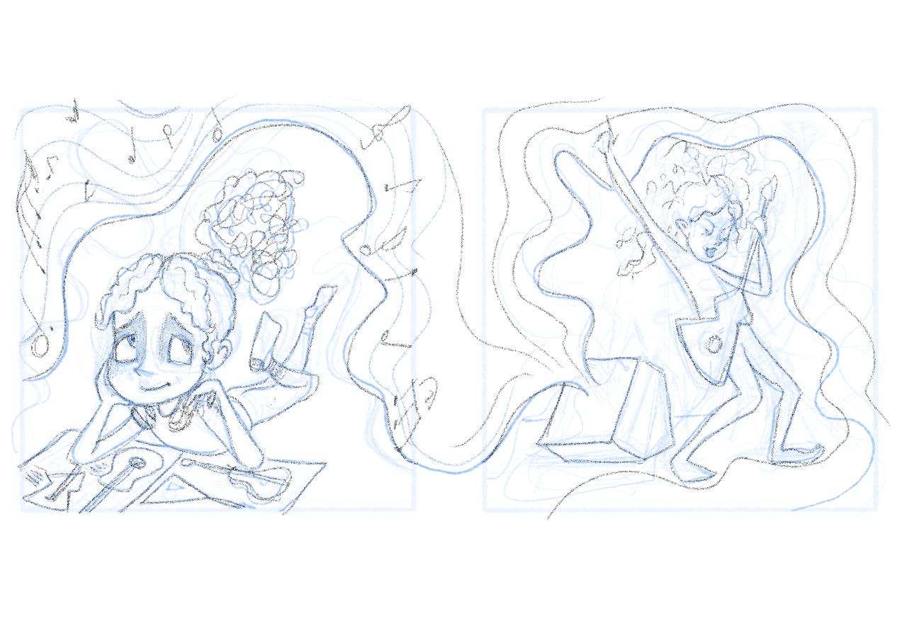
I thought id try my hand at this months picturehooks prompt which is a character being both quiet and loud. Id love to hear your thoughts on my rough sketch.
i tried a few different thumbs, so if this is too boring, i have others that i can work with.
thanks all!3

(It's supposed to be 2 separate illustrations and I'll break them apart when I start rendering)
-
@AngelinaKizz These two do show "quiet" & "loud" -- especially the "loud" one.
You mentioned whether they are too boring. They are both pretty standard views of a character & they are on one plane (no foreground / background). The stories would be: "A girl reads about guitars." & "A girl plays an electric guitar." So they are nice, but there's definitely room to add more interest if you want images that are exciting & stand out.I really like the upper half of the girl playing the guitar. Her expression & pose show she's really into it! I think the waves of sound work really well on the "loud" one.
-
@AngelinaKizz They look lovely! (I've been working on mine this week too, and am struggling to make them interesting...)
Your loud one definitely looks loud, but the quiet one could be more extreme in its quietness... Maybe the music waves could be more smooth and flat, to look more controlled (like a calm sea). Eyes could be closed?
Really looking forward to seeing how these end up!
-
@AngelinaKizz Very nice concept!
I agree with Robyn that there may be a more "extreme" quietness to express here. I also agree with Miram that the view of the character could be more dynamic. The combination of these brings to mind images of a girl lounging in bed with headphones on, eyes closed, totally chilled out, or maybe the same view of her reading, but zoomed out a little with her off center and showing her environment.
The loud side could similarly be shown in a more dynamic light - maybe she's jumping on the bed, totally rocking out.Also might be neat to show her in her bedroom in both images at the same angle and everything, but it's only her pose that has changed.
This all depends on the intent of the images of course - it's totally different to design a spot illo over a full spread, for example. My suggestions probably are more applicable to a full spread.
Looking forward to seeing where this goes!
-
This post is deleted!