How to Business Card
-
Howdy folks!
I want to make a new business card and I’m just wondering what some do’s and dont’s might be for making an illustration business card.
Couldn’t find many examples of other illustrators cards so I don’t have much to go off of. If can share your own card that would be super helpful!
I’m mainly wondering if I should just place one of my illustrations on one side of the card and my info in the other side or if I should make a design specifically for the card. I can see arguments for both but I think the most important part is, how much do art directors, publishers, or whomever else really care as long as it shows some artwork and has your info?
-
This is mine! If I had more time, I would've done something double-sided and made sure the two sides were the same theme.
I collected a bunch of business cards at a conference, and they kind of covered the whole spectrum of business card formats. Some people did some really off-the-wall stuff. Which, I think, means that it doesn't matter too much how you format your business card. As long as it's legible and has your info and a little bit of art, you're probably fine.
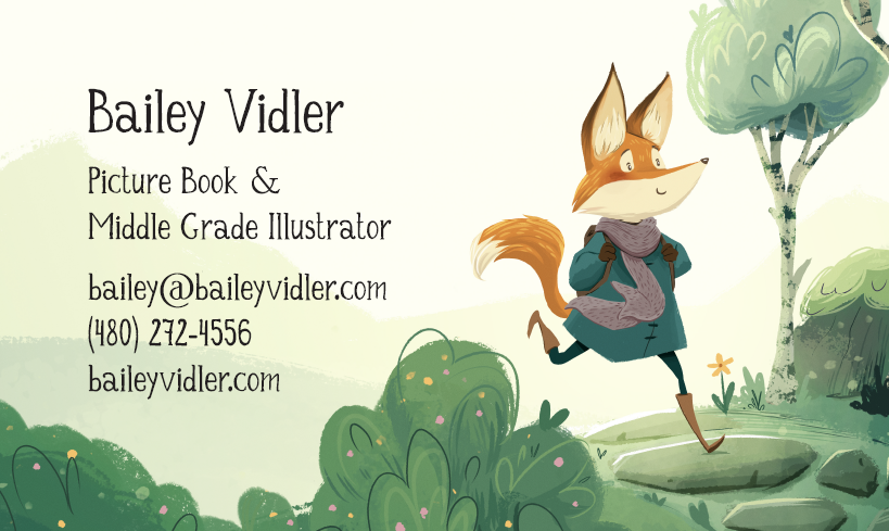
Bailey Vidler
Portfolio: baileyvidler.com -
@baileyvidler yours looks great! I think they way I’m going to do mine is with one of my illustrations on one side and then my info on the other
-
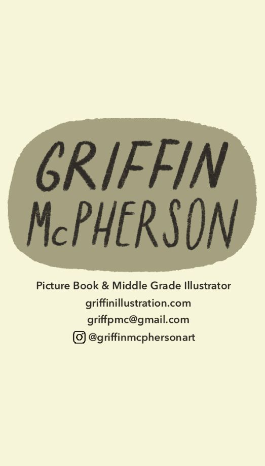
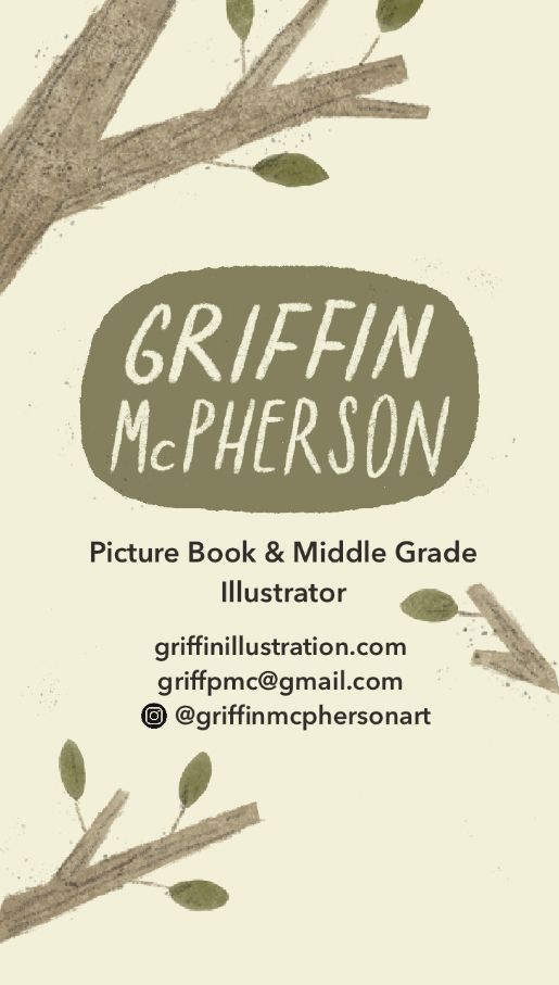
@baileyvidler okay, I’m struggling here. Here is what I was thinking for the two sides but it’s not looking very good to me. It just seems unprofessional for some reason. Additionally I’m not sure how I can shrink down an image to put on here without crushing the quality. How did you manage it? I have never understood resizing images and maintaining quality. Your image is even much larger than business card size but still looks good.

-
Wow! Your portfolio looks great. Wonderful pieces. What portfolio website are you using?
-
@Julia-Hegetusch that question was meant for bailey vidler
-
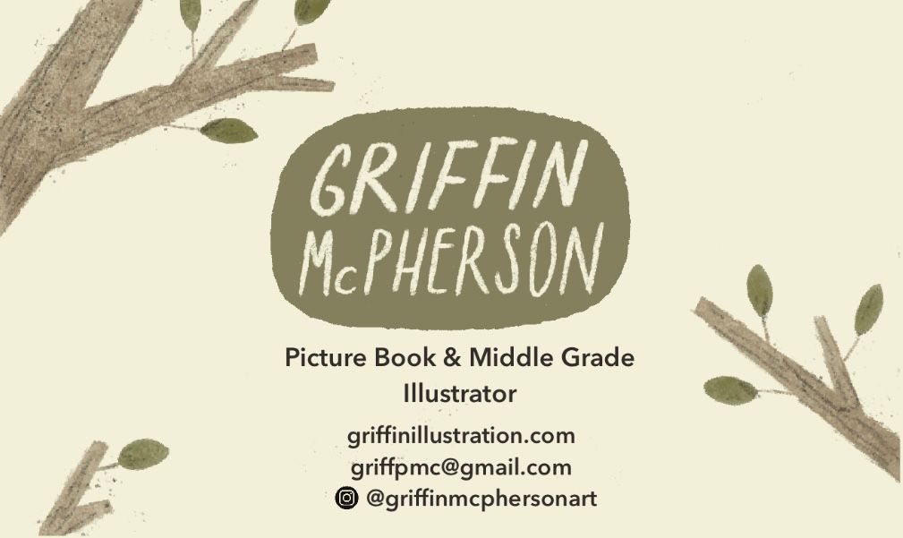
@Griffin-McPherson I hope you don't mind I played around with your card a bit!
First off, I think this totally looks professional! It's simple, clean, and classic. It's when business cards get overly complicated that they start to look unprofessional. (I worked in a print shop so I've seen a ton of business cards.) Yours is subtle, but still has a lot of character, which I think is the perfect combo.
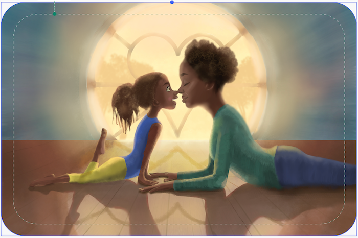
Because business cards are so small, the little details in your piece are going to be microscopic. (In the original crop, the bear is about the size of a thumbnail, so you won't be able to see his face.) So, it often looks better to crop really close on the subject matter of the piece, so you can see the smaller details better. I think that'll help your question about crushing the quality.
With image resizing, the general rule of thumb is that images can always go smaller, but they can't really go bigger. Which program are you using to make the design? As long as you're above 300dpi on the image, you're golden.
And then last thing, because your name is long, it felt more comfy to me to turn the card horizontal on the name side. But I think either way, horizontal or vertical, will be fine. Just a matter of your preference.
Sorry that's a lot - hope this helps!
P.S. Did you handletter your name or is that a font? It looks SO good.

Bailey Vidler
Portfolio: baileyvidler.com -
@baileyvidler thanks so much! I don’t mind you playing around with the design at all, it’s really helpful!
I do think I like my name in the horizontal composition better but will it look odd for the card to be oriented vertically with the image but horizontally on the other side?
I’m using procreate and the original illustration is 300dpi but when I crunch it down this small it looks pretty chunky and bad. I’m just using staples to get these card quickly and on their site I can just drop in the image and I doesn’t seem to reduce quality so I guess I’ll just do that. I still want to understand why I can’t shrink it down in procreate though.
-
@baileyvidler forgot to mention that my name is in fact hand lettered. I love hand lettering so I do it wherever I can
-
@Griffin-McPherson Procreate has various known issues regarding loss of quality when resizing, so shrinking needs to be done in another software like Photoshop, InDesign or affinity. Even Canva gave better output. Not quite sure why, it seems random...
www.instagram.com/art.melc.illo/
www.artmelc.com
I write weekly on mondayblues.substack.com -
@ArtMelC it’s so frustrating. I really wish procreate could figure that out
-
@Griffin-McPherson I was going to say the same, I would not use Procreate for this kind of work. Affinity Design (avalaible on iPad), GIMP, Inkscape or Krita (the last 3 are free and open source) would be a better bet
")
In terms of the business card, I think it would look more like a business card in landscape orientation; but that's because I never received any business card in portrait orientation. Also, if you zoom on the bear, it might work better in landscape orientation?
Finally, I would make sure that the text is big enough, especially the contact info. It seems tiny.
-
I really like the illochat podcast, and sunny was talking about how she got hers printed through moo. I don't know the website, I haven't looked yet. But she said that you can choose up to 50 images for 1 order of business cards and each one will be different. I think I'd like to go that route with my own.
-
@Griffin-McPherson
Hi Griffin,Your card is looking good! Just a few comments from me, based on my own experience. First up, this is my business card - front and back:
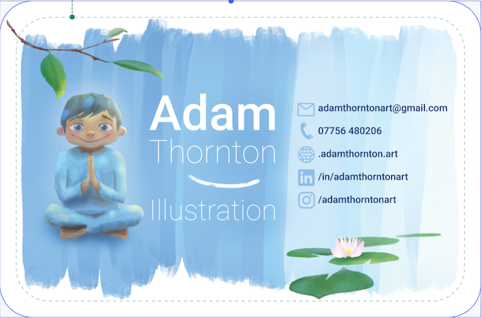
Definitely do double-sided. It looks so much better and more professional and is a great opportunity to showcase more of your artwork.
A couple of design choices I made which I feel are good was to have contrasting values on the front and back, to give the card more visual interest. You can see the front is a lighter illustration whereas the back is a darker one.
Also, the printing company I went with (Vista Print, here in the UK) offered cards with rounded corners. I like that because it's easier to put the card in your wallet without the corners catching.
I fully agree with what Bailey said about keeping it "simple, clean, and classic".
One big mistake I made though was to have the font much too small (will be doing a reprint soon), which I see you are at risk of doing in your example. Try zooming the image of your business card down to real size, and see if everything is still easily legible. It needs to be legible for normally-sighted people.
I probably won't have my LinkedIn or Instagram on the next print run either. Just make sure their links are prominent on my website.
Also, obviously make sure your business card follows the same design style as your website, logo etc.
-
Update: here’s how the info side is looking. I’m liking it a lot more now but I may still try landscape style on both sides
-
@Griffin-McPherson I really think the text is gonna be too small, did you check it is readable when printed?
Find me on Instagram: https://www.instagram.com/nodragem/
Portfolio: https://www.nodragemillustration.com -
@Geoffrey-Mégardon I actually scaled the text up in this one. I’m using size 8 and 9 for the text here which are pretty standard for business cards and shouldn’t be too small
-
Here’s how the landscape version could look. I really like it but the main thing that holds me back is that the image would be portrait and then flipping it over to a landscape layout feels like poor design to me but maybe that’s overthinking it